Adform is a Danish advertising technology company founded in Copenhagen in 2002. Its platform supports the buying and serving of digital advertising, and Adform FLOW is one of its products. The company’s product literature describes the business as founded in Denmark in 2002, while an industry alliance profile names founders Gustav Mellentin, Jakob Toftgaard Bak and Stefan Juricic (Adform product literature; EDAA profile).
 Adform Logo PNG
Meaning and history
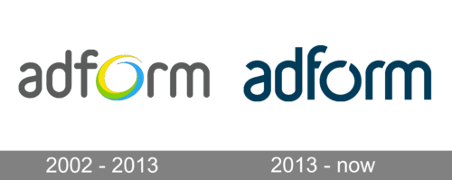
The wordmark is lowercase in both designs shown in the historical sequence. Its most noticeable changes are the treatment of the letter O and the colour of the lettering: the early version gives the O a bright, multicoloured outline, while the later mark uses a dark blue wordmark with a more restrained circular form.
2002 – 2013
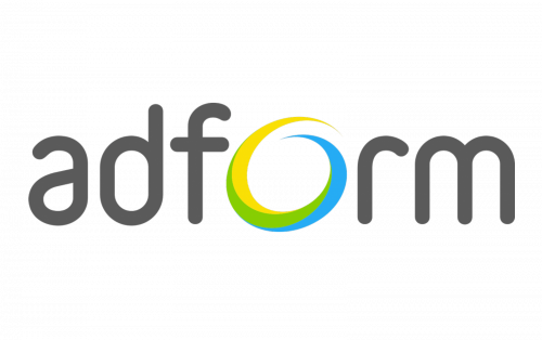
This early design pairs a grey, rounded lowercase wordmark with a yellow-and-blue circular O. The coloured ring stands out against the otherwise muted lettering. The heading dates this stage to 2002–2013, but the date range is not independently confirmed by the cited company materials.
2013 – Today
The mark shown here replaces the grey letters and vivid ring with a dark blue lowercase wordmark. The O remains distinctive, with breaks in its circular shape, but it is integrated into the word rather than separated as a standalone icon. The image closely resembles the lead logo above; it is retained here because it belongs to this timeline stage. Adform’s marketing leader described the pre-2023 identity as dark and business-oriented in Markedsføring’s report on the later refresh (Markedsføring).
Adform FLOW
Adform introduced FLOW in September 2020. The product image uses the Adform name with FLOW beneath it, set inside a layered blue circular graphic. This gives the product a distinct visual treatment while keeping the parent brand’s name prominent. Adform’s November 2023 milestone announcement described an evolution of the brand identity and reported recognition for the FLOW interface (Adform newsroom).
Font and color
The wordmark’s letterforms are lowercase and rounded in the examples shown. The emblem image presents a blue-to-green gradient ring around a white centre, with small line details extending from its lower and right edges. It is visually distinct from the dark blue wordmark above, but the image alone does not establish which identity generation it belongs to. Markedsføring reported that the identity introduced in 2023 uses blue, purple and lime, alongside a new typeface and photography-led imagery; the article does not identify the typeface by name (Markedsføring).
Current identity
Adform announced a refreshed visual identity and the tagline “Change the game” in November 2023. Markedsføring reported that AKQA worked on the visual identity, Capucin on positioning and the tagline, and Adform’s internal creative team also contributed. The reported system includes a blue, purple and lime palette and photography featuring Adform employees. Adform’s 2025 annual report continues the positioning introduced with the refreshed identity (Markedsføring; Adform 2025 annual report). The dark blue mark under “2013 – Today” therefore represents an earlier stage, not the later documented identity.
Disclaimer
This article is part of the educational resources provided by Logo Index, an independent archive covering logos, visual identities and graphic design history. Adform and associated trademarks and brand assets remain the property of their respective rights holders where applicable.