AESC’s current identity pairs a custom AESC wordmark with a separate A Mark: an uppercase A without a crossbar. The system is presented with the line “Advancing Beyond.” Kontrapunkt’s case study credits the work to Kenya Hara and Nippon Design Center and describes it as a digital-first identity.
 AESC Logo PNG
AESC, short for Automotive Energy Supply Corporation, makes batteries for electric vehicles and energy storage. Nissan and NEC Group formed the company in 2007; Envision agreed to acquire the battery business in 2018, and the transaction completed in March 2019 with Nissan retaining a 25% stake, according to Energy-Storage.news and InsideEVs.
Meaning and history
The company’s first documented identity stage belongs to its Nissan–NEC joint-venture years. AESC was registered in April 2007, with Nissan, NEC and NEC TOKIN holding shares, as reported by Energy-Storage.news. The name AESC and its full corporate-name expansion identified the business during this period.
AESC’s early production footprint included Zama in Japan, followed by plants in the United States and the United Kingdom. The company timeline records production starting in 2010 at Zama and in 2012 at Smyrna and Sunderland (Envision AESC timeline).
After Envision’s acquisition, the business was commonly referred to as Envision AESC. The design history is distinct from that ownership and naming change: the current identity gives AESC a wordmark and a separate graphic mark, rather than making the parent company’s name part of the logo.
???? — Today
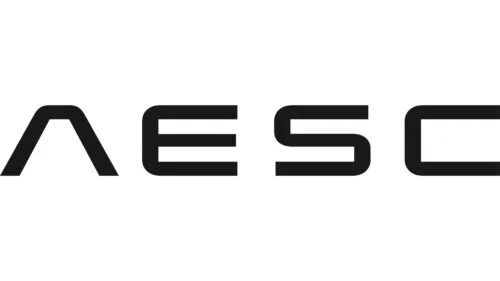
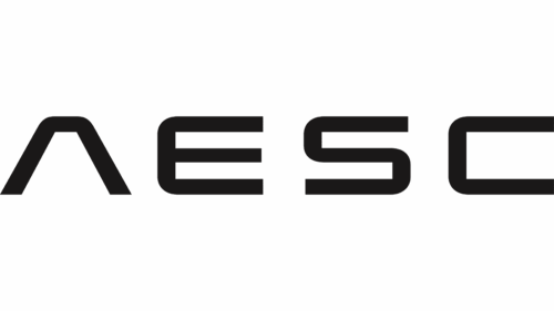
The image shows the uppercase AESC wordmark. In the broader identity, it is paired with the A Mark, a crossbar-less A. Kontrapunkt says that this open form evokes an open road ahead and a forward arrow, and connects the system to the line “Advancing Beyond.” The case study identifies Kenya Hara and Nippon Design Center as collaborators on the digital-first identity (Kontrapunkt).
Lettering and mark
Kontrapunkt describes the lettering as a bespoke display typeface. The standalone A Mark is derived from the same letterform as the wordmark’s opening character, giving the two elements a clear visual link. Removing the crossbar is the defining difference between that symbol and an ordinary uppercase A.
The two documented stages are different in what they emphasize: the earlier identity is tied to the company name and its joint-venture history, while the later system separates the AESC wordmark from a distinctive A symbol. The designer’s case study also frames the identity around Japanese heritage and the “Advancing Beyond” story.
Disclaimer
This article is part of the educational resources provided by Logo Index, an independent archive covering logos, visual identities and graphic design history. AESC and associated trademarks and brand assets remain the property of their respective rights holders where applicable.