 AP Racing Logo PNG
AP Racing makes brake and clutch systems for motorsport, vehicle manufacturers, road cars and motorcycles. The brand is part of the Brembo Group, which acquired the AP Racing division in 2000 (AP Racing company history). Its identity has moved from a compact, framed badge to a more open wordmark.
Meaning and history
AP Racing traces its name to Automotive Products: the company formed a Competition Products division in 1967 and renamed it AP Racing in 1970 (AP Racing company history). The company records a logo change in 2004. A new identity launched on 8 June 2026 at the 24 Hours of Le Mans, making the earlier mark a historical stage (The Brake Report).
2004 — 2026
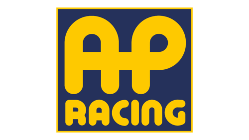
The earlier mark places large, rounded yellow “AP” lettering above “Racing,” all within a dark blue square edged in yellow. The letters fill most of the badge, making the initials the dominant element while the smaller word identifies the racing division. AP Racing lists 2004 as a logo-change year in its company chronology (AP Racing company history).
2026 — Today
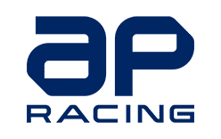
Launched in June 2026, the current identity replaces the framed badge with a lowercase “ap” above “Racing.” The supplied mark uses dark blue lettering on white, without the earlier square panel. The 2026 launch introduced a refreshed visual language and colour palette designed to work across digital and motorsport settings, according to The Brake Report’s coverage of the launch.
The redesign appeared at Le Mans, where AP Racing supplied components for 47 of the 62 cars on the 2026 grid, according to The Brake Report. The company also marked its 1,000th Formula 1 Grand Prix as a component supplier in May 2026; that milestone counts appearances, not race victories (Brembo Group).
Wordmark and color
The clearest change is the shift in structure: a bold, contained badge gives way to a wordmark with open white space around it. In the supplied 2026 artwork, “ap” is lowercase and built from broad geometric forms, while “Racing” sits below in smaller, more widely spaced capitals. The contrast between the two lines keeps the full name legible without a colored background.
The earlier badge relies on yellow against dark blue and a defined border; the newer mark uses dark blue lettering against white. AP Racing’s 2026 identity announcement describes a refreshed palette, and the new wordmark also appears on motorcycle brake-pad packaging rolling out from autumn 2026, as The Brake Report reported.
The company history behind the name begins with Automotive Products, founded in 1920. Its Competition Products division became AP Racing in 1970, and Brembo acquired the division in 2000 (AP Racing company history). That lineage explains the initials and the racing descriptor; the logo’s visual emphasis, however, has shifted from the initials inside a badge to a standalone wordmark.
Disclaimer
This article is part of the educational resources provided by Logo Index, an independent archive covering logos, visual identities and graphic design history. AP Racing and associated trademarks and brand assets remain the property of their respective rights holders where applicable.