Allegion is a global security products and solutions company that was formed as a spin-off from Ingersoll Rand in 2013. The company specializes in security around the doorway and adjacent areas, producing everything from mechanical locks to electronic access control systems.[1]
Design and History
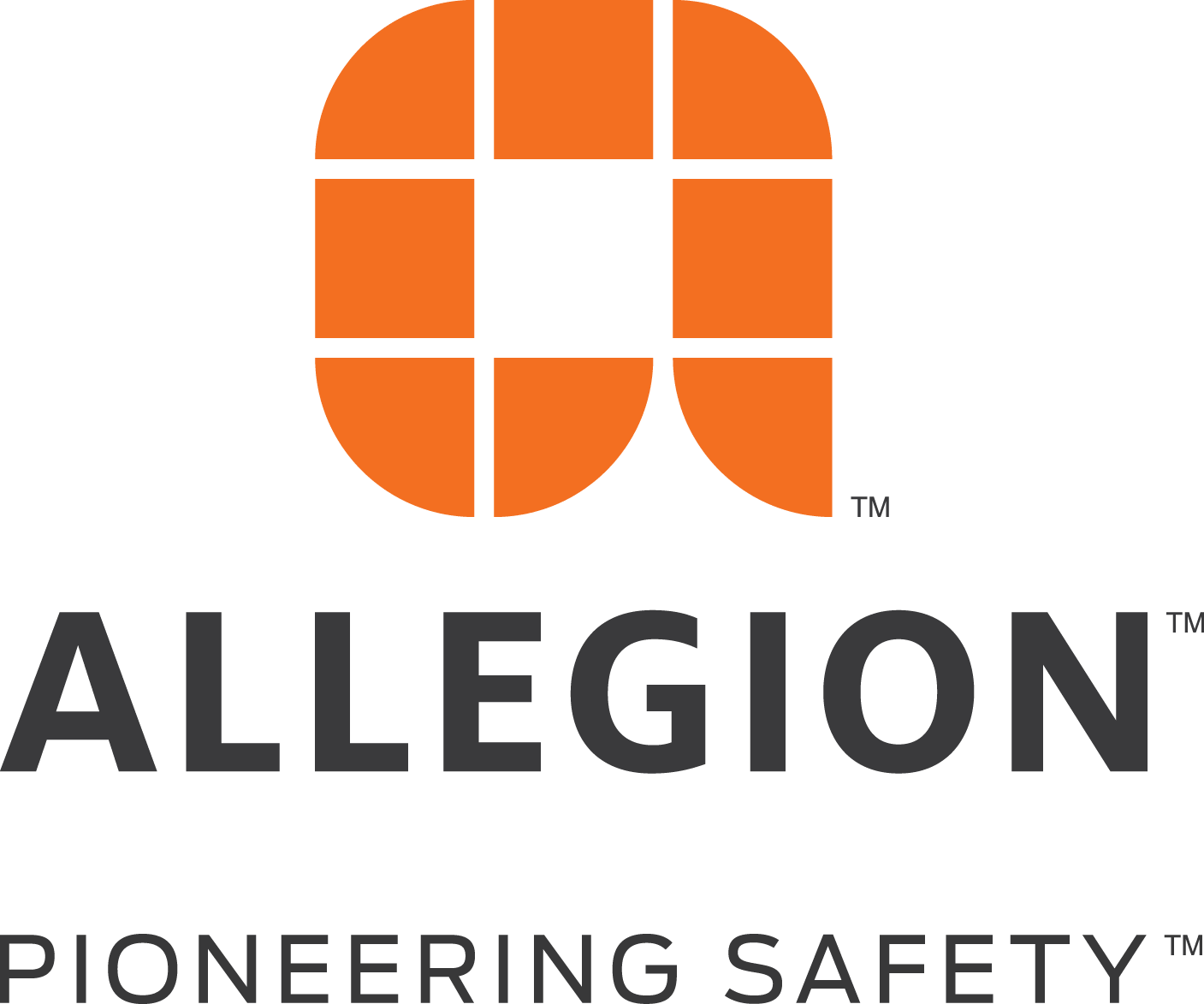
Allegion’s logo was unveiled on July 9, 2013, by Ingersoll Rand, ahead of the security business’s separation as an independent public company later that year.[2] The brand identity was designed by Lippincott, a brand strategy and design consultancy.[3]
The logo features a lowercase “a” constructed through a deliberate arrangement of panels and openings often seen in architecture blueprints.[2] The mark is composed of eight orange shapes that together form the letterform.[3]
The company name “Allegion” is derived from “allegiances,” symbolizing close, collaborative and long-term relationships with partners and customers.[4]
Meaning and Symbolism
According to the official announcement, the logo was “inspired by the intricate systems of protection in which Allegion’s products and solutions work.”[2] The blueprint-like arrangement of panels and openings reflects the architectural and security systems context of the company’s offerings.[2]
The logo’s vibrant orange color was described by Ingersoll Rand at the unveiling as suggesting “Allegion’s boundless energy.”[2] The design was also noted to support Allegion’s future vision to expand the breadth and depth of its electronic security offerings.[2]
Logo Index is an independent educational archive covering logos, visual identities and graphic design history. All trademarks and brand assets remain the property of their respective owners.