
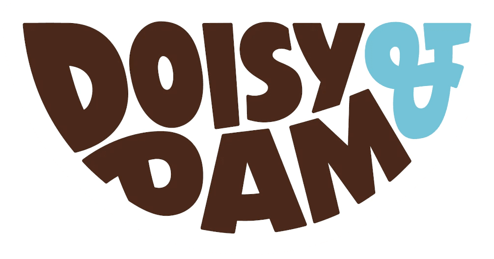
Doisy & Dam is a UK-based chocolate brand founded in 2013 by childhood friends Ed Smith and Richard Wilkinson. The company produces vegan, palm-oil-free chocolate products made with ethically sourced cocoa and is a certified B Corp. The brand name references two scientists, Edward Doisy and Henrik Dam, who were instrumental in nutritional science in the 1940s. [1]
Design and History
The brand’s visual identity was developed by London-based branding agency Naked Ideas, which was asked to refine the logo and revamp patterns and packaging across a variety of formats. In its original form, the logo was being applied inconsistently across packaging and used a generic ampersand that lacked personality. The resulting marque underwent several typographic refinements, including the creation of a customised ampersand reminiscent of a heart shape. [2]
Naked Ideas also designed packaging for the brand’s Snaps snacking chocolate product, using geometric forms, type treatment and colour to illustrate the brand’s fun and bold personality. The packaging incorporated copper foiling through the brand name as a subtle nod to luxury. [3]
In January 2020, Doisy & Dam launched a brand refresh with new packaging featuring a bold new look and logo, a host of colours and striking patterns, which rolled out across all of its products. The refresh accompanied the introduction of a new product range including Ballers, Buttons and D&Ds. [4]
Meaning and Symbolism
The customised ampersand in the logo, shaped like a heart, serves as the brand’s central symbolic element. It was created specifically to replace a generic ampersand that lacked personality, giving the wordmark a distinctive character tied to the brand’s identity. [2]
Typography and Design
The logo is a typographic wordmark that underwent several refinements during the Naked Ideas rebrand. The key typographic development was the customised heart-shaped ampersand, which replaced the generic ampersand used previously. The design work extended beyond the logo itself to include new wrappers, patterns, colour palettes, label icons and typography across the full packaging range. [2]
Logo Index is an independent educational archive covering logos, visual identities and graphic design history. All trademarks and brand assets remain the property of their respective owners.


