 Ariel Logo PNG
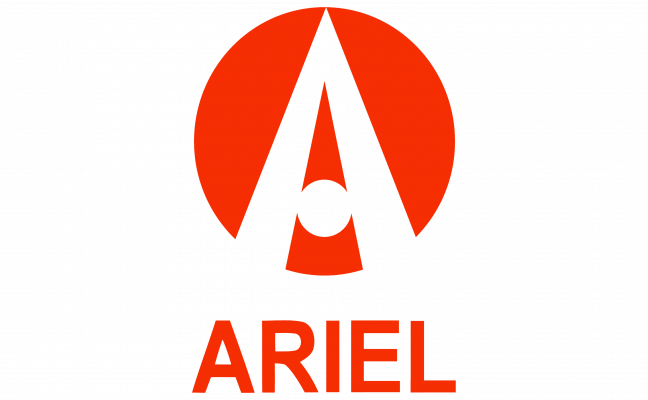
The Ariel logo used by the modern British performance-vehicle company is built around a stylized capital A inside a red circular field, usually accompanied by the ARIEL wordmark.
The badge became closely associated with the modern Ariel era that produced the Atom, Nomad and Ace. Ariel itself dates the Atom’s launch to 1999, with first deliveries in 2000, and describes 2025 as the 25th anniversary of the modern Ariel Motor Company. [1] [2]
Ariel Logo Meaning and Design
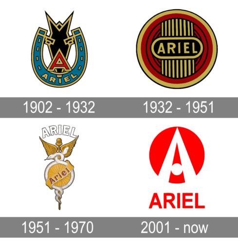
The modern Ariel emblem is visually simple. Its main elements are:
- a solid red circular background;
- a highly stylized white or light-colored capital A;
- a small circular opening or dot in the center of the letterform;
- the ARIEL name used below or alongside the symbol in some applications.
The letter A is the clearest documented reading because it directly corresponds to the Ariel name.
Some secondary logo histories interpret the central form as a road narrowing toward the horizon. That reading is visually plausible, but no official Ariel source located for this article confirms that the logo was designed specifically to represent a road, speed or forward movement.
The Stylized “A”
The most distinctive element in the current badge is the unusual construction of the letter A.
Instead of using a conventional crossbar, the design incorporates a circular opening in the middle. The outer strokes extend beyond the red circular field, which gives the symbol a more open and mechanical appearance than a standard enclosed monogram.
Is the Ariel Logo Supposed to Look Like a Road?
A number of later automotive-logo websites describe the white A as resembling a road or two converging lines leading toward the horizon.
The comparison is understandable because the letter narrows sharply toward its upper point. However, this explanation does not appear in Ariel’s own published company history or current brand material.
For Logo Index, the safer interpretation is that the mark is primarily a stylized initial A, while the road-like appearance can be mentioned only as a visual observation rather than official symbolism.
Ariel Logo Colors
The most familiar version of the modern Ariel badge uses red and white.
The red field gives the small circular badge strong contrast, while the white A remains legible even at reduced sizes. Ariel also uses monochrome and metallic applications depending on the vehicle or medium.
There is no authoritative Ariel source located for this article stating that red officially represents passion, energy or performance, or that white represents purity and precision. Those are generic color-psychology interpretations rather than documented brand meaning.
Ariel Wordmark and Typography
The ARIEL wordmark is generally shown in uppercase sans-serif lettering beneath the circular emblem.
The letters are narrow and relatively simple, giving the symbol itself visual priority.
No authoritative Ariel brand source located for this article identifies a commercial font used for the wordmark. Comparisons with Arial Narrow, Akhbar Bold or Neue Alte Grotesk are only approximate visual matches and should not be presented as verified typeface identification.
The Ariel Name Before the Modern Company
The Ariel name is much older than the Atom.
Ariel’s official history traces the name back to 1871, when James Starley created the Ariel Ordinary, an early high-wheel bicycle. Ariel describes it as the world’s first series-production vehicle. [1]
The company later developed safety bicycles and, by the beginning of the 20th century, motorcycles. Ariel’s current motorcycle material states that the first Ariel motorcycle appeared in 1901. [3]
This history gives the modern company a genuine connection to one of Britain’s oldest vehicle names, but it does not mean every historical Ariel badge belongs to one uninterrupted corporate identity.
Early Ariel Badges
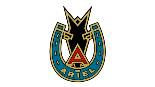
Surviving Ariel motorcycles, bicycles, advertisements and restored badges show that the historic marque used several different nameplates and decorative emblems over many decades.
The image above is commonly reproduced online as an early Ariel emblem. However, no primary Ariel archive located for this article confirms that this exact artwork was introduced precisely in 1902 or functioned as the company’s single official corporate logo for the entire 1902–1932 period.
It is therefore more accurate to describe it as an early Ariel badge style rather than assign an exact redesign chronology without stronger evidence.
Interwar Ariel Badge
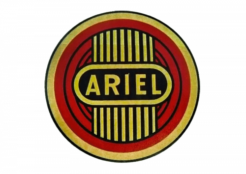
Another surviving style uses a vertically oriented decorative structure crossed by the Ariel name.
Its ornamental geometry reflects the type of enamel and metal badging commonly used on motorcycles of the period, but the exact introduction date and designer are not clearly documented in Ariel’s current historical material.
For that reason, it should not automatically be labeled a formal “1932 redesign” unless a period catalogue, trademark filing or company archive confirms the date.
Later Historic Ariel Emblem
Later Ariel motorcycles also carried more decorative badges combining the Ariel name with circular or wheel-like forms.
The surviving graphic above is often assigned to the 1950s in modern logo collections. Again, the broad period may be reasonable, but Ariel does not provide a precise official logo timeline matching the widely repeated 1902, 1932 and 1951 dates.
The safest approach is to document these as historical badge variations rather than pretend there was a modern-style corporate rebrand every few decades.
From Historic Ariel to the Atom
The modern Ariel performance-car story developed separately many decades later.
Ariel’s official history says Simon Saunders began developing the Lightweight Sports Car concept while working as a senior lecturer in transport design. Together with student Niki Smart and input from companies including Stewart Grand Prix, TWR, British Steel and Ford, the LSC was shown at the 1996 British Motor Show. [1]
The design then evolved into the Ariel Atom, which was launched in 1999 and delivered to customers from 2000. [1]
This period is the practical starting point for the modern Ariel badge and brand identity seen today.
When Was the Current Ariel Logo Introduced?
Secondary logo histories commonly date the current red circular A emblem to 2001.
However, no authoritative Ariel source located for this article provides a confirmed 2001 introduction date or identifies the designer of the mark.
What can be said with confidence is that the logo belongs to the modern Atom-era Ariel identity that emerged around the turn of the millennium.
Rather than treating 2001 as an unquestionable redesign date, it is more accurate to describe the badge as the identity associated with the modern Ariel Motor Company from the early 2000s onward.
Modern Ariel Brand Identity
The red A badge remains in active use across Ariel’s current website, vehicles, apparel and corporate communication. [4]
The company now applies the identity across several different vehicle categories, including:
- the Atom sports car;
- the Nomad off-road car;
- the Ace motorcycle;
- the Dash e-bike.
The ability of the same compact badge to work across cars, motorcycles and bicycles is particularly appropriate for a name whose history spans all three forms of transport.
Ariel Logo and the Atom
The logo became especially recognizable through the Ariel Atom.
Ariel describes the Atom as having launched in 1999, with first deliveries in 2000. The company celebrated the model’s 25th anniversary in 2025 and continues to develop it through the Atom 4, 4R and 4RR. [2]
The badge is visually small compared with the Atom’s exposed tubular chassis, but that restraint suits a vehicle whose identity is dominated by visible engineering rather than decorative bodywork.
Ariel Logo Today
Ariel remains based in Crewkerne, Somerset, where its vehicles are built in small numbers. The company emphasizes hand assembly, with individual technicians responsible for taking a vehicle through construction, road testing and final sign-off. [5]
The modern logo has remained remarkably consistent throughout the Atom era, with the stylized A and circular field continuing to serve as the brand’s primary identifying device.
What Is Actually Known About the Ariel Logo?
The strongest defensible facts are relatively simple:
- the symbol is based around a stylized A for Ariel;
- the modern mark uses a red circular field with contrasting lettering;
- it belongs to the modern Atom-era Ariel identity;
- the Ariel name itself has genuine vehicle history dating back to 1871;
- historic Ariel motorcycles used several different badge styles;
That distinction gives a more reliable picture of the identity than assigning hidden meanings to every shape and color.