Banamex is the familiar name of Banco Nacional de México, formed in 1884 through the merger of Banco Nacional Mexicano and Banco Mercantil Mexicano. The bank’s name is a contraction of its legal name. Its identity has moved from an ornate monogram to the interlocking Roseta, which returned in a redesigned form in 2025.
The current Banamex identity launched on 3 March 2025, created with Interbrand after the bank’s separation from Citi. It updates the Roseta and pairs it with a custom typeface and a palette of more than two dozen colours, as Interbrand describes and El Economista reports.
 Banamex Logo PNG
Meaning and history
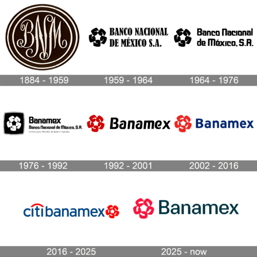
The Roseta is formed from five interlocking letter Bs. Designer Fernando Mercado del Collado explained that the letters represented five entities of the banco múltiple, including Banco Nacional de México and four related financial businesses, as reported by Expansión. The symbol has been adapted across several wordmarks and colour schemes rather than used in only one fixed lockup.
1884 – 1959
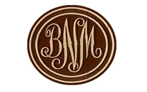
This stage shows an oval, double-outlined medallion with an elaborate monogram at its centre. Its engraved-looking initials and enclosing rings give it the appearance of a formal seal, quite different from the compact symbols and wordmarks used in later stages.
1959 – 1964
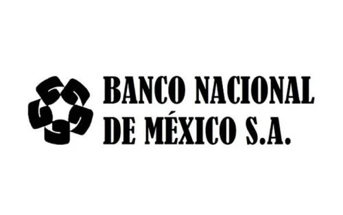
Here the ornate medallion gives way to a compact interlocking emblem, set beside the bank’s full name in tall serif capitals. The horizontal arrangement makes the name easier to read while keeping the symbol as a separate visual anchor.
1964 – 1976
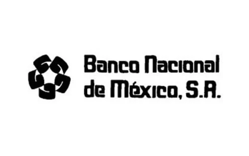
The interlocking emblem remains, but the lettering changes to a heavier, more rounded style and uses title case for “Banco Nacional de México, S.A.” The date labels for these early designs belong to the visual archive; the documented identity milestone that follows is the Roseta design launched in 1975.
1976 – 1992
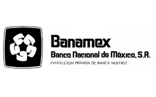
The image combines a framed interlocking symbol with the Banamex wordmark and the bank’s full name beneath it. The Roseta identity was created by Walter Landor Associates, with Fernando Mercado del Collado as responsible designer, and publicly launched on 6 January 1975, according to Expansión. The designer’s account describes an ochre-and-brown palette, distinguishing the identity from the blue used by rival banks.
1992 – 2001
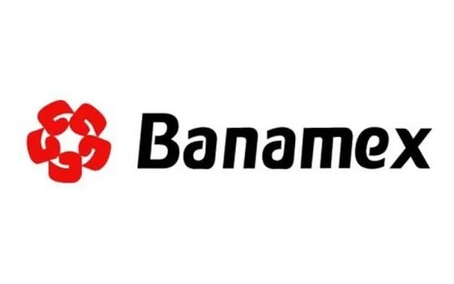
The 1992 revision removes the symbol’s enclosing frame and places a red Roseta beside a black Banamex wordmark. A new corporate typeface accompanied the change. TipoMap México records the design credits and notes that this identifier remained in use until 2002.
2002 – 2016
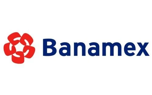
This stage keeps the red Roseta but changes the wordmark from black to blue. The symbol and name remain in a straightforward side-by-side arrangement, giving the design continuity with the preceding version while making the wordmark the dominant colour element.
2016 – 2025
In 2016, the bank adopted the Citibanamex name. The mark combines the blue wordmark with Citi’s red arc above the “t” and places the Roseta at the end. The change was a co-branded name for the same company, not a new institution, according to the bank’s Citibanamex FAQ; Expansión also notes the arc as a defining feature of the design.
2025 – Today
The current design returns to the Banamex name and makes the Roseta the red symbol beside a dark wordmark. Interbrand’s custom typeface takes its forms from the Roseta’s lines, and the broader identity includes an expanded colour palette, motion and sound. Banamex launched the identity on 3 March 2025 after separating from Citi in December 2024, as Interbrand and El Economista report.
Symbol, lettering and colour
The identity’s most consistent element is the Roseta, although its framing, colour and relationship to the wordmark have changed. In 1975 it appeared in an ochre-and-brown system; the 1992 revision introduced red and removed the enclosing shape around the symbol. The 2002 stage shown here keeps the red emblem but switches the wordmark to blue. TipoMap México documents the 1992 changes and typography credits.
The 2025 system brings the symbol and lettering closer together: Interbrand says the custom Banamex typeface draws on the Roseta’s lines. The redesigned mark retains the interlocking form while replacing the Citibanamex-era wordmark and Citi arc with the Banamex name. The bank’s slogan for the identity is “Aquí. Para ti. Siempre.”
Disclaimer
This article is part of the educational resources provided by Logo Index, an independent archive covering logos, visual identities and graphic design history. Banamex and associated trademarks and brand assets remain the property of their respective rights holders where applicable.