 Artega Logo PNG
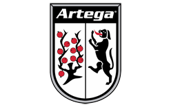
The Artega logo combines a distinctive ARTEGA wordmark with an abstract geometric symbol. The identity appeared with the German sports-car project created by Klaus Dieter Frers in Delbrück and became associated most strongly with the Artega GT.
Unlike many later logo descriptions, the original trademark record gives a useful factual description of the design. Artega’s U.S. filing describes the mark as the word ARTEGA together with stylized arcs and a semicircle. It does not assign meanings such as speed, precision or exclusivity to those shapes. [1]
Artega Logo Meaning and Design
The Artega identity is relatively restrained. Its main elements are:
- the uppercase ARTEGA name;
- a small abstract symbol formed from curved geometric elements;
- a predominantly monochrome presentation in many applications.
The trademark filing formally categorizes the symbol as a combination of arches, curved bands and a semicircular form. [1]
No authoritative Artega source located for this article explains the symbol as representing engineering precision, motion or German design philosophy. Those interpretations may be visually plausible, but they are not documented logo meaning.
The Artega Symbol
The abstract element sits close to the wordmark and is built from several rounded strokes.
Depending on how it is viewed, the design can suggest an arch, a stylized letterform or a compact mechanical shape. However, Artega’s trademark description deliberately remains geometric rather than assigning a pictorial subject to it.
For that reason, it is better to describe the symbol according to its actual construction rather than invent an intended object or metaphor.
The Artega Wordmark
The ARTEGA name forms the dominant part of the identity.
The lettering is uppercase and relatively narrow, with several customized shapes that give the wordmark more character than ordinary typeset text.
No official Artega source located for this article identifies a commercial font used for the logo. The mark should therefore be treated as a custom or modified wordmark rather than assigned to a specific typeface based only on visual similarity.
Artega Logo Colors
The logo is frequently reproduced in black, white, silver or metallic treatments.
Importantly, the 2008 U.S. trademark application states that color is not claimed as a feature of the mark. [1]
That means claims such as black representing exclusivity or silver representing engineering precision should not be presented as official Artega symbolism.
The neutral construction simply allows the mark to work across vehicle badges, print, digital material and different body colors.
When Was the Artega Logo Introduced?
The strongest documented date for the figurative Artega identity is January 25, 2008, when Artega GmbH filed the mark in the United States. It was registered in April 2009. [1]
The brand itself was already public by then. Artega presented its first GT prototype at the Geneva Motor Show in 2007, marking the public emergence of the new German sports-car marque. [2]
It is therefore safest to place the identity in the 2007–2008 launch period rather than assign an unsupported earlier date.
Who Founded Artega?
Artega was created by German engineer and entrepreneur Klaus Dieter Frers, founder of automotive electronics supplier Paragon.
The sports-car project developed during the mid-2000s and reached the public with the Artega GT in 2007. Artega’s own later company material describes the brand as having launched in 2007. [3]
The Artega GT
The logo became best known through the Artega GT.
The compact mid-engine sports car was designed by Henrik Fisker, whose previous work included Aston Martin and BMW projects. Contemporary coverage from 2007 identified Fisker as the exterior designer of the new Artega. [2]
Artega later stated that 153 GTs were produced before production ended in 2012. [3]
The GT gave the relatively simple logo most of its visual recognition, with the mark appearing on the car, promotional material and company signage.
What Happened to Artega in 2012?
The original Artega Automobil company entered insolvency in 2012.
Paragon AG announced that it would acquire all of Artega’s assets on October 1, 2012. Crucially, Paragon also stated that it would not resume sports-car production, which had already been shut down by the insolvency administrator. [4]
It is therefore misleading to describe Paragon simply as Artega’s continuing parent company.
The Artega Brand Returned
The brand later returned under a new corporate structure.
At the 2015 Frankfurt motor show, Artega announced that it was operating again as a manufacturer under a new company name. The company stated that the new Artega GmbH & Co. KG was once again owned by the family of founder Klaus Dieter Frers. [3]
The revival introduced the electric Scalo sports car and the smaller Karo electric vehicle.
This period reused the established Artega name and identity rather than replacing it with an entirely new brand.
Artega and Electric Vehicles
After the revival, Artega shifted much of its public attention toward electric mobility.
The 2015 Scalo was presented as a fully electric continuation of the sports-car idea, while later company material promoted the compact Karo electric vehicle. [3]
A 2022 Artega Karo brochure still displayed the Artega identity and gave the company’s Delbrück address, showing that the mark remained in active corporate use well beyond the original GT period. [5]
Is Artega Still Active?
Artega’s recent corporate status is more complicated than the older article suggests.
The official Artega website remains online and preserves material for its vehicles and brand. However, German commercial-register aggregations show that one later legal entity named Artega GmbH has been deleted from the register, while other Artega-related entities have existed separately.
Because of that changing structure, it is safer to describe Artega today as a historic and periodically revived automotive brand rather than confidently state that Paragon currently owns and operates the marque.
Artega Logo Legacy
The most defensible story behind the Artega identity is straightforward:
- the mark emerged with the new German sports-car brand around 2007–2008;
- its trademark combines the ARTEGA name with stylized arcs and a semicircle;
- color was not claimed as part of the registered mark;
- the identity became associated primarily with the Henrik Fisker-designed Artega GT;
- it survived the original company’s 2012 insolvency and appeared again during the later electric-vehicle revival.
That documented history provides more value than generic claims about monochrome colors representing sophistication or typography representing German engineering precision.