 Celine Logo PNG
Celine’s current wordmark spells the name in six uppercase letters, without the acute accent used in the French spelling Céline. The house introduced this design in September 2018. FashionNetwork reported the brand’s explanation that the change created a simpler, more balanced proportion, evoking Celine’s 1960s collections and a modernist typographic style dating to the 1930s (FashionNetwork).
Meaning and history
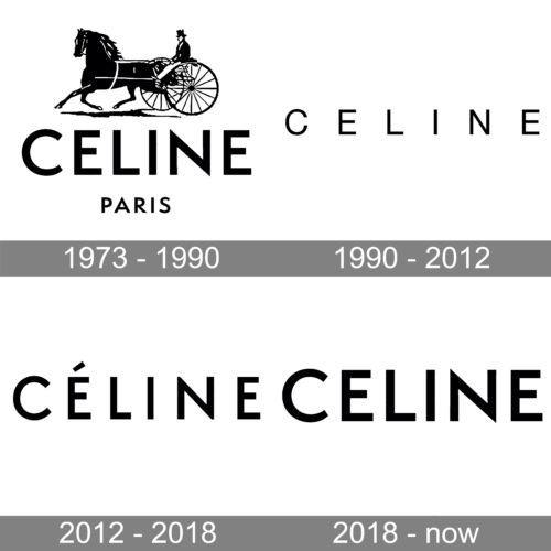
Celine began in Paris in 1945 as a made-to-measure children’s shoe business founded by Céline and Richard Vipiana. An early mark was a red elephant; L’Officiel also credits its drawing to Raymont Peynet (L’Officiel). The house moved into women’s ready-to-wear in 1960, and its visual identity later became associated with a horse-and-carriage emblem and the Celine name.
The carriage emblem is commonly called the Sulky. L’Officiel dates its use to around 1966 or 1967 through 1990. A related but distinct identity milestone came in 1973, when the house introduced an intertwined-C Sulky canvas linked to the Arc de Triomphe (L’Officiel; Celine brand history).
1973 – 1990
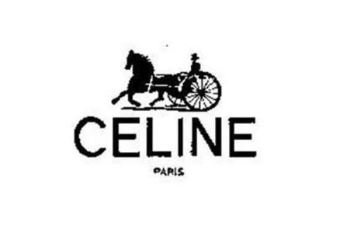
This stage image pairs a horse-and-carriage illustration with the CELINE name and a small PARIS line. The carriage emblem is documented as part of Celine’s identity before 1990, while the 1973 date also marks the intertwined-C Sulky canvas. The image shows the carriage and wordmark together; the date label should not be read as establishing when the carriage emblem first appeared.
1990 – 2012
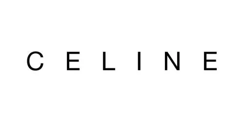
Here the pictorial carriage is absent: the identity is reduced to the name, set in uppercase letters with generous spacing. That open letter spacing contrasts with the denser CELINE wordmark introduced in 2018. In 2005, Hannes Famira drew a custom Celine typeface through a commission from Studio Peter Miles. Famira describes it as a digital revival of Semplicità, a 1931 typeface by Alessandro Butti for Fonderia Nebiolo, adapted for print and screen (Hannes Famira; WWD).
2012 – 2018
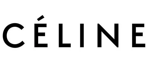
The image shows the name in uppercase with an acute accent over the first E. It differs from the preceding stage image chiefly in that accent; the date range is the archive’s label and does not establish when the accented form began. Both images rely on letterforms alone, without a carriage emblem.
2018 – Today

This stage shows the accent-free, all-capital wordmark that Celine introduced in September 2018. The letters are more closely set than in the widely spaced version, making the name read as a compact unit. The brand also reinstated “Paris” on garments and packaging, but not in advertising campaigns, according to FashionNetwork (FashionNetwork). WWD reported that Famira criticized the redesign as “homogenized rather than modernized” (WWD).
Wordmark and Triomphe motif
The wordmark is Celine’s primary name-bearing mark. The house’s Triomphe motif provides a separate graphic element: its interlocking double C and chain are linked to the Arc de Triomphe and the chain around the monument. The detailed story of how Céline Vipiana encountered the chain is less firmly established, so the monument connection is best stated as the motif’s reference rather than as a documented account of its creation.
Celine continues to use the CELINE wordmark under artistic director Michael Rider. LVMH reported Rider’s debut Spring 2026 collection at 16 rue Vivienne on 6 July 2025, and WWD’s coverage of the house under Rider identifies no later wordmark redesign (LVMH; WWD).
Disclaimer
This article is part of the educational resources provided by Logo Index, an independent archive covering logos, visual identities and graphic design history. Celine and associated trademarks and brand assets remain the property of their respective rights holders where applicable.