 Asia Motors Logo PNG
The Asia Motors logo belonged to a South Korean vehicle manufacturer based in Gwangju. During its later decades, the identity moved from a distinctive blue ASIA wordmark to a red oval badge closely related to the visual system used by parent company Kia.
Asia Motors was established in 1965 with financial backing from businessman Lee Mun-hwan. Kia acquired the company in 1976, meaning Asia spent most of its history as part of the Kia organization rather than remaining an independent manufacturer until 1999. [1]
Asia Motors Logo Meaning and History
Asia Motors did not rely on a mascot or elaborate pictorial emblem. Its best-known identities were based primarily on the ASIA name.
This makes typography and corporate ownership more important to the logo story than generic symbolism. No authoritative source located for this article confirms that blue represented trust, red represented confidence or the weight of the lettering represented vehicle durability.
The Blue ASIA Wordmark
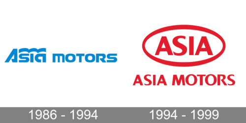
One of Asia Motors’ most recognizable identities used a blue stylized Asia wordmark with a three-part curved accent running above the final letters.
The design gave the company a recognizable standalone identity even though Asia had already been owned by Kia since 1976. Kia’s own corporate history confirms its takeover of Asia Motors that year. [2]
The precise introduction date of this artwork is often given as 1986, but readily available primary corporate archives do not provide enough evidence to build a detailed year-by-year logo timeline with complete confidence. It is therefore safer to describe it as Asia’s late-1980s and early-1990s identity.
The Red Oval Asia Motors Logo
During the 1990s, Asia Motors also used a red oval emblem containing the ASIA name.
The design is important because it visually brings the Asia identity much closer to Kia’s contemporary oval branding. This makes sense within the company’s corporate history: Asia had already been a Kia subsidiary for almost two decades.
Rather than interpreting the oval as a symbol of unity or red as a symbol of passion, the stronger observation is that the identity increasingly reflected corporate alignment with Kia.
Asia Motors Typography and Colors
Both surviving logo styles rely heavily on the company name. The earlier version uses customized lettering and a distinctive curved accent, while the later badge places uppercase ASIA lettering inside an oval.
No authoritative source located for this article identifies the exact typefaces used.
Blue and red were both prominent in different periods, but there is no reliable evidence that Asia Motors formally assigned psychological meanings such as reliability, strength or confidence to those colors.
What Happened to Asia Motors?
Asia Motors was founded in Gwangju in 1965 and initially developed commercial and military vehicles. It was acquired by Dongkuk Steel in 1969 and then by Kia Motors in 1976. [1]
Kia continued operating the Gwangju facilities and used Asia for vehicles including buses, trucks, military vehicles and the Rocsta compact 4×4.
After Hyundai acquired Kia during the restructuring that followed the Asian financial crisis, the Asia Motors brand was discontinued in 1999. Its Gwangju manufacturing operation survived and became part of Kia’s production network. [1]
Asia Motors Logo Legacy
The useful story behind the logo is therefore relatively simple:
- Asia Motors was established in Gwangju in 1965;
- Kia acquired it in 1976;
- the brand used a distinctive blue wordmark during its later independent-brand years;
- its later oval identity became visually closer to Kia;
- the Asia name disappeared in 1999, while the Gwangju factory continued under Kia.
That corporate relationship explains the visual evolution more convincingly than assigning invented meanings to individual colors or shapes.