 Airtel Logo PNG
Meaning and history
Airtel’s current logo pairs a red, curved symbol with a lowercase “airtel” wordmark. The identity was introduced in a 2010 global rebrand and is still used in Bharti Airtel’s corporate and investor materials, including its FY2024–25 annual report (Bharti Airtel annual report). The company’s 2010 description connected the symbol to the letter “a” and characterized its curved form as warm and inviting, while describing the lowercase wordmark as a recognition of humility, as reported by Business Standard.
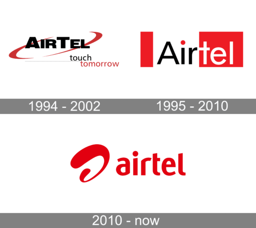
The visual story spans the launch-era AirTel mark, a 2002 consolidation and the 2010 rebrand. Bharti Today’s retrospective groups the major incarnations under 1994, 2002 and 2010; the earlier image ranges overlap, so they are best read as broad stages rather than exact changeover dates (Bharti Today).
1994 – 2002

The early identity uses a prominent “AirTel” wordmark with sweeping red strokes around it. The mobile service launched in India in 1995 under the AirTel name. afaqs credits the launch logo to Gullu Sen, then national creative director at Rediffusion-Y&R. Bharti Today says Sunil Bharti Mittal chose the name from several options, linking it to “telephony over airwaves.”
1995 – 2010
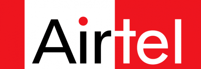
The later pre-2010 treatment replaces the sweeping strokes with a compact, banner-like wordmark: “Air” appears in black on white, while “Tel” is white on red, with a red dot over the “i.” Business Standard described this as a “flag” construction. In 2002, Airtel brought its Telemedia, DTH and Enterprise sub-brands under one name; afaqs reports that the accompanying identity was designed by Bengaluru-based Ray+Keshavan.
2010 – Today
The 2010 redesign replaced the boxed wordmark with the red symbol and a custom-drawn lowercase “airtel” logotype. afaqs reported that London-based Brand Union created the identity and JWT handled the campaign. Business Standard reported that the design team explored roughly 100 symbols before settling on the final form. The rollout began in India before extending to African markets, Sri Lanka and Bangladesh. The company later named the symbol “Wave” through a contest that shortlisted Wave, Hug and Curve, according to afaqs.
Wordmark and colour
The contrast between the earlier mixed-case “AirTel” and the current lowercase “airtel” is one of the clearest changes across the logo’s history. Red links the identities across those changes: it forms the early swooshes and the later banner, then carries through in the 2010 symbol. Business Standard reported the company’s description of red as part of Airtel’s heritage and as a colour associated with energy and dynamism. It also covered criticism that the 2010 design resembled marks used by Vodafone and Videocon (Business Standard).
Disclaimer
This article is part of the educational resources provided by Logo Index, an independent archive covering logos, visual identities and graphic design history. Airtel and associated trademarks and brand assets remain the property of their respective rights holders where applicable.