 Bremach Logo PNG
Bremach Logo Meaning
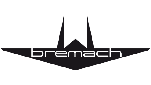
 The Bremach logo combines a geometric symbol with the BREMACH name underneath. The emblem is constructed from thick angular strokes arranged into a compact symmetrical form.Its shape can visually suggest an abstract letter M or a series of overlapping peaks, but no authoritative Bremach source located for this article provides an official explanation of the symbol.It should therefore not be stated as fact that the emblem represents mountains, strength, stability, precision or forward movement.
Where Does the Bremach Name Come From?
The history behind the Bremach name is more concrete than the symbolism of its emblem.Historical accounts describe the name as a combination of BRE from the Brenna brothers and MACH from Macchi. The connection emerged when the company acquired rights connected with a small utility vehicle developed by Aeronautica Macchi during the early development of its vehicle-manufacturing business. [2]The resulting BREMACH name therefore links two parts of the company’s early history rather than functioning as an invented word without meaning.From Fratelli Brenna to Bremach
The company traces its origins to 1956 in Varese, Italy. The business began as Fratelli Brenna, operated by the Brenna brothers as a vehicle workshop. [1]The company later became involved with a three-wheeled utility vehicle derived from a Macchi design. This relationship is generally associated with the emergence of the Bremach brand name toward the end of the 1960s. [2]This context matters for the logo because the name itself preserves the company’s industrial origins even after Bremach moved well beyond its first utility vehicles.Bremach as a Vehicle Brand
During the following decades Bremach became increasingly associated with specialized work vehicles rather than ordinary passenger cars.The company developed compact four-wheel-drive trucks for applications including construction, municipal work, firefighting, civil protection and military use. Bremach’s later vehicles were particularly recognizable for combining relatively compact dimensions with substantial off-road capability. [1]That specialist positioning gave the angular BREMACH identity a consistent context: it appeared primarily on functional commercial and off-road vehicles rather than luxury or mass-market automobiles.The Angular Bremach Emblem
The primary graphic mark is composed of several diagonal elements meeting around a central axis. The overall form is broad at the base and narrower toward the top, producing a compact badge that works well on vehicle grilles and bodywork.Because of its construction, the symbol is sometimes interpreted as a stylized M. That reading is visually possible, particularly in connection with the M in Bremach, but no reliable company source located for this article confirms that interpretation.The safest description is therefore simply a geometric Bremach emblem rather than assigning it a definitive letterform or hidden symbolism.Bremach Wordmark
The emblem is usually accompanied by an uppercase BREMACH wordmark.The lettering uses wide, heavy sans-serif forms that remain legible when applied to trucks, equipment and promotional material. Its straightforward construction contrasts with the more unusual geometry of the symbol above it.No authoritative source located for this article identifies the original logo designer or the exact commercial typeface used for the wordmark.Bremach Logo Colors
The Bremach identity has frequently appeared in black, white, metallic and monochrome applications.Vehicle badges may use metallic finishes, while printed and digital logos often use a simple black-on-white treatment.No documented Bremach brand guideline located for this article assigns psychological meanings to these colors. Black should therefore not automatically be described as representing authority, power or professionalism.Changes to the Bremach Identity
Available historical material does not provide a reliable year-by-year Bremach logo chronology.Unlike major passenger-car manufacturers with extensively documented rebranding programs, Bremach was a comparatively small specialist manufacturer. Surviving vehicles and promotional materials show variations in the treatment of the wordmark and emblem, but there is not enough authoritative evidence to assign exact redesign dates.The angular symbol and BREMACH name nevertheless became the recognizable core of the later identity.Italian Bremach and Its Closure
Bremach’s Italian manufacturing operation eventually moved to the Brescia area and continued producing specialist vehicles into the twenty-first century.The Italian company ultimately ceased operations in 2018. Bremach’s current U.S. website explicitly distinguishes that former Italian manufacturer from the later North American operation and confirms that the Italian Bremach business ended that year. [1]The Bremach Name in the United States
Bremach also established North American operations, which the company dates to 2010. [1]The American company later planned to use the Bremach name on versions of the Russian UAZ Patriot SUV and Pickup adapted for the U.S. market. Automotive trade reporting confirmed that the vehicles were intended to be marketed in America under the Bremach brand. [3]The project was subsequently suspended following Russia’s invasion of Ukraine. Bremach’s U.S. website states that the planned SUV and pickup program was put on hold because of the Russia-Ukraine situation. [1]Bremach Today
The original Italian Bremach manufacturer no longer operates.The Bremach name has nevertheless survived through the separate U.S. organization and later vehicle projects. This should not be interpreted as uninterrupted production by the original Italian company.From a branding perspective, the continued use of the name illustrates how the Bremach identity survived beyond the manufacturer that originally made it recognizable.Why the Bremach Identity Is Distinctive
Bremach’s identity is notable less for an elaborate documented logo story than for the relationship between its name and industrial history.The BREMACH name is tied to the Brenna and Macchi names associated with the company’s formative years, while the later angular emblem gave that unusual name a compact visual signature suitable for specialist trucks and off-road vehicles.Because no authoritative design explanation has surfaced, keeping those documented elements separate from visual interpretation gives a more accurate account of the brand than assigning generic ideas such as strength, mountains or precision to the symbol.FAQ
What does Bremach mean?
Historical accounts trace BREMACH to a combination of the Brenna family name and Macchi, reflecting the relationship between the Brenna brothers’ company and a utility-vehicle design connected with Aeronautica Macchi.
What does the Bremach logo represent?
The Bremach logo uses a symmetrical angular emblem above the company name. It can resemble a stylized letter M, but no authoritative source located for this article confirms an official symbolic interpretation.
When was Bremach founded?
Bremach traces its origins to 1956 in Varese, Italy, where the Brenna brothers operated the business that later developed into the specialist vehicle manufacturer.
Is Bremach still an Italian truck manufacturer?
No. Bremach’s Italian manufacturing operation ceased in 2018. A separate North American Bremach business survived and later pursued other vehicle projects under the name.
Who designed the Bremach logo?
No reliable source located for this article identifies the designer of the familiar angular Bremach emblem or its exact introduction date.
Disclaimer
This article is part of the educational resources provided by Logo Index, an independent archive covering logos, visual identities and graphic design history. Bremach and associated trademarks and brand assets remain the property of their respective rights holders where applicable.