 Bentley Logo PNG
Bentley has built cars in England since Walter Owen Bentley founded the company on 10 July 1919, and for almost all of that time one device has stood for the marque: the Winged B. It is a capital B flanked by two feathered wings, the flat badge fitted to the nose of the cars, and it is a different object from the upright Flying B bonnet mascot that some Bentleys have carried. Bentley has redrawn those wings five times, most recently on 1 July 2025.
Meaning and history
Bentley Motors Limited is a British luxury carmaker headquartered in Crewe, England, and owned by the Volkswagen Group since 1998. Its founder, known throughout the industry as W.O. Bentley, had spent the First World War designing rotary aero engines for British fighters, the Bentley Rotary 1 and 2. The company was registered in 1919, the first experimental Bentley appeared at the Olympia Motor Show that year, and the first production model, the 3 Litre, reached customers in 1921. The wider Bentley model story is covered separately.
For the badge, W.O. turned to F. Gordon Crosby, a motoring artist whose illustrations for The Autocar made him one of the best-known draughtsmen of the period. According to Bentley’s own history, W.O. asked his friend Crosby to create the emblem, and the result was the letter B between two wings that has survived in some form ever since. The wings are officially described as representing the exhilaration of motion, and Bentley’s account also notes that they may refer to the founder’s wartime work on fighter engines.
Crosby gave the two wings an unequal number of feathers. That asymmetry was practical rather than decorative: it made the badge more distinctive and harder to imitate at a time when copied parts and imitation marques were a genuine problem. It is also the one detail later Bentley designers have returned to more than once.
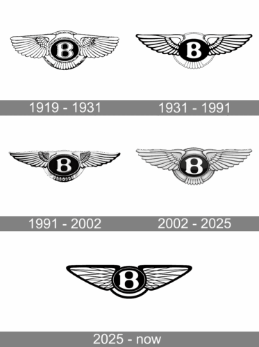
1919 to 1931
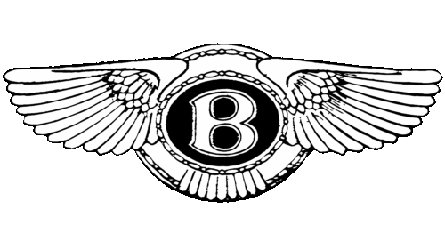
The first Winged B placed a solid capital B between broad wings with a different feather count on each side. It appeared on the 3 Litre from 1921 and on the racing Bentleys that made the marque famous at Le Mans during the 1920s. Period cars carried the emblem on the radiator in several finishes. Hemmings, the collector-car publication, describes an early 3 Litre radiator badge as a bright metal oval framing stylised laurels around a dark blue enamel ellipse with a silver B.
1931 to the mid-1990s
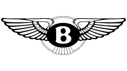
Rolls-Royce bought Bentley in 1931, and the first documented redesign followed. The wings became symmetrical, with ten straightened feathers on each side, and the B was simplified inside a plain black oval. That badge proved the longest-standing version of the mark, staying in service for more than six decades. Its balanced proportions are what most people picture when they imagine a classic Bentley grille.
Circa 1996
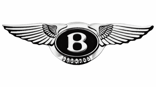
The third iteration is documented as a 1990s revision, dated by Bentley to around 1996. The central B was redrawn to echo Crosby’s original lettering, the emblem became more ornate, and pronounced curvature returned to the wings. This is the version that carried Bentley through the final years of Rolls-Royce ownership and into the Volkswagen era. The exact rollout date is not well documented, and the 1991 date sometimes attached to this stage is not supported by official sources.
2002 to 2025
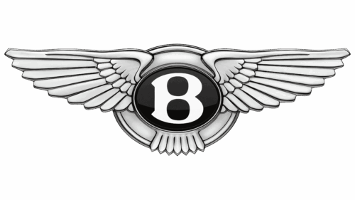
Bentley’s 2002 corporate identity, introduced as the Continental GT arrived, took the badge back to asymmetry: ten feathers on the left wing and eleven on the right, an explicit reference to the 1919 original. The result was the badge most drivers know today, and it remained in service through the modern Continental and Flying Spur generations. Bentley also marked its centenary in 2019 with a gold-finished version of the emblem.
2025 to today
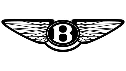
The fifth iteration was revealed on 1 July 2025 and first appeared on a concept car on 8 July 2025. It was designed in-house under Bentley’s design director Robin Page, from a concept by Young Nam of the interior design team. The wings are sharper and more angular, closer in shape to the angled wings of a peregrine falcon than to the softer curves they replaced, while the diamond pattern in the inner wings is retained. The small feathers that used to sit below the B have been removed for a cleaner silhouette.
The central B was reworked with a beveled glass edge, a chamfered metal surround and depth beneath the surface, detailing that echoes luxury watch making, and the letter was drawn so it can stand alone as a graphic mark when the wings are not practical. Design press coverage of the change, including Dezeen and CAR Magazine, treated it as the biggest revision in the badge’s history.
Symbol
Read as a symbol, the Winged B is economical. The wings carry the idea of movement, officially the exhilaration of motion, while the letter anchors the mark to the surname of the man who founded the company. The 2025 version pushes that logic further: with the lower feathers gone and the B given its own weight and finish, the emblem works both as a complete badge on a radiator and as a standalone letter on a screen, a key fob or a piece of trim.
Emblem
The emblem and the mascot are often confused, and the distinction is worth keeping clear. The Winged B is the flat identity device: it sits on the nose of the car and appears on tread plates, in leather stitching and on small trim pieces throughout the cabin. The Flying B is a separate object, the upright figure mounted on Bentley bonnets at various points in the marque’s history, with its own independent story. Treating the two as a single mark is the most common mistake made about Bentley’s identity.
Badge colours and labels
Bentley badges have not always been black and silver. The enamel labels used alongside the emblem on early cars varied by model, and Hemmings documents the sequence in detail. The early 3 Litre wore a dark blue enamel ellipse with a silver B, the 3 Litre Speed used a red label, the 1925 to 1927 100 MPH and Supersports cars used green, and the 4½ Litre of 1927 to 1931 used black. Rolls-Royce-built Bentleys after 1931 generally wore black labels until the 1982 Mulsanne Turbo, which carried red. Bentley used green labels for the 1991 model year to mark 60 years of Rolls-Royce ownership, and a blue label appeared on the first-generation Azure in 1995. The Arnage Red Label took its name from its badge, and a small number of green-label Arnages were also sold. Modern Bentley badges are generally black.
These colours identified particular models and periods rather than forming a simple code that tells a buyer which class of car they are looking at.
Typography and colour
The modern Bentley wordmark is set in a clean sans serif, and the badge itself is predominantly black, silver and white, with chrome and enamel finishes varying by application. No reliable typographic source documents the exact typeface used for the wordmark, and claims that the lettering has stayed unchanged for a century are difficult to verify. The consistency of the Winged B across five versions is far easier to demonstrate than the consistency of any one typeface.
FAQ
What does the Bentley logo mean?
The wings in the Bentley badge are officially described as representing the exhilaration of motion, and Bentley’s own account notes they may also refer to W.O. Bentley’s First World War aero-engine work. The B at the centre stands for the founder’s surname, which has been the company name since 1919.
Why do the Bentley wings have different numbers of feathers?
F. Gordon Crosby gave the original 1919 wings an unequal feather count so the badge would be more distinctive and harder to counterfeit. Bentley returned to that idea in 2002, when the redesigned wings carried ten feathers on the left and eleven on the right. The 1931 version was the exception, with symmetrical wings and ten feathers on each side.
How many versions of the Bentley logo are there?
Five. The original Winged B was drawn in 1919, followed by a redesign in 1931 after Rolls-Royce took over, a 1990s revision usually dated to around 1996, the 2002 identity introduced with the Continental GT, and the current version revealed on 1 July 2025.
What is the difference between the Winged B and the Flying B?
The Winged B is the flat radiator badge and the marque’s main identity device. The Flying B is the upright bonnet mascot, a separate object with its own history that has been fitted to Bentleys at various times but is not the same mark.
What do the colours on Bentley badges mean?
Badge and label colours have been tied to particular models rather than to a simple class system. Documented examples include a dark blue enamel label on the early 3 Litre, red on the 3 Litre Speed, green on the 1925 to 1927 100 MPH and Supersports cars, black on the 4½ Litre, a red label on the 1982 Mulsanne Turbo, green labels on 1991 model-year cars marking 60 years of Rolls-Royce ownership, blue on the 1995 Azure, and red on the Arnage Red Label.
Disclaimer
This article is part of the educational resources provided by Logo Index, an independent archive covering logos, visual identities and graphic design history. Bentley and associated trademarks and brand assets remain the property of their respective rights holders where applicable.