The DS logo is a monogram: a “D” and an “S” drawn as near-mirror images of each other and joined at the centre. It began as the badge of Citroën’s premium DS line, and since 2014 it has stood for DS Automobiles, the French marque that is now part of Stellantis.
 DS Logo PNG
Where the name and the letters come from
DS Automobiles started as a premium sub-brand of Citroën. The DS line was introduced on 5 February 2009 and previewed by the DS Inside concept at that year’s Geneva motor show; contemporary reporting treated it as a sub-brand rather than a separate carmaker. According to the marque’s brand history, the letters were presented as standing for “Different Spirit,” and also “Distinctive Series.”
The name additionally honours the original Citroën DS of 1955 to 1975, the aerodynamic saloon designed by Flaminio Bertoni and André Lefèbvre, and plays on the French word déesse (“goddess”), which sounds like the two letters read aloud in French. That older car is not just a namesake: the shape of the badge is drawn from its bodywork.
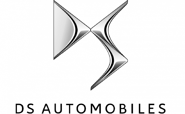
The artwork above shows the three-dimensional DS emblem mounted over the “DS Automobiles” lettering. Surviving copies of it are often labelled 2009, but the presence of the complete company name places it in the standalone era of roughly 2014 to 2019 rather than the original DS-line badge, which sat on the bonnet of cars still wearing Citroën chevrons on the grille.
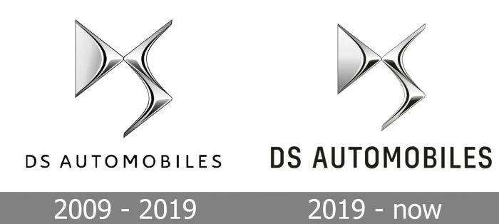
Its individual stages are not dated by any primary source, so it is best read as a visual overview of the emblem’s forms rather than as a reliable chronology.
From Citroën badge to standalone identity
For its first five years the monogram was a model-level badge. Cars of the DS line carried it while the Citroën chevrons stayed on the grille, so both marks appeared on the same vehicle. DS was separated from Citroën as an independent marque on 1 June 2014 under PSA Group, and the chevrons were subsequently dropped from the cars themselves.
The first identity created for DS as a standalone brand was unveiled at the Geneva motor show on 3 March 2015. The DS press material issued for that show describes a new logo debuting “as the DS monogram together with the company name ‘DS AUTOMOBILES’,” and introduces the brand theme “Spirit of Avant-Garde.” The change appeared first on the facelifted DS 5 and on the DS 4 and DS 4 Crossback.
Around 2019 the wordmark was redrawn. DS commissioned the type foundry Black Foundry to create a new identity typeface and to rework the “DS Automobiles” lettering and its baseline, work that the marketing trade title Stratégies reported and that reached the public through the DS 3 Crossback launch campaign. It was a typographic refresh rather than a replacement of the emblem.
What the monogram is meant to show
Stellantis’s own account of the emblem’s origin, published in 2021, states that the “S” was drawn first. Its curve was inspired by the silhouette formed by the boot hinge, rear pillar and roofline of the 1955 DS, the shape the source calls the “Tiburón.” The “D” was then drawn as a mirror of the “S.” The smooth, fluid shapes are said to echo the 1955 car’s bonnet, and the emblem as a whole was conceived as an expression of “Different Spirit.”
A separate account attributed to Korean designer Jin Joo describes reaching the same result from the opposite direction: filling in a Citroën chevron to form the “D,” then mirroring it to create the “S.” That attribution circulates in third-party brand histories and interviews rather than in official DS or Stellantis material.
Typeface and rendering
The DS monogram is built from two interlocking letterforms that meet at a central point, with the “S” curving through the vertical stroke of the “D.” On cars the emblem is finished in polished metallic silver, while the accompanying DS Automobiles wordmark is set in black capitals. The badge appears both as a three-dimensional piece with gradient shading and as flat artwork depending on where it is applied, but the underlying geometry of the two letters stays the same. Letterform monograms are a recurring device in car branding, as the DeLorean mark shows, though few are drawn from the silhouette of a specific car body.
The standalone emblem above shows the monogram without the company name, the form used where the letters alone are recognisable enough to carry the brand.
On 2 December 2024, alongside the DS N°8, DS announced a “N°” model naming strategy, a more prominent front badge and the full “DS Automobiles” signature across the rear of the car, as the company’s launch communication set out. Coverage of that launch described an updated front emblem built around a diamond-shaped “D,” although DS’s own announcement concentrated on naming and badge placement rather than describing the new letterforms in detail.
DS is not an electric-only brand. Its current range documentation lists diesel BlueHDi and E-Tense plug-in hybrid versions of the DS 7 alongside petrol PureTech engines and the fully electric DS 3 E-Tense; the company’s commitment is that from 2024 all newly introduced models will be electric. The marque also withdrew from the Chinese market at the end of 2023, so its presence is concentrated in Europe and selected other markets rather than worldwide.
FAQ
What does DS stand for?
When the DS line launched in 2009, the letters were presented as standing for “Different Spirit,” and also “Distinctive Series.” The name doubles as a tribute to the classic Citroën DS of 1955 to 1975 and as a pun on the French word déesse, which sounds like the two letters.
When did DS become its own car brand?
DS separated from Citroën as an independent marque on 1 June 2014 under PSA Group. Its first standalone identity, pairing the monogram with the written name “DS Automobiles,” was unveiled at the Geneva motor show on 3 March 2015.
Who designed the DS logo?
No designer credit is established in official DS or Stellantis material. An account attributed to Korean designer Jin Joo, describing the “D” as a filled-in Citroën chevron later mirrored into an “S,” appears in third-party brand histories and interviews. The curving forms of the emblem are explained differently in the company’s own 2021 account, which traces the “S” to the silhouette of the 1955 DS.
Disclaimer
This article is part of the educational resources provided by Logo Index, an independent archive covering logos, visual identities and graphic design history. DS and associated trademarks and brand assets remain the property of their respective rights holders where applicable.