 Bitter Logo PNG
Bitter is a German marque built around one man’s surname and one letter of it. Founded in Schwelm in 1971 by Erich Bitter, a former bicycle and automobile racer who later became an Abarth importer and automotive designer, the company has spent more than five decades producing low-volume sports and luxury cars, most of them rebodying or refining Opel and General Motors mechanicals. Its visual identity follows the same logic: an uppercase BITTER wordmark and a stylized “B” that has appeared on every car the firm has put its name to. The official Bitter site states it plainly: “Das ‘B’ ziert damals wie heute alle BITTER Fahrzeuge,” meaning the B adorns all Bitter vehicles, then as now.
The marque behind the mark
The company’s first production model was the Bitter CD, a grand tourer built on Opel mechanicals and produced from 1973 to 1979. The Bitter SC family followed in the 1980s, and the later history runs through the Vero, press-presented in 2007 and built until 2009, to today’s Opel-based refinement models. Vehicle documents for the CD list Bitter GmbH & Co. KG as the manufacturer, a detail noted in a specialist German magazine feature marking 45 years of the CD. During the CD and SC years the cars were distributed in continental Europe and the United States, which is the period when Bitter had its widest commercial reach.
The relationship with Opel is now part of the company’s formal identity. The current business, BITTER GmbH, describes itself as a licensed Aufbauhersteller, a coachbuilder and refinisher working on Opel vehicles, and its own tagline reads “Opel und BITTER, Partner seit 1971.” That partnership language matters for reading the badge: Bitter has never been a mass manufacturer with a corporate identity system to match, and its cars carry the mark of a small, specialist house rather than a global brand.
Where the “B” sits on the cars
The Bitter CD carried a small, discreet “B” emblem on the lower edge of its flat hood, positioned where it reads as a signature rather than a statement. On later Bitter models the letter grew and moved to the grille, where it served as the main point of recognition on the front of the car. That progression, from a modest hood-edge badge to a prominent grille emblem, is the clearest documented change in how the mark has been used on the vehicles themselves. Physically, the badges are metal and appear in a polished silver finish, which suits the restrained, monochrome character of the rest of the identity.
The wordmark and the emblem
The typographic half of the identity is an all-capital BITTER wordmark set in a plain geometric sans-serif with no obvious ornamentation. No authoritative typeface name, designer credit or official typographic specification is documented, so the lettering is best described by what it does rather than by a font attribution. In the wordmark reproduced below, the crossbars of the two “T”s read as a single continuous horizontal line running across the middle of the inscription, and the terminals of the first and last letters are trimmed back close to the stems. The overall effect is a compact, horizontal signature built for the width of a car’s rear panel or the header of a document.
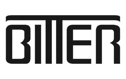
The palette is consistently monochrome: black, light gray with a darker shadow, or silver, depending on where the mark appears. That restraint is a practical choice as much as an aesthetic one, since a small marque needs a mark that reproduces cleanly on a chromed badge, a printed brochure and a web page without a supporting color system.
The emblem on its own
Used without the wordmark, the identity reduces to a single uppercase “B.” That standalone letter is what most people actually see, since it is the element mounted on the nose of the car, and it is flexible enough to sit inside a simple enclosing shape or to stand alone. A formal brand style guide setting out exact color values, clear-space rules or an official emblem geometry is not publicly documented, so claims about a precise set of “versions” of the Bitter logo are difficult to verify against any primary source.
What can be said with confidence is that the identity has stayed remarkably stable in its essentials. Bitter did not replace its mark when it moved from the CD to the SC, or from the SC to the Vero, and the letter has outlasted every model it has been attached to.
What the “B” stands for
The documented meaning is the simplest possible one: the letter stands for Bitter, the founder’s surname and the company name. That reading is supported by the official company site and by the marque’s unbroken use of the Bitter name across models, decades and legal entities.
FAQ
What does the Bitter logo represent?
The stylized “B” stands for Bitter, the surname of founder Erich Bitter and the name of the company he established in 1971. The uppercase BITTER wordmark carries the same name in full.
When did Bitter first use its logo?
The marque was established with the company in 1971, but no exact launch date for the first emblem is documented. The earliest clearly documented badge appearance is the small “B” on the hood edge of the Bitter CD, introduced in 1973.
Where is the badge placed on Bitter cars?
On the Bitter CD the “B” sat discreetly on the lower edge of the flat hood. Later models used a larger version of the letter mounted in the grille, where it became the car’s main identifying mark.
Is the Bitter logo different from the BITTER wordmark?
They are two elements of the same identity: an all-capital wordmark and a standalone “B” emblem. The letter appears on its own on the vehicles, while the full name is used in printed and online material.
Is Bitter still making cars?
Bitter continues as BITTER GmbH, a licensed Opel coachbuilder and refiner, and describes Opel as a partner since 1971. Its last full model, the Vero, was built until 2009 in a run of roughly ten cars.
Disclaimer
This article is part of the educational resources provided by Logo Index, an independent archive covering logos, visual identities and graphic design history. Bitter and associated trademarks and brand assets remain the property of their respective rights holders where applicable.