BMW M is the high-performance division of BMW, created in 1972 as BMW Motorsport GmbH under racing director Jochen Neerpasch and renamed BMW M GmbH in 1993. The M stands for Motorsport. The division’s visual identity is nearly as famous as its cars: three diagonal stripes in blue, violet and red set against a slanted letter M.
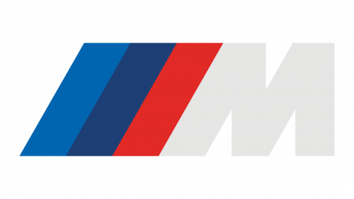 BMW M Logo PNG
The round emblem of 1972
The first BMW M logo was not the slanted M. It was a circular badge: three staggered semicircles in blue, violet and red wrapped around the BMW roundel at the centre. According to Neerpasch, the design came from the Swiss graphic agency Müller. The emblem and the matching blue, violet and red stripe livery first appeared on a racing car in 1973, on the BMW 3.0 CSL, the E9 coupé-based machine that became the division’s first competition project.
The finishing look of that racing car is credited to graphic designer Pierre Mendell, working with BMW designer Manfred Rennen. The colour scheme itself is attributed to BMW interior designer Wolfgang Seehaus, with Neerpasch and Rennen also involved in the decision. Those three colours have stayed with the division ever since.
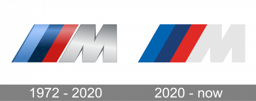
A timeline of the identity therefore runs from the round 1972 Motorsport emblem, through the 1973 racing livery, to the slanted M of 1978 and the flat mark in use today. The stripes began life as bodywork decoration. Only later were they compressed into a compact graphic device attached to the letter.
The slanted M and the Giugiaro stripes
The familiar uppercase M with three diagonal stripes on its left side arrived in 1978, on the BMW M1, the first car developed entirely in-house by the Motorsport division. It is often called the “Giugiaro M” because it came from Italdesign and Giorgio Giugiaro, the studio behind the car’s shape. BMW M’s own account of the logo describes the bevelled stripes as a suggestion of dynamism and speed, which is the clearest piece of symbolic intent attached to this form.
Since the M1, this has been the mark most people picture. The letter has barely changed in outline: a heavy M with a diagonal left leg, and three stripes running parallel to it. The stripes read as a flag or a set of motion lines, which places the design in the same family as other well-known logos built from parallel lines. It appears on boot lids, wheel centre caps, steering wheels and sill plates, and in a shorter form on cars that carry only part of the division’s engineering.
What the three colours mean
BMW M’s own explanation is simple: blue stands for the BMW brand, red for motorsport, and violet for the connection between the two. A more detailed historical account comes from BMW Group Classic historian Marc Thiesbürger, who describes blue as BMW’s colour, red as probably inspired by Texaco, and violet as the pragmatic mix of the two.
The Texaco theory has a real basis. Early 1972 design drafts by Seehaus for the 3.0 CSL carried the Texaco logo, and the oil company was in sponsorship talks with BMW Motorsport that collapsed at the end of 1972. Neerpasch has backed the Texaco link, while Rennen denied it, and no archive document settles the matter. It is best treated as a probable influence rather than official history. BMW Group’s account of the colours sticks with the simpler official reading.
The middle stripe was violet for most of the mark’s life, and it shifted toward dark blue gradually over a number of years rather than through a single dated redesign. That gradual change is often confused with the update that followed in 2020.
The flat 2020 communication logo
In 2020 BMW M introduced a flattened, two-dimensional version of the mark for brand communication. The M turned white, the stripes moved flush against its diagonal leg, and the palette was set as light blue, dark blue, red and white, with the light blue matched to the blue of the BMW roundel. This was a communications treatment for screens and printed brand material rather than a wholesale replacement of every badge on every car. No individual designer or typeface for the update is documented in BMW’s own material.
Set beside the earlier version, the flat mark shows how much of the identity is carried by the stripes rather than by the letter. The M stays more or less as it was, while the tricolor does most of the work of signalling the division.
Black, bronze and the badges of the 2020s
In 2022 BMW added a new M badge in high-gloss black with a titanium-bronze surround. It debuted on the iX M60, with the XM following as the second model to receive it, as reported by Motor1. The badge is reserved for completely new and next-generation M models, while existing M cars continue with the tricolor version. BMW has also used colour-coded surrounds, including a red surround on the M4 CSL. From 2024, new M high-performance models began to carry high-gloss black model lettering with a satin-aluminium outline.
The 50th-anniversary roundel
For the division’s 50th anniversary, BMW revived the original round Motorsport emblem, with the BMW roundel encircled by blue, violet and red semicircles. Announced in 2021 for 2022, it was offered on M and M Sport models, with ordering open from January 2022 and production from March 2022, according to Motor1. It was a retro option rather than a permanent change to the standard badges.
Model badges: M3, M4, M5 and XM
Individual M models use the same visual grammar with their own lettering, so their badges are best read as applications of one identity rather than separate logo histories.
On the M3, the tricolor sits beside a blocky geometric “M3” that follows the same diagonal logic as the stripes. The lettering appears in silver and in black depending on the model and finish.
On the M4, the M’s left leg is drawn at the same weight as the stripes beside it, so the mark reads as four parallel bands next to a heavy, squared-off digit.
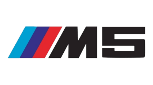
The M5 badge commonly pairs a black M with the diagonal tricolor and a wide geometric “5”, with the letterforms and the stripes sharing the same angle.
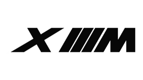
The XM arranges the elements differently: the three stripes sit between the X and the M, leaving the X standing slightly apart on the left of the badge.
A lone M badge without a model number is a separate matter. It normally marks an M Performance or M Sport car, which carries selected parts from the division’s range rather than a full M engine and chassis.
FAQ
What do the colours of the BMW M logo mean?
BMW M states that blue stands for the BMW brand, red for motorsport, and violet for the connection between the two. The same three colours appeared on the round 1972 Motorsport emblem, where they were arranged as stacked semicircles around the BMW roundel.
What was the first BMW M logo?
The first emblem, introduced with the founding of BMW Motorsport GmbH in 1972, was a round badge with three staggered semicircles in blue, violet and red surrounding the BMW roundel. It appeared on a car for the first time in 1973 on the BMW 3.0 CSL.
When did the slanted M with stripes first appear?
In 1978, on the BMW M1. The mark, created by Italdesign and Giorgio Giugiaro, is still the version most people recognise, and it has kept its basic shape since then.
Is the middle stripe violet or dark blue?
Both, at different times. Violet was the middle colour for most of the mark’s history and gradually shifted toward dark blue over a period of years. That shift is separate from the flat 2020 communication logo, which uses a light blue, dark blue and red palette.
Which BMW model first used the black M badge?
The iX M60, in 2022, with the XM as the second model to receive it. The black badge with its titanium-bronze surround is used on completely new and next-generation M models, while existing M cars keep the tricolor badge.
Disclaimer
This article is part of the educational resources provided by Logo Index, an independent archive covering logos, visual identities and graphic design history. BMW M and associated trademarks and brand assets remain the property of their respective rights holders where applicable.