 Buick Logo PNG
Meaning of the Buick Logo
The modern Buick emblem consists of three narrow shields. Their origin is historical rather than abstract.In the 1930s, a General Motors styling researcher found a heraldic description associated with David Dunbar Buick’s Scottish family name, historically spelled Buik. Buick’s own heritage account says the resulting 1937 badge incorporated a diagonal blue-and-silver checkered band, a gold buck’s head and a gold cross with an opening at its center. [2]The later tri-shield expanded this single family-crest motif into three overlapping shields. Buick states that the red, white and blue tri-shield debuted in 1959, while Smithsonian historical material dates the revision to 1960. The change coincided with Buick’s new LeSabre, Invicta and Electra model families. [3]This documented origin is stronger than generic claims that the shields symbolize strength, protection or prestige. Buick’s emblem is fundamentally a modernized continuation of heraldic imagery associated with its founder’s family.Buick Logo History
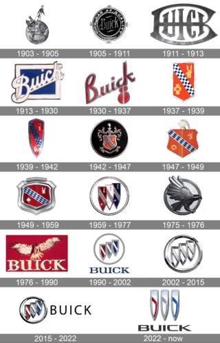 Buick has used wordmarks, scripts, heraldic shields and even a temporary hawk symbol during its history. Buick’s own 120th-anniversary logo retrospective confirms major identity stages in 1903, 1905, 1913, 1937, 1939, 1959 and 2022. Other surviving vehicle badges add more variations, but exact start and end dates should be treated cautiously because model emblems and corporate marks did not always change simultaneously. [2]
1903: Buick’s First Known Emblem
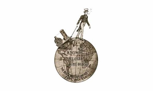 Buick’s official heritage history dates its first known graphic identity to 1903, not 1904. The unusual illustration depicts an Uncle Sam-like figure walking across a globe and includes references to Detroit. Buick says the design was soon revised when the company moved to Flint and adopted the Buick Motor Company name. [2]
1905: Signature-Based Buick Wordmark
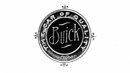 By 1905, Buick had moved toward script-based branding. Buick’s current historical account says several marks from this period were based on David Dunbar Buick’s signature. [2]This makes the early cursive identity directly connected with the founder rather than simply an ornamental font chosen to suggest elegance.
1911 Era: Experimental Lettering
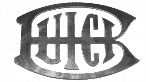 Buick experimented with several lettering treatments in the years before its better-known blue-square identity. The supplied example integrates the company name into an enlarged B.No authoritative Buick source located for this article establishes this illustration as a universal company-wide logo used exclusively from 1911 to 1913, so it is better presented as a period mark.
1913: Blue Square and Buick Script
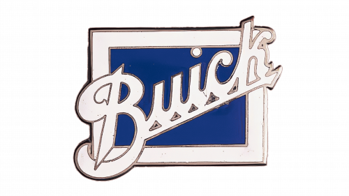 Buick’s official history identifies 1913 as an important logo change. A cursive Buick name was placed diagonally across a blue square, and versions of this identity remained in use through much of the 1920s. [2]The Smithsonian also documents a Buick radiator emblem from around 1913 using cursive lettering on a blue background. [4]
1930s Buick Wordmark
 Buick continued to use stand-alone lettering during the early 1930s. Surviving vehicle and advertising marks differ in proportion, color and treatment, illustrating that Buick’s visual identity was not yet centered on a single shield symbol.
1937: The First Buick Shield
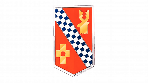 The most important turning point came in 1937. Buick adopted a shield derived from heraldry associated with David Dunbar Buick’s Scottish family.Buick says the source was a coat of arms for the family name when it was spelled “Buik.” The design included a checkered diagonal band, a buck’s head and a cross. [2]The Buick Car Club of Australia preserves a Buick Communications history explaining that GM Styling researcher Ralph Pew found a description of the arms in an 1851 edition of Burke’s heraldic reference and translated the written description into a graphic emblem. [5]
1939: The Shield Becomes Narrower
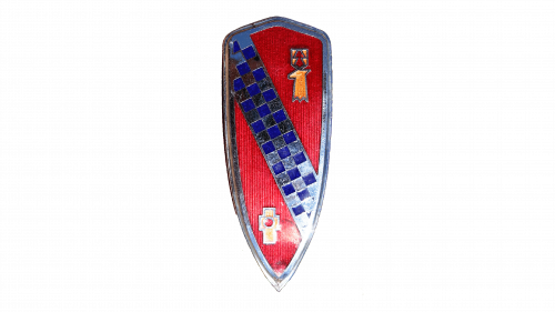 Buick updated the shield in 1939, making it narrower and more vertically elongated. Buick’s heritage account notes that the emblem also gained more three-dimensional treatment and texture. [2]
1942: Ornamental Shield
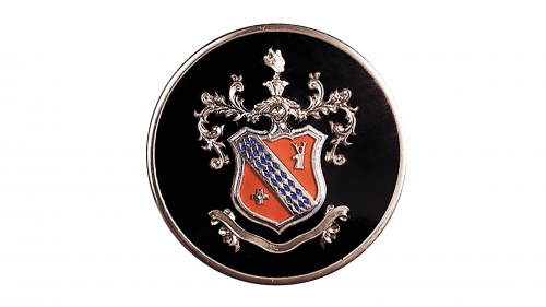 The shield received additional heraldic ornamentation for the 1942 model year. Production of civilian Buick automobiles was interrupted during the Second World War as General Motors shifted manufacturing toward military needs. [5]
1947 Era
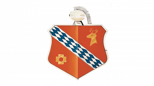 Postwar Buick badges returned to simpler treatments of the family shield. Proportions and framing changed as the emblem was adapted to new grille and bonnet designs.
Late 1940s and 1950s
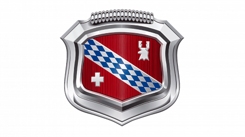 Buick’s own historical communications note that the crest was widened around 1949 to better integrate with contemporary hood and grille styling. Although details evolved, the diagonal band and other family-crest elements remained recognizable. [5]
1959 to 1960: Birth of the Tri-Shield
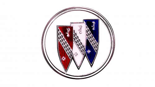 The single shield eventually became the famous tri-shield. Buick’s own 120th-anniversary history dates its debut to 1959, when the marque replaced much of its previous model naming structure with LeSabre, Invicta and Electra. [2]Historical Buick communications explain that the three shields represented those three model families. The shields appeared in red, white or silver, and blue while retaining simplified elements of the earlier family crest. [5]There is a small chronology ambiguity: Smithsonian material describes the tri-shield as a 1960 revision, likely reflecting the model-year appearance of the emblem. For accuracy, it is safer to describe it as introduced around 1959 to 1960 rather than force one interpretation. [3]
1975: Buick Hawk
 Buick briefly experimented with a hawk symbol during the 1970s. The idea was connected with the Buick Skyhawk and was known as the Happy Hawk.Historical Buick Communications material says the hawk concept began in 1975 and was expanded across Buick car lines in 1976, although the tri-shield remained Buick’s primary identifying emblem. [5]
1976 to 1980: Happy Hawk
 The expanded version paired the bird with Buick lettering. Its use was relatively brief, and Buick returned to emphasizing the tri-shield rather than developing the hawk into a permanent replacement.
1980s to Early 2000s: Return to the Tri-Shield
 After the hawk experiment, the three shields again became Buick’s central identifying symbol. The emblem was repeatedly refined in its framing, colors and three-dimensional presentation.Buick’s own 2022 announcement describes that year’s new logo as the first significant change to the emblem since 1990, suggesting that many of the intervening variations are better understood as refinements and physical badge treatments rather than fundamentally new logo concepts. [6]
2000s Metallic Tri-Shield
 During the 2000s, Buick frequently used a monochrome or metallic three-dimensional tri-shield enclosed by a circular ring. This treatment worked especially naturally as a physical grille or trunk badge.The traditional internal heraldic details had been simplified significantly by this stage, leaving the three shield silhouettes as the dominant identifying forms.
2010s Buick Identity
 Later versions restored more visible red, silver and blue coloring to the three shields while retaining the circular border.Rather than assigning meanings such as passion, purity or trust to those colors, the historically relevant point is that they continued the color structure used when the tri-shield was introduced decades earlier.
2022 to Today: Open Horizontal Tri-Shield
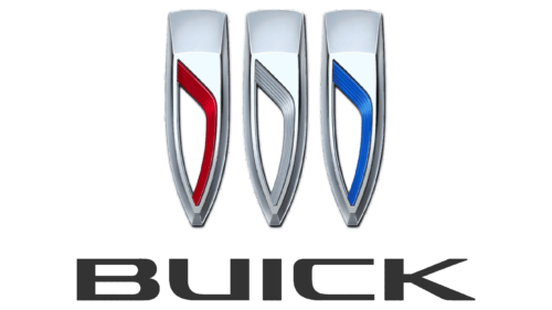
 Buick unveiled a fundamentally redesigned tri-shield in 2022. For the first time in decades, the three shields were no longer stacked diagonally inside a circle. Instead, they were separated and arranged horizontally. [6]Buick described the change as the first significant update to the emblem since 1990. The company said the open columns of the three shields had roots in David Dunbar Buick’s ancestral heraldry while introducing a sense of fluid movement that would also appear in future vehicle designs.The new badge debuted publicly with the Wildcat EV concept and began appearing on production vehicles afterward. Buick also introduced new typography and an updated color palette as part of the broader identity system. [7]
Why Are There Three Shields in the Buick Logo?
The three shields originated when Buick reorganized its vehicle range around the LeSabre, Invicta and Electra names for 1959.Buick’s historical communications explain that one shield became three to represent these three model families. Each retained elements derived from the original family crest. [5]The individual shields should therefore not be described simply as abstract symbols of quality, strength or luxury. They have a specific historical connection with Buick’s late-1950s product range.David Dunbar Buick and the Family Crest
David Dunbar Buick was born in Scotland and emigrated to the United States as a child. Before entering automobile manufacturing, he worked in plumbing-related manufacturing and developed processes associated with porcelain enameling.By the late 1890s he was developing gasoline engines. General Motors records that Buick completed experimental automobiles before the Buick Motor Company was incorporated in Flint in 1903. [1]The heraldic logo connection came much later. Buick did not simply use a family crest from the company’s foundation. The shield appeared only in 1937 after GM Styling researched heraldry associated with the Buick or Buik family name.Buick and General Motors
Buick is not part of GMC. Buick and GMC are separate vehicle marques owned by General Motors. GM’s current portfolio includes Chevrolet, Buick, GMC and Cadillac. [8]William C. Durant took charge of Buick in 1904 and transformed it into a major automobile manufacturer. Buick’s success became the foundation for Durant’s creation of General Motors in 1908. GM’s original holdings initially included Buick, with other manufacturers added soon afterward. [9]Typography
Buick has used many lettering systems throughout its history, from David Dunbar Buick-inspired signature marks to decorative scripts, block lettering and modern sans-serif typography.No single commercial font describes Buick’s entire identity history. Buick also introduced revised typography with its 2022 brand system, so older wordmarks should not be treated as versions of one continuous typeface. [6]Color
Red, white or silver, and blue became particularly associated with Buick through the tri-shield introduced around 1959 to 1960. Earlier Buick marks used a much wider variety of colors depending on advertising, enamel badges and vehicle applications.There is no need to assign generic color psychology to the palette. Its strongest documented significance is historical: the three colors formed part of the tri-shield identity that accompanied Buick’s LeSabre, Invicta and Electra era.FAQ
What does the Buick logo mean?
The Buick logo consists of three shields derived from the heraldic crest associated with founder David Dunbar Buick’s Scottish family. The single family-style shield was introduced in 1937, and the tri-shield followed around 1959 to 1960.
Why does Buick have three shields?
Historical Buick material says the three shields represented the LeSabre, Invicta and Electra model families introduced as part of Buick’s reorganized 1959 range.
When was Buick founded?
Buick Motor Company was incorporated in 1903. David Dunbar Buick had already been developing gasoline engines and experimental automobiles before the formal creation of the company.
Is Buick owned by GMC?
No. Buick and GMC are separate automobile brands within General Motors.
When did Buick change its logo?
Buick introduced its current horizontal tri-shield identity in 2022. The redesign removed the surrounding circle and placed the three shields side by side.
Disclaimer
This article is part of the educational resources provided by Logo Index, an independent archive covering logos, visual identities and graphic design history. Buick, General Motors and associated trademarks and brand assets remain the property of their respective rights holders where applicable.