 Some of the world’s most recognizable logos are built from surprisingly simple linear elements. Stripes, bars, waves, outlines and repeated strokes can create letters, suggest objects or simply make a mark distinctive enough to recognize at a glance.But lines do not have one universal meaning. A horizontal line does not automatically symbolize calm, and a diagonal line does not necessarily mean speed. The most interesting examples are those where the designer, company or history gives the lines a specific purpose.
15 Famous Logos That Use Lines
1. IBM
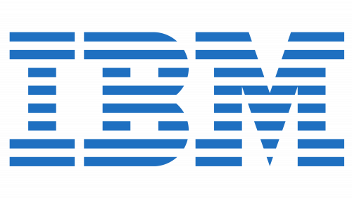 IBM’s logo is one of the clearest examples of lines becoming the identity itself. Designer Paul Rand created the famous version in 1972, dividing the letters IBM into eight horizontal bars. IBM still officially calls it the 8-bar logo, and its fundamental construction has remained unchanged for more than five decades. [1]The striped treatment replaced Rand’s earlier solid IBM lettering and gave the monogram a distinctive rhythm without sacrificing recognition. Rather than inventing meanings such as “digital data flow,” the important design fact is how the eight repeated lines turn three ordinary initials into a proprietary visual pattern. [2]
2. Adidas
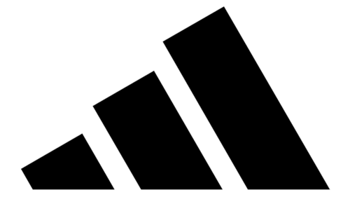 The three stripes have identified Adidas since the company’s early years. Adidas explains that Adi Dassler tested different numbers of stripes on footwear and found that three stood out particularly well in photographs. They therefore became a practical identifier before growing into the company’s worldwide trademark. [3]This also corrects a common logo myth: Adidas explicitly says the original three stripes did not carry a hidden numerological meaning. Later three-bar configurations became part of Adidas’s Performance identity, but the stripes themselves predate the familiar mountain-like arrangement. [4]
3. Cisco
 Cisco’s name is derived from San Francisco, and its line-based emblem has long referenced the city’s Golden Gate Bridge. The sequence of vertical strokes creates a simplified bridge silhouette while also fitting naturally with a networking company whose business is based on connecting systems.The effectiveness comes from reduction: instead of illustrating the bridge literally, the identity uses only enough vertical marks to make the reference recognizable.
4. SoundCloud
 SoundCloud combines two ideas directly related to its name: a cloud silhouette and vertical audio-like bars. The result creates an immediately recognizable connection with sound without requiring a conventional music note.SoundCloud has since simplified its identity. Its current media kit identifies the 7 Bar Cloudmark as the official symbol and specifically says not to use the previous 13-bar horizontal version or legacy orange logo. [5]
5. Spotify
 Spotify’s symbol uses three curved horizontal strokes inside a circle. Their resemblance to transmitted audio or radio waves makes the mark closely related to the company’s streaming product.The slight curvature and increasing spacing keep the three strokes distinct even when the icon is displayed at small sizes, demonstrating how very few lines can create a recognizable app-scale symbol.
6. Ericsson
 Ericsson’s three diagonal bars are not an abstract symbol of connectivity invented after the fact. They form a stylized letter E.The identity was developed through a corporate visual identity project with British consultancy Allied International Designers. Designer Terry Moore created the selected proposal, and Ericsson introduced it globally in 1982. The three-bar E later became so familiar internally that it acquired nicknames such as the “three sausages.” [6]
7. Renault
 Renault’s diamond has been part of the marque since the 1920s, but the version introduced in 2021 turns the shape into a particularly clear example of linear logo design. Two angular lines interlock to create the familiar diamond without filling it in.Renault introduced the redesign during its “Nouvelle Vague” brand transformation. The company said the updated visual identity was intended to communicate modernity and technology while preserving the historic diamond. [7]
8. Konica Minolta
 Konica Minolta provides unusually detailed official symbolism for its logo. The oval represents a globe, while the five horizontal lines represent beams of light and the company’s technological expertise in imaging. [8]The underlying globe mark originated with Minolta and was designed by Saul Bass, introduced in 1981. When Konica and Minolta combined, the mark was retained for the new Konica Minolta identity. [9]
9. European Parliament
 The European Parliament logo is based on a stylized hemicycle, the semicircular chamber in which the Parliament meets. Repeated curved lines describe that architectural form beside the European Union flag.The Parliament’s official visual identity describes the complete mark as a representation of its values of openness and democracy. The accompanying wordmark uses Europea, a custom typeface developed for the institution. [10]
10. MINI
 MINI’s current emblem reduces the familiar winged wheel to simple black lines. The brand name sits inside the central circle, while horizontal strokes on each side preserve the wing motif established in earlier Mini identities.BMW Group introduced this flat version on MINI models in 2018. The company explicitly described it as a reduction to essential graphic elements while preserving the traditional winged-wheel motif. [11]
11. AT&T
 AT&T’s striped globe identity originated after the breakup of the Bell System in the 1980s. The repeated curved bands turn a sphere into a distinctive telecommunications mark rather than simply decorating a circle.The company’s official historical archive documents the transition from Bell logos to the AT&T globe and its subsequent redesigns. AT&T itself dates the company to 1885, correcting the common mistake of saying it was founded in 1983. [12]
12. Whataburger
 Whataburger’s line-based identity is the Flying W, a sequence of orange curved strokes that together form a large W.This is not simply generic flowing typography. Whataburger records that the Flying W was selected in 1973 following a design competition, with the winning mark created by Corpus Christi artist Will Clay. [13]
13. DHL
 DHL integrates horizontal strokes directly into and around its wordmark. The marks extend the letterforms laterally and have become one of the most recognizable visual features of the logistics brand.Because they visually resemble speed lines, they fit an express-delivery identity particularly well. It is still better to describe that visible relationship than to invent separate meanings for each stroke.
14. New Balance
 The classic New Balance mark combines an N and B with repeated horizontal cuts through the left side. Those lines make the monogram distinctive and create an impression similar to the motion streaks commonly used in sports graphics.The important design feature is the way the lines remain integrated with the initials rather than existing as a separate pictorial symbol.
15. HP
 HP has used one of the most radical line-based interpretations of a corporate monogram. The simplified mark reduces the lowercase hp to four diagonal strokes, relying on the viewer to reconstruct the familiar initials from minimal visual information.It is a useful example of how recognition can survive extreme simplification when a company already has strong visual equity.
What Makes Line-Based Logos Effective?
The examples above work for different reasons. There is no universal rule that a particular line direction creates a specific emotion. Instead, lines can perform several practical design functions:- Construct letters: IBM, Ericsson and HP turn repeated strokes into recognizable initials.
- Represent an object: Cisco suggests a bridge, while the European Parliament depicts its hemicycle.
- Reference the product: SoundCloud and Spotify use wave-like forms that naturally relate to audio.
- Create a proprietary pattern: Adidas and New Balance make repeated stripes part of their recognition system.
- Simplify an established symbol: Renault and MINI use line work to reduce historically more dimensional emblems.
Why Simple Lines Can Be Memorable
A line-based logo can work particularly well at small sizes because fewer elements have to survive reproduction. Simple geometry is also easier to adapt across print, signage, apps, products and motion graphics.Simplicity alone, however, does not make a logo distinctive. Three generic lines are still three generic lines. Recognition comes from the exact relationship between length, angle, spacing, proportion and context.IBM’s eight bars, Ericsson’s diagonal E and Adidas’s three stripes demonstrate this clearly: repeated lines become valuable only when their configuration is consistent enough to belong unmistakably to one brand.Lines in Logo Design: Observation vs. Meaning
One of the most common mistakes when discussing logos is treating visual impressions as documented symbolism.A diagonal line can look dynamic, but that does not prove the designer intended it to mean progress. A circle can feel balanced, but that does not mean it officially symbolizes unity. Good logo analysis distinguishes between three things:- Documented meaning: confirmed by the designer or organization.
- Visual function: something objectively visible in the design.
- Interpretation: a possible reading that should not be presented as fact.
FAQ
What famous logos use lines?
Well-known examples include IBM’s eight-bar lettering, Adidas’s three stripes, Ericsson’s three-bar E, Cisco’s bridge-inspired mark, SoundCloud’s Cloudmark, Renault’s outlined diamond and Spotify’s three curved strokes.
What do lines mean in logos?
There is no universal meaning. Lines may construct letters, represent objects, create patterns or simplify shapes. Their intended symbolism depends on the individual logo and should be verified from the designer or brand whenever possible.
Who designed the IBM striped logo?
Paul Rand created IBM’s famous eight-bar logo in 1972. Its basic design has remained unchanged since then. [1]
Why does Adidas use three stripes?
Adidas says Adi Dassler experimented with different numbers of stripes and found that three were especially visible in photography. They subsequently became the company’s trademark. [3]
What do the lines in the Konica Minolta logo mean?
Konica Minolta officially says the five lines represent beams of light and the company’s technological expertise in imaging. [8]
Disclaimer
This article is part of the educational resources provided by Logo Index, an independent archive covering logos, visual identities and graphic design history. All trademarks, logos and brand assets referenced remain the property of their respective rights holders.