Hurtan is a small Spanish coachbuilder that hand-builds retro-styled cars over current mechanicals, and its corporate mark has followed a similar logic: heritage-minded lettering that has been formally reworked only once in the documented record. The company trades as Hurtan Automóviles from a factory in Santa Fe, in the province of Granada, and its logo is the public face of a family workshop that grew into a low-volume carmaker.
 Hurtan Logo PNG
The mark in use today is a plain, all-capital wordmark: HURTAN set in a clean, unadorned sans-serif style and rendered almost exclusively in black or monochrome. On the cars themselves the identity is carried by a compact “H” emblem, which also appears embroidered on headrests. The current scheme has no pictorial mascot or crest; the letterforms and the initial do the work.
Meaning and history
Hurtan Desarrollos S.L. was officially constituted in 1992, the founding date recorded by El Mundo and other Spanish outlets. Some published profiles place the start in 1991, and others point to 1967, a date that refers to the Granada body-repair and panel-beating shop Juan Hurtado González ran before the car company existed. Born in 1943 in Abla, Almería, Hurtado built the business on re-bodying modern donor cars by hand in a 1930s-to-1960s idiom. The second generation now runs it, with Juan Ignacio Hurtado as commercial director alongside Rosa and Francisco Javier Hurtado, and output remains deliberately small at around 20 to 30 cars a year from the Santa Fe plant, as the Granada daily Ideal has reported.
The earlier Hurtan mark
Hurtan Logo PNG
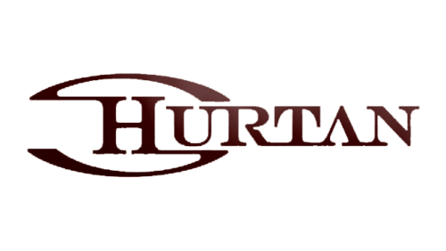
The surviving older artwork is materially different from the mark in use now. It sets the name in all-capital serif lettering with bracketed serifs and links the characters by letting strokes meet at the top or the bottom of adjacent letters. From the H, a line sweeps into a curve that reads as an oval, or as a wide S passing behind the letter, giving the wordmark the rounded feel of a classic automotive badge. That artwork circulates under a 1992 filename, but no company statement or press report confirms when it was drawn or how long it stayed in use. In the documented record the identity has one dated turning point: the change announced in 2017.
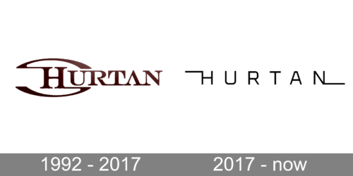
A comparison graphic that pairs the older serif treatment with the current monochrome wordmark is also in circulation. It is a composite rather than a single historical mark, and it carries no attribution or verifiable dates, so it serves as a visual aid for the two treatments side by side.
The 2017 renewal
In June 2017, marking 25 years since the official 1992 founding, Hurtan announced a renewal of its corporate image together with a new website, hurtan.com. The announcement, carried by outlets including Luxury News Motor and Revista Car, described the new logo as born from the combination of the classic spirit of the company’s models and a commitment to maximum innovation, in the words of Juan Ignacio Hurtado, and framed the change as a way to align the brand’s lines and raise its visibility.
Visually, that shift moved the identity from the connected serif lettering with its oval sweep to the restrained monochrome wordmark used today. No designer or studio is credited in the announcement, and the company has not published a shape-by-shape explanation of the letterforms, so the documented rationale stays at the level of positioning rather than individual design elements.
Where the mark appears
The badge reaches the public mainly through the Grand Albaycín, the retro-styled model that carries the H emblem on its bodywork. Two distinct generations share the name: the first, built on a Renault Clio donor car, was designed from 2008 and shown at Top Marques Monaco in 2009, while the new Grand Albaycín, based on the Mazda MX-5, was unveiled in January 2021 in a run of 30 units. The founder’s own account of the earlier cars is preserved in an ASEPA document on Spanish coachbuilding. Growth into export markets, including a debut in the United Arab Emirates in 2023, has widened the audience for a wordmark that was drawn for a workshop rather than a mass-market brand.
FAQ
When did Hurtan change its logo?
The documented renewal came in 2017, announced in June as part of the company’s 25th-anniversary corporate-image update, which also introduced a new website.
What does the Hurtan logo look like?
It is an all-capital wordmark reading HURTAN, set in a clean, sans-serif style and used mainly in black or monochrome, with a separate “H” emblem applied to the cars.
Who designed the Hurtan logo?
No designer or agency credit is documented in the company’s 2017 announcement or in press coverage of the renewal.
Disclaimer
This article is part of the educational resources provided by Logo Index, an independent archive covering logos, visual identities and graphic design history. Hurtan and associated trademarks and brand assets remain the property of their respective rights holders where applicable.