 Italdesign Logo PNG
Italdesign is an Italian design and engineering house founded on 13 February 1968 in Moncalieri, in the Turin metropolitan area, by designer Giorgetto Giugiaro and engineer Aldo Mantovani. The company’s mark has been redrawn at least five times since then, moving from a simple typographic lockup to a monogram built out of vertical lines. Almost every version after 1987 encodes the same piece of information: the founding date.
The name behind the marks
The studio was originally registered as Studi Italiani Realizzazione Prototipi S.p.A., and the very first logotype rendered the shortened name as two words: “Ital Design.” In that 1968 mark, according to Italdesign’s own logo-history release, the letters “I” and “D” were set in alignment with the rest of the wordmark rather than standing apart from it. The rationale for the name itself is straightforward and stated by the company: “Italian” plus “design.”
A year later the wordmark was restyled, and the “I” took on the form that would define the identity for decades: a column of short vertical strokes. In 1969 that column counted 17 sticks.
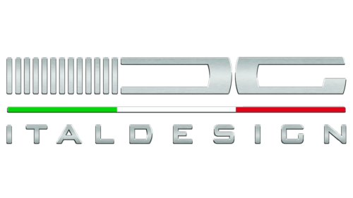
Early artwork from this period survives in circulation, including files labelled with a 1968 date. The company’s records place the first vertical-stick “I” in the 1969 restyle and give it 17 bars, with the count cut to 13 only in 1987. The surviving file carries no verified date of its own, so it is best described as an early-stage rendering rather than a confirmed first logo.
1987: the bars start counting
The most consequential revision came in 1987, when the company name was shortened to a single word and the vertical strokes of the “I” were reduced from 17 to 13. Italdesign has stated the reason directly: 13 corresponds to the day the company was established, 13 February. That decision turned a decorative device into a date, and it is the one element that has survived every subsequent redesign in some form.
1999: Giugiaro enters the mark
When the company listed on the Italian stock exchange in 1999, its legal name became Italdesign Giugiaro S.p.A. The logo followed, with the surname “Giugiaro” written beneath the two stylised letters, and the palette shifting to red and grey. This is the point at which the founder’s name became part of the public identity rather than just the corporate record.
2016: a tribute G and the tricolour
A new corporate logo debuted at the Geneva Motor Show on 1 March 2016. It combined a stylised “G” with the established “I” and “D”, described by the company as a tribute to Giorgetto Giugiaro, and it reinstated the full word “Italdesign” in the logotype. The Italian tricolour was also introduced into the mark, tying the design to the studio’s national origin. The three documented readings of the 2016 badge, the founder tribute, the restored wordmark and the flag, all come from the same company statement.
2022 to 2023: thirteen lines, one monogram
The current identity was announced on 16 December 2022 and shown publicly at CES in Las Vegas between 5 and 8 January 2023. ANSA reported the announcement as a logo aimed at the company’s 55th year, and Italdesign marked that anniversary on 13 February 2023.
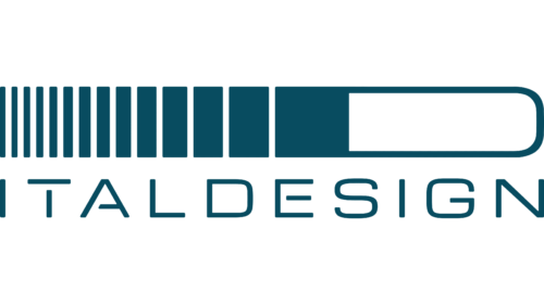
The redesign keeps the counting device but rebuilds it. Thirteen vertical lines, again representing the founding date, are drawn so that the “I” progressively widens and thickens until it resolves into a bold “D”, letting the mark be read as a single monogram. Italdesign’s own announcement frames that transition as future, movement and evolution, and introduced a new payoff line, “Be Ideneers.” The work was carried out by TBWAItalia together with the company’s in-house style centre, according to trade coverage of the assignment.
Some company summaries file this change under a “2020” heading, which conflicts with the dated press release and the CES debut. The December 2022 announcement and the January 2023 launch are the more precisely documented facts.
What the mark is documented to mean
Four symbolic readings are supported by the company’s own statements: the name is a contraction of “Italian” and “design”; the vertical bars represent 13 February; the “G” introduced in 2016 honours Giorgetto Giugiaro; and the tricolour stands for Italian heritage. Claims that the mark draws on the coat of arms of Turin, or that it has a metallic finish, are not supported by the available sources and are best left out of any account of the identity.
Ownership of the mark today
Italdesign’s ownership has changed twice in ways that affect how the brand is positioned. In 2010, Volkswagen Group acquired 90.1 percent of the company through Lamborghini Holding S.p.A., with the Giugiaro family retaining 9.9 percent, as contemporaneous reporting noted. The remaining family stake was sold to Audi in 2015, effective 28 June and publicly reported in early July, with Giorgetto Giugiaro stepping down. In December 2025, Audi agreed to sell a majority stake to UST, a deal still subject to regulatory approval, with Audi remaining a strategic partner. That pending transaction is the current state of the company behind the logo.
FAQ
What do the 13 lines in the Italdesign logo mean?
They stand for 13 February, the date the company was founded in 1968. Italdesign introduced the count of 13 when it shortened its name in 1987, and the current mark, revealed at CES in January 2023, rebuilds the same idea using thirteen vertical lines.
Does the current Italdesign logo still reference Giorgetto Giugiaro?
Not by name. The 1999 identity wrote “Giugiaro” beneath the letters, and the 2016 logo formalised the tribute as a stylised “G” alongside the “I” and “D”. The 2022/2023 monogram works only with the “I” and “D” forms, so the surname no longer appears in the mark itself.
Disclaimer
This article is part of the educational resources provided by Logo Index, an independent archive covering logos, visual identities and graphic design history. Italdesign and associated trademarks and brand assets remain the property of their respective rights holders where applicable.