Grolsch is a Dutch beer brand founded in Groenlo in 1615. Its visual identity centers on a flowing cursive wordmark and a heritage emblem combining two hops with a swing-top bottle. Grolsch’s history recounts the brewery’s origins and the story behind the bottle and hop pairing.
 Grolsch Logo PNG
Meaning and history
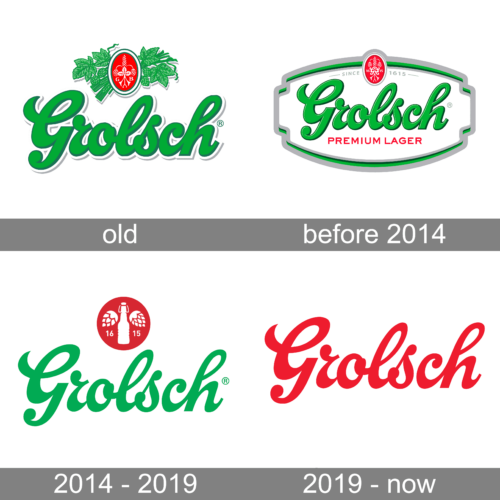
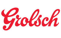
The wordmark is a hand-lettered cursive script. A design-press account notes that its lettering has often been cropped at the edges. Green is prominent in the documented 2014 identity, while the 2024 international redesign returned the wordmark to green.
The red heritage emblem combines two hops and a swing-top bottle. Cartils described those elements in its 2014 redesign, which removed the previous outline and shading and introduced a circular mark. Grolsch’s history credits Peter Kuijper, who joined the business around 1650, with establishing the two-hop recipe.
The swing-top bottle became an important part of Grolsch’s identity after Theo de Groen adopted the half-litre bottle in 1897. Its porcelain cap, rubber ring and metal clasp made the closure a distinctive visual feature. Grolsch’s own account describes the adoption, while an RTL timeline also dates it to 1897.
???? – 20??
This badge places the cursive name inside a framed design. Leaves surround a small red emblem above the wordmark, while a green ribbon extends across the composition. The stage is visually distinct from the later, simpler wordmark-and-emblem arrangement.
20?? – 2014
This version shows the green script beneath a red circular emblem featuring two hops and a bottle. It is a more open arrangement than the leafy framed badge above. The archive assigns it this heading; the documented Cartils redesign followed in 2014.
2014 – 2019
The image shows the green cursive wordmark with a red circular emblem above it, featuring two hops and a bottle. Cartils’ documented 2014 work removed the previous outline and shading and brought in a circular pack shape and red heritage mark. The image repeats the preceding stage artwork, so it does not establish a separate visual change between these two headings. Dexigner’s report on Cartils’ redesign describes the 2014 changes.
2019 – Today
This stage shows the Grolsch name alone in red script, without the emblem. The archive labels it “2019 – Today,” but that stage was superseded by the 2024 international identity, which restored a green wordmark and brought the red heritage mark back into the identity.
Current identity
Purple Creative developed Grolsch’s 2024 international identity. The wordmark was re-crafted in green, and the swing-top bottle was retired from the international logo while remaining part of the brand’s heritage imagery. The identity also uses the tagline “Make it real”; packaging began rolling out in the UK and Canada from June 2024, according to LBB. Purple Creative’s project account describes the redesign.
The bottle therefore has a role beyond the main international logo lock-up: it remains a heritage icon, while the green script carries the name. The red hops-and-bottle emblem connects the current identity with the visual language used in the 2014 redesign.
Disclaimer
This article is part of the educational resources provided by Logo Index, an independent archive covering logos, visual identities and graphic design history. Grolsch and associated trademarks and brand assets remain the property of their respective rights holders where applicable.