Karma Automotive is a Southern California luxury electric-vehicle maker whose visual identity carries an unusual amount of history for a company of its age. The name, the badge and much of the brand language exist because a bankrupt automaker’s assets were bought at auction and relaunched under a new corporate title. Reading the Karma logo means reading that handover.
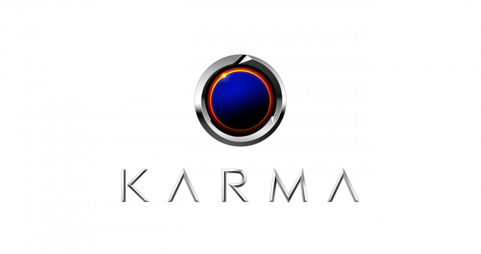 Karma Logo PNG
From Fisker Automotive to Karma
The predecessor business, Fisker Automotive, was founded in 2007 by Henrik Fisker and Bernhard Koehler, and its plug-in hybrid sedan, the Fisker Karma, reached production in 2011. Output was short-lived: roughly 2,000 cars were sold according to the company’s Wikipedia record, while Forbes puts the 2011-2012 build at about 2,450 units. Henrik Fisker resigned in March 2013, and the company’s slide into insolvency followed. Accounts differ on the precise sequence, with some sources describing a filing in late 2013 and others dating the bankruptcy declaration to early 2014.
In February 2014, China’s Wanxiang Group bought the Fisker assets out of auction for $149.2 million, a figure later reported as roughly $150 million by Fortune. The sale did not include the Fisker name or trademarks, which stayed with Henrik Fisker. What Wanxiang acquired was a factory, tooling and a platform, and the resulting company was formed in 2014, with headquarters functions and design based in Irvine, California. Karma’s own ten-year company account describes the wider Fisker and battery-supplier A123 transaction at about $400 million.
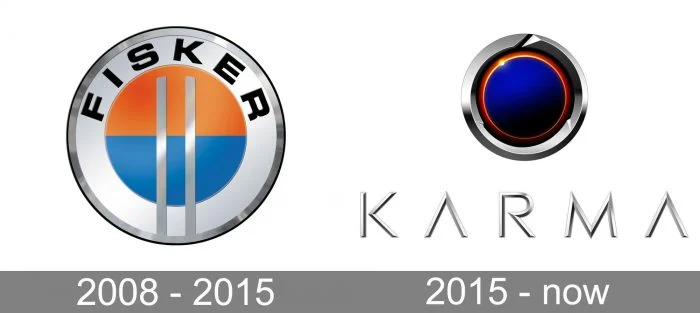
The rebrand itself was announced on 30 September and 1 October 2015, when Fisker Automotive and Technology Group became Karma Automotive and a new logo and website were revealed alongside the name, as reported by Electrek and Aftermarket News. In the same period, MotorTrend described the mark as a reinvented version of Fisker’s old orange-and-blue stamp. A new emblem was therefore required, because the old one belonged to someone else.
The Fisker-era emblem
Artwork that circulates as an early “Karma” mark is better understood as a Fisker emblem. In 2008 the business was still Fisker Automotive, so any badge from that period belongs to the Fisker identity rather than to Karma, which did not exist as a brand name until 2015. That distinction matters when tracing the visual lineage: the orange-and-blue stamp that MotorTrend cites as the ancestor of the Karma emblem is a Fisker design, and the two marks share a parent company’s history rather than a continuous brand.
What the Karma emblem represents
The symbolism was set out at launch by Karma’s chief marketing officer at the time, James Taylor, who described the mark as an imperfect ring representing constant effort toward unattainable perfection, encircling the Earth, with a spark of the sun as the eternal symbol of endlessly renewable energy (Electrek). He also attributed meaning to the interior cut lines, which he said stood for three brand priorities: beautiful, clean and memorable.
Two years later the company offered a slightly different reading, describing the inspiration behind the logo as an eclipse showing a spark of sun, again tied to renewable energy, a formulation repeated in trade coverage around a 2017 solar eclipse. The two explanations are compatible rather than contradictory: a ring with a sun escaping its edge reads as both an eclipsed disc and an orbiting body, and the company has used both descriptions.
A badge finished by hand
The physical badge adds a detail the corporate artwork does not show. Each vehicle badge is hand-painted by an artist and set into a precision-machined aluminium ring, which is why no two cars carry an identical emblem. Gear Patrol documented the process during a 2018 auto-show showing, noting the practice applies to the badges fitted front and rear. It is an unusual choice for a low-volume manufacturer, and it turns the logo into a small piece of craft rather than a purely printed asset.
Lineage, and what is not documented
The Karma emblem’s relationship to the Fisker mark is a matter of colour lineage rather than geometry. MotorTrend’s description of the new badge as a reinvented version of Fisker’s orange-and-blue stamp supports a family connection, but the specific colour divisions and cut-line geometry of the Karma ring are not established by any comparable source. Both are better left as open questions than stated as fact.
Later brand work has extended the identity into a broader visual system. Karma has introduced named design elements, including Comet Line surfacing, Target lighting signatures and a Backslash motif, applied across newer vehicles, and it has described these as part of a deliberate design language rather than one-off styling. The company’s own anniversary announcement frames that work as a decade-long evolution from the Revero, which debuted on 8 September 2016, to a broader electric range.
FAQ
Who designed the Karma logo?
No reliable designer or agency credit for the 2015 Karma emblem has been published.
Is the Karma logo the same as the Fisker logo?
No. They are separate marks belonging to separate owners. The Fisker brand and its trademarks were excluded from the 2014 asset sale and remained with Henrik Fisker, so Karma Automotive needed a new emblem when it renamed itself in September 2015. Only the colour lineage, the old orange-and-blue stamp, connects the two.
Disclaimer
This article is part of the educational resources provided by Logo Index, an independent archive covering logos, visual identities and graphic design history. Karma and associated trademarks and brand assets remain the property of their respective rights holders where applicable.