 America East Conference Logo PNG
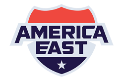
America East’s current logo pairs a bold, uppercase wordmark with a shield and star. The conference introduced the identity on February 21, 2024, with the tagline “Where Champions Rise.” Its brand page describes the colors as Americana and connects the shield to strength and the I-95 corridor linking its membership.
Meaning and history

America East began in 1979 as ECAC North, became the North Atlantic Conference in 1988–89, and adopted the America East name on July 1, 1996. The name change came with a new logo; the Hartford Courant reported that the winning design was by Steven Burke, then a Drexel sophomore studying graphic design. The conference lists nine full members and 18 sponsored sports in its quick facts.
2000 – 2007

This mark combines an outlined star with the America East name. The star’s long upper point rises alongside the lettering, while its lower points extend beneath it. The conference’s 1996 name change also brought a new logo, but the dates attached to these earlier archived stages are not established by the contemporary reporting.
2008 – 2012

Here, a large outlined star sits behind a slanted “America East” wordmark, with “Championship” set across the lower portion. Compared with the preceding star-and-name arrangement, this composition makes the lettering more prominent and frames it with championship-specific wording. In 2013, NESN described America East as having two previous red, white and blue logos, without confirming these stage dates.
2013 – 2024

America East introduced the block-A identity on August 20, 2013. The conference’s launch release describes three white stripes inside the A, representing academic achievement, athletic excellence, and leadership on and off the field. Developed with SME, Inc., the mark used dark blue, light blue and white, and the conference also produced it in member schools’ colors. Its compact geometric letterform was a clear departure from the earlier star-led marks.
2024 – Today

The 2024 identity replaced the block A with a shield enclosing the wordmark and a star. The conference says the star and Americana palette honor its roots and 45-year history, while the shield reflects strength and the I-95 corridor. The new identity uses the tagline “Where Champions Rise” and was rolled out across campuses in 2024, with full integration during the 2024–25 season, according to the conference brand page.
Secondary Logo

This artwork uses a compact “AE” monogram: a dark-blue A sits beside a red E, with the E’s horizontal bars extending to the right. It provides a more abbreviated visual than the full shield and wordmark shown above.
View the America East Conference logo archive entry.
Disclaimer
This article is part of the educational resources provided by Logo Index, an independent archive covering logos, visual identities and graphic design history. America East Conference and associated trademarks and brand assets remain the property of their respective rights holders where applicable.