 Grey Goose Logo PNG
Grey Goose is a French-produced vodka brand introduced in 1997. Its logo has kept the goose as a central motif while changing how the bird and wordmark are presented. The brand’s current documented global identity was developed by Intertype Studio in 2022. Intertype’s case study describes the new mark and its design elements.
Meaning and history
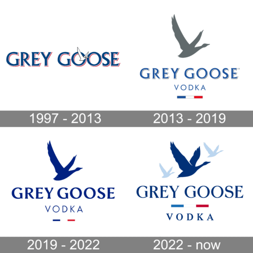
The logo history moves from a detailed flying-goose illustration to a flatter single bird, then to a lockup with three geese. The composite image presents these as successive visual stages; the documented global redesigns include work by Ragged Edge in 2019 and Intertype Studio in 2022.
Before 2013
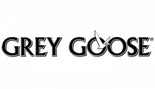
This stage image shows a light-outlined, dimensional-looking wordmark with a small flying goose incorporated into the lettering. The original packaging was described in a Delaware Chancery Court opinion as having a cutaway of geese in flight and the French flag. The flag element therefore predates this archive heading. The court opinion documents those packaging details.
2013 – 2019
The image presents the name in blue, with a flying goose over the lettering, “Vodka” below and a French tricolour bar. A documented packaging update came in 2014: the bottle gained a longer neck and new neck foil, and the change was scheduled to roll out worldwide by year’s end, Drinks International reported. A new “Marianne” bottle form followed in the United States in 2014 and France in 2015, according to Spiritueux Magazine.
2019 – 2022
In 2019, Ragged Edge redesigned the identity, replacing the textured goose with a flat, single-colour bird and changing the small line beneath the wordmark to “Vodka,” GKPB reported. The stage image emphasizes that simpler silhouette: a single dark-blue goose sits above the name, with “Vodka” and a small tricolour bar below. That April, Grey Goose also launched the “Live Victoriously” brand platform with MullenLowe, as The Drum reported.
2022 – Today
Intertype Studio’s 2022 identity replaces the single bird with three geese above the wordmark. The studio says the group was intended to suggest togetherness and conviviality. Its redesign also reworked the logotype and introduced a bespoke typeface developed with Dalton Maag; the studio credits Ginger Monkey with the logo lettering. Intertype’s case study identifies this as the brand’s current documented global identity.
Logo and lettering
The bird remains the linking device across the stages, but its treatment changes: the earlier image has a detailed, outlined appearance, the 2019 mark is a flat single goose, and the 2022 lockup groups three birds. The 2022 work also pairs the mark with a reworked wordmark and bespoke typography. Intertype describes geese as a flock animal and connects the motif to the brand’s French provenance.
Disclaimer
This article is part of the educational resources provided by Logo Index, an independent archive covering logos, visual identities and graphic design history. Grey Goose and associated trademarks and brand assets remain the property of their respective rights holders where applicable.