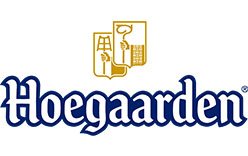
The Hoegaarden logo pairs a distinctive wordmark with a small gold emblem above the name. The brand takes its name from the Belgian town of Hoegaarden. Its packaging carries the heritage line “Anno 1445”; that is a brand claim, not the documented founding date of the revived brewery. The current brewer named on pack is InBev Belgium nv/sa, and Hoegaarden belongs to Anheuser-Busch InBev. Pack information
 Hoegaarden Logo PNG
Meaning and history
Hoegaarden’s last local white-beer brewery, Tomsin, closed in 1957. Pierre Celis, a local milkman, revived brewing in the town in 1966 by founding Brouwerij Celis. The brewery was later renamed Brouwerij De Kluis; the name means “the cloister” and refers to the region’s brewing monks. The Oxford Companion to Beer covers the Tomsin closure and Celis’s revival, while its De Kluis entry records the rename and its background.
A fire destroyed the brewery in 1985. Interbrew took a stake in the business that year and had acquired it outright by 1990, according to The Oxford Companion to Beer and its biographical entry on Celis. The brewery history helps explain the identity’s heritage cues, but it does not establish that one logo has been used continuously since 1966.
1966 – Today
The image shows the name in prominent, ornate lettering, with a compact gold emblem above it. Its dark-blue wordmark and gold symbol contrast against the light background; the other supplied image places the same mark against black. The “1966 – Today” heading is a timeline label, not evidence that this exact design remained unchanged across that span.
Wordmark, emblem and brand signatures
The wordmark’s archaic-looking letterforms give the name a traditional character, while the small emblem provides a separate graphic element above it. The packaging’s “Anno 1445” line reinforces the brand’s heritage presentation, but should be read as a printed claim rather than proof of the brewery’s founding date. The pack copy supplies the wording.
White-led packaging, with blue and gold accents, is documented in the brand’s trade-asset work. The hexagon is also used as a signature element on trade materials and glassware. These supporting devices extend the identity beyond the wordmark, without requiring every application to use one fixed three-colour formula. Bridger Conway’s project page describes the white-led direction and hexagon.
The 2022 identity and later packaging
In 2022, Tátil Design developed a global visual identity system for AB InBev’s Hoegaarden, including new illustrated iconography, updated typography, photography direction and an expanded colour palette. The agency describes the project in its Hoegaarden case study. Project credits identify woodcut illustrations by Steven Noble, photography by Doma02 and creative direction by Daniel Souza; the design-award record lists the contributors.
A Japan-market packaging update announced in 2026 added a “World No.1 white beer” badge from May. This is market-specific packaging artwork, not evidence that the badge replaced the wordmark worldwide. Gourmet Press and Nomooo reported the Japan release.
Disclaimer
This article is part of the educational resources provided by Logo Index, an independent archive covering logos, visual identities and graphic design history. Hoegaarden and associated trademarks and brand assets remain the property of their respective rights holders where applicable.