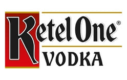
The Ketel One logo combines a prominent letter K with a compact wordmark and the word “VODKA” below. The supplied versions show the lettering against different backgrounds: one dark and one light. These are visible renderings of the mark, not evidence of a single fixed colour specification. The bottle label adds a separate layer of identity, drawing on the history of the Nolet distillery.
 Ketel One Logo PNG
Meaning and history
The name refers to Distilleerketel No. 1, a coal-fired copper pot still at the Nolet distillery in Schiedam. The brand’s account of its history connects the distillery’s name to that still, which is also illustrated on the bottle label. “Ketel” means pot still in Dutch.
The label carries several other documented details: the Nolet family crest, a list of family heads, and the signature of Carl Senior. The bottle base bears Schiedam and 1691 in relief. The brand describes the bottle shape as inspired by stone spirits bottles and says its raised neck was requested by bartenders. Together, these elements give the packaging a family and distillery history beyond the wordmark itself. (Ketel One’s history)
The Nolet distillery dates to 1691, while Ketel One Vodka was created in 1983 by the family’s tenth generation. The US trademark record lists a first-use date of 24 November 1983 and an initial vodka registration dated 27 August 1985. It also records marks in a variety of colour palettes, with many registrations making no claim to colour. No reliable source in the available record identifies the wordmark’s designer or a redesign date. (Ketel One; USPTO filing)
A brand-development engagement followed in 2017. Agency GERTRUDE described work for Diageo within a global refresh, including bar systems, barware and experiential activity; its announcement does not credit the agency with designing the bottle wordmark. In 2018, the “Family-Made Vodka” descriptor was in use, and Ketel One introduced its Botanical line in illustrated, embossed bottles. (GERTRUDE; 2018 launch announcement)
Ketel One and Ketel 1 Jenever are separate brands. In the 2008 arrangement between Diageo and Nolet, the Nolet family retained the brand rights and distillery, while Diageo took a 50 percent interest in a separate company and exclusive global sale, marketing and distribution rights. The trademark registrant is Double Eagle Brands B.V. (UK competition review; USPTO filing)
Today
The wordmark’s large K, lettering and separate “VODKA” line provide the central visual structure in this rendering. On the bottle, the illustrated still and family details supply context that the standalone mark does not carry. The available trademark record documents versions in multiple colour palettes, rather than one required colour treatment.

Disclaimer
This article is part of the educational resources provided by Logo Index, an independent archive covering logos, visual identities and graphic design history. Ketel One and associated trademarks and brand assets remain the property of their respective rights holders where applicable.