 Izze Logo PNG
IZZE logo and identity
IZZE is a sparkling-juice brand founded in Boulder, Colorado, in 2002 by Todd Woloson and Greg Stroh. PepsiCo announced its acquisition of the brand in September 2006, according to The Denver Post and the acquisition announcement.
2002 – Today
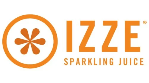
The pictured design combines an uppercase IZZE wordmark with smaller uppercase “SPARKLING JUICE” lettering. A circular outline encloses a radiating, petal-like fruit emblem beside the name. The artwork shows these forms in orange; it does not establish what the emblem was intended to represent. The wordmark and emblem are arranged as a compact horizontal signature.
The original packaging was credited to TDA Advertising & Design in a packaging-design book excerpt. That source also identifies Trade Gothic in connection with the original packaging, not as a verified typeface for the lettering shown here. The credit provides context for the launch identity without establishing that the pictured artwork is unchanged from 2002.
Packaging and sub-brand updates
In January 2006, IZZE announced a redesigned 8.4-ounce can with revised colors and more legible labels. The announcement describes a packaging update, so it is best understood as a change to the presentation around the brand name rather than proof of a new core logo. The company’s can announcement documents the change.
In 2008, IZZE collaborated with couture designer Loris Diran on signature apparel that used the brand’s logo and color palette as design references. The project shows the identity applied beyond beverage packaging, without documenting a replacement for the core wordmark. The collaboration release describes the project.
In January 2010, IZZE announced a reformulation of its low-calorie esque line and said it had redesigned the IZZE esque logo and accompanying label and packaging graphics. This was a documented revision to a sub-brand, distinct from a confirmed redesign of the main IZZE identity. The company announcement describes the update.
For IZZE Fusions, launched in 2017, Sagmeister & Walsh created an identity and campaign using fluid multicolor gradients and fruit photography. That approach gives the line a more image-led look than the simple wordmark-and-emblem arrangement shown above. The studio’s project page documents the work.
Later identity projects also extended beyond packaging. Rosie Lee Creative says it developed experiential guidelines for PepsiCo’s IZZE brief, applying the brand system to live environments. This project documents an additional application of the identity, but does not establish whether the pictured wordmark and emblem remain the brand’s current official mark. Rosie Lee Creative’s project account describes the work.
Disclaimer
This article is part of the educational resources provided by Logo Index, an independent archive covering logos, visual identities and graphic design history. Izze and associated trademarks and brand assets remain the property of their respective rights holders where applicable.