 Malibu Logo PNG
Meaning and history
Malibu is a coconut-flavoured rum-based spirit brand owned by Pernod Ricard. The company places its creation in the late 1970s and describes its rum as coming from Barbados (The Absolut Company; Pernod Ricard).

The logo’s recurring elements are an arched MALIBU wordmark, two palm trees and a sun set against a horizon. Across the archived stages, the lettering remains prominent while the sun’s shape, colour and relationship to the palms change. The 2019 redesign made the overall mark bolder and brought brighter sunset colours into the identity.
1982 – 2013
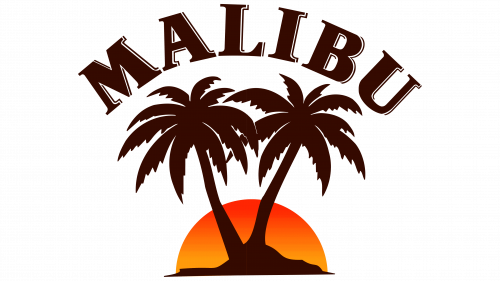
This stage uses a dark, heavy wordmark arched over two broad palm silhouettes. A simple orange semicircle sits behind the trunks at the horizon, making the trees and lettering read as one compact silhouette. Malibu’s brand timeline separately records a refreshed logo and symbol on its 2004 bottle, without identifying that packaging update as the start of this archived stage (The Absolut Company).
2013 – 2019

The next archived version keeps the arched wordmark and two-palm arrangement but replaces the flat semicircle with a larger, more detailed round sun. Orange and red dominate the disc, while a pale outer edge frames the trees. The brand timeline notes a lighter bottle redesign in 2012, a packaging milestone that precedes this stage label (The Absolut Company).
2019 – Today

The 2019 redesign used a more open, colourful treatment: the palms rise clearly in front of a yellow-to-pink sun, and the wordmark arches above rather than merging into a dark silhouette. Malibu’s announcement described a bigger, bolder look with lifted palm leaves, sunset colours and a revised horizon. Brand Union’s Stockholm team led the redesign, with Dag Forsberg as lead designer and Elsa Rafen as brand lead (Malibu).
Although the archive uses this stage heading, the 2019 artwork should not be read as the latest pack identity: Malibu introduced a new bottle design in 2024 and continued to evolve its presentation after that. The 2019 redesign remains a useful reference point for the colourful sun-and-palm treatment (The Absolut Company).
Wordmark, emblem and colour

This black-and-gray treatment shows the same arched wordmark and palm silhouettes in a reduced palette. Unlike a stand-alone palm emblem, it includes the brand name; the gray semicircle gives the sun a quieter appearance than the vivid sunset colours in the later designs.
The 2019 redesign’s sunset palette is one documented expression of the identity, not its only colour system. Pond Design’s later “The Colors of Malibu” work used turquoise as the main communication colour and described a customized Cubano typeface for the wordmark, paired with handwritten lettering for supporting text (Pond Design). The recurring palms, arched name and horizon connect these different treatments even as the colour and packaging evolve.
Disclaimer
This article is part of the educational resources provided by Logo Index, an independent archive covering logos, visual identities and graphic design history. Malibu and associated trademarks and brand assets remain the property of their respective rights holders where applicable.