The MARTINI logo is built from a red circle, a black horizontal bar and the name in white capital letters. Known as the Ball & Bar, the design places its wordmark across the circle, making the name and emblem one compact unit. The MARTINI brand covers vermouth, sparkling wines and aperitifs; it is distinct from the cocktail called a martini.
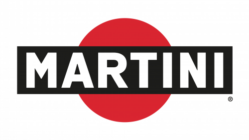 Martini Logo PNG
Meaning and history
The Ball & Bar was created in 1925 and registered as a mark for alcoholic products in Italy and abroad in 1929, according to the Museo del Marchio Italiano and the Museo Nazionale dell’Automobile. The museum describes a story linking the design to Livio Cibrario as tradition, rather than a documented account of its origin. The emblem’s defining elements are its red circle and the bar carrying the MARTINI name.
1863 – Today
The company’s history predates the logo. A Turin business founded in 1847 became Martini, Sola e C.ia in 1863, with Luigi Rossi as a partner; in 1879, after the Sola family’s exit, it took the name Martini & Rossi. The brand’s company history is summarized by Museo del Marchio Italiano and Treccani. Bacardi acquired the Martini & Rossi Group in 1993, according to Bacardi.
In February 2025, Bacardi announced a MARTINI relaunch featuring a redesigned bottle, the “MARTINI Dare To Be” campaign and a Bianco Spritz. The announcement still identifies the Ball & Bar logo as a trademark, so the packaging update did not replace the emblem’s role in the brand identity.

Color and lettering
The core mark contrasts a red circle with a black bar and white capital letters. The Museo Nazionale dell’Automobile describes red as a long-standing distinctive brand color. The lettering sits inside the bar, where the strong contrast keeps the name prominent. The supplied emblem artwork below adds a navy bar and gold edging; those visible colors distinguish that treatment from the simpler red, black and white logo, but do not establish its date or use.
The Emblem
The documented history includes several revisions to the Ball & Bar. Museo del Marchio Italiano records a short-lived green-circle variant in 1944, a Robilant agency restyle in 1995, and a three-dimensional treatment of the red circle in 2003. These changes altered the emblem’s treatment while retaining its recognizable circle-and-bar structure. The 2025 announcement continued to refer to the Ball & Bar as a trademark.

The result is an identity whose recognition depends on a few clear shapes: the circle, the crossing bar and the MARTINI name. The documented revisions show that the emblem could receive different treatments without losing that basic arrangement.
Disclaimer
This article is part of the educational resources provided by Logo Index, an independent archive covering logos, visual identities and graphic design history. Martini and associated trademarks and brand assets remain the property of their respective rights holders where applicable.