Miller’s visual identity includes several distinct marks: the flowing Miller script, the Miller Lite label and the Miller High Life emblem. Their lettering and layouts differ, so their histories are best understood as related but separate identities.
 Miller Beer Logo PNG
Meaning and history

Frederick Miller acquired the Plank Road Brewery in Milwaukee, and its first barrels were produced in fall 1855, according to Reference for Business and Molson Coors’ company history. The brewery’s marks later included separate identities for beers such as Miller Lite and Miller High Life.
19?? – 2001

This stage image shows the Miller name alone in red, drawn as a slanted connected script with a long underline flourish. It differs from the framed red-and-white emblem shown in the later stage image. The archive’s broad date range should not be read as proof that this exact artwork remained unchanged throughout those years.
A documented milestone in the company’s identity came in 1954, when Milwaukee industrial designer Brooks Stevens created the “soft cross” logo. The Dieline describes the mark and Stevens’s role in its history in its account of the Miller High Life identity.
2001 – Today

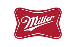
This image places the white Miller script inside a red, softly curved rectangular frame with a double outline. It is a different presentation from the unframed red script in the preceding image. The heading identifies the archive stage; the image alone does not establish present-day use.
The “soft cross” was later revised in a Miller High Life identity refresh by Soulsight, which also gave the Girl in the Moon greater prominence, according to The Dieline. That account describes a redesign of the identity while noting that the bottle design was unchanged.
Lite Emblem

Miller acquired Meister Brau Lite among three brands from the bankrupt Chicago brewer Meister Brau in 1972. Landor Associates designed the Miller Lite label in 1974, and the beer launched nationally in January 1975, as recounted in The Creation of Miller Lite and the Immigrant Entrepreneurship archive.
The design shown here centers the word “Lite” above a round crest with the words “A Fine Pilsner Beer,” a red central illustration and pale gold decorative branches. The Red Dot project listing describes the packaging’s Germanic typography and beer crest. Landor’s documented aim was to present a low-calorie beer without the unwanted “diet beer” association, as discussed by Beer et Seq.

This second Lite image uses a different arrangement: a small red Miller script sits above oversized blue Lite lettering, enclosed by sweeping blue and gold curves. Miller Lite packaging changed from white to silver in 1997 and to a blue-and-silver scheme in 2001. In 2014 the brand brought back packaging based on its early design; the Milwaukee Journal Sentinel timeline and Creative Bloq’s coverage describe the packaging changes and the throwback cans.
High Life Symbol

The pictured High Life mark combines a white Miller script and block-style “HIGH LIFE” lettering inside a red, double-outlined frame. High Life launched in 1903, and the Girl in the Moon was trademarked in 1907, according to the Miller High Life site. The figure appears on the bottle neck rather than in this particular emblem image.
The Girl in the Moon returned to High Life packaging in 1998, as reported by ABC4. The same report says her identity is unknown. The design’s combination of a distinctive character, bottle presentation and “Champagne of Beers” slogan sets High Life apart from the standalone script and Lite label.
Across these images, the Miller script is paired with different supporting forms: by itself, inside a red frame, above the large Lite wordmark, or alongside High Life lettering. The differences show why the parent name, Lite packaging and High Life identity should not be treated as one unchanging logo.
Disclaimer
This article is part of the educational resources provided by Logo Index, an independent archive covering logos, visual identities and graphic design history. Miller and associated trademarks and brand assets remain the property of their respective rights holders where applicable.