Reyka is a vodka brand launched in 2005 by William Grant & Sons, with a distillery in Borgarnes, Iceland, as the Moodie Davitt Report covered at the time. Its identity is carried by the bottle label, where the brand name is the main visual feature.
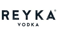
The wordmark sets REYKA in large, widely spaced uppercase letters, with smaller VODKA lettering centered beneath it and a registered mark beside the name. The logo shows dark lettering on a light ground, with a visibly distressed texture in one version and a more uniform look in another. The contrast and size establish a clear reading order without a separate emblem.
 Reyka Logo PNG
Meaning and history
The name Reyka is linked to an Icelandic and Old Norse word for smoke or steam. Master of Malt connects that meaning with the brand’s geothermal positioning. The packaging history shows how label illustrations and process details changed around the prominent name.
2005: the volcano label
The original packaging featured an illustration of Mount Hekla, alongside the Reyka wordmark on a paper label attached to a heavy-based glass bottle with a cork stopper. Difford’s Guide and the Moodie Davitt Report describe the volcano artwork as part of the launch-era presentation. In that design, landscape imagery shared the label with the name rather than leaving the wordmark alone as its main graphic element.
2010: the Here Design rebrand
Here Design reworked Reyka’s identity and packaging in 2010, as The Dieline documented. The redesign used tactile paper stocks, embossing, a tax strip and icons illustrating the distillation process. It removed the colorful artwork around the bottle neck and introduced a “Limited batch” text strip. The lighter label and grey imagery gave the dark wordmark a more prominent role; Sostav also reported the rebrand that year.
c.2012: the perforated process label
Difford’s Guide describes a 2012 label with stamp-like perforated edges and illustrations of the distillation process, replacing the earlier volcano artwork. This version continued to pair label detail with the brand name, while shifting the imagery from landscape toward production.
Today

This image shows the REYKA name above smaller VODKA lettering, with a distressed texture visible in the large letters. The two supplied logo images share that basic hierarchy but differ in the texture and background shown. The heading is retained as part of the image sequence; the image alone does not establish whether this particular treatment is Reyka’s current identity. Master of Malt has also reported that Reyka bottles use 85% recycled glass, a packaging detail distinct from the design of the wordmark.
Disclaimer
This article is part of the educational resources provided by Logo Index, an independent archive covering logos, visual identities and graphic design history. Reyka and associated trademarks and brand assets remain the property of their respective rights holders where applicable.