 Priceline Logo PNG
Meaning and history
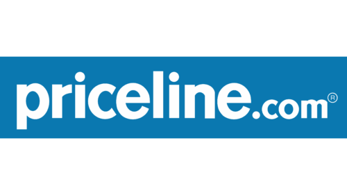
The wordmark shown here reads “priceline.com” in lowercase white letters on a blue rectangle. In May 2018, Priceline changed its consumer name from “Priceline.com” to “Priceline” and updated its logo and marketing collateral, as Skift reported.
1997 — Today
This presentation shows the same “priceline.com” lettering, with a registered-mark symbol at its right end. The blue rectangle spans the width of the artwork, while the white canvas leaves broad margins above and below it. The design has no separate pictorial icon or tagline. The 2018 refresh later replaced the dot-com consumer name with “Priceline” and updated the logo, according to Skift.
Lettering and color
The lettering is lowercase and rounded, with “.com” following directly after “priceline.” White letters stand out against the blue band. These visible features make the name the focus of the mark; they do not identify a particular typeface.
The 2018 refresh and later branding
In 2025, Priceline used the “go to your happy price” platform in a campaign featuring Kaley Cuoco, according to a PR Newswire release carried by MarketScreener. This campaign shows the later use of the Priceline name and brand platform.
Priceline is a Booking Holdings brand. The Australian Priceline Pharmacy is a separate business owned by Wesfarmers Health, as Retail Pharmacy Assistants reported.
View the Priceline logo archive entry.
Disclaimer
This article is part of the educational resources provided by Logo Index, an independent archive covering logos, visual identities and graphic design history. Priceline and associated trademarks and brand assets remain the property of their respective rights holders where applicable.