Metabo’s logo is a lowercase wordmark with bold, squared slab serifs. The name itself comes from Metallbohrdreher, the German term for a hand drill. Metabo’s history records the name’s origin and notes that the company logo included its telephone number in 1932. The slab-serif wordmark has characterised the brand’s corporate design since the 1960s, according to type-design studio bBox Type’s Metabo project page.
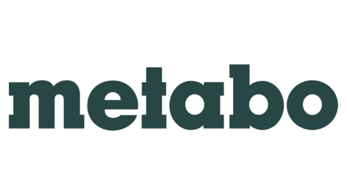 Metabo Logo PNG
Metabo logo history
The composite below brings together three visibly different treatments: one with a circular emblem and capitalized lettering, one with an emblem and lowercase lettering, and one that consists of the lowercase wordmark alone. The accompanying stage headings are retained as labels for those images.
1967 – 1999
This artwork pairs a circular emblem with a capitalized “Metabo” wordmark. The tall initial letter and compact lowercase forms give this version a different silhouette from the all-lowercase mark shown in the lead image. The stage heading supplies the date range; the image itself shows the design, not when it was introduced or retired.
1999 – 2004
Here the name appears in lowercase beside a circular emblem formed from vertical bars. Compared with the preceding artwork, the wordmark has a more uniform letter height, while the emblem remains a separate element to its left. Metabo’s general presentation documents green and blue in its brand palette, but the image alone does not establish a date or explain the emblem’s meaning.
2004 – Today
This artwork reduces the arrangement to the lowercase wordmark, without the circular emblem. The heading is preserved as the image’s historical stage label, but it does not describe the current identity: the later redesign retained the logo and dark green while updating the broader visual system.
The 2024 identity refresh
In 2024, Strichpunkt led a redesign that kept Metabo’s logo and dark green while expanding the palette into three greens and adding new iconography and labelling, as reported by Page. Type designer Ralph du Carrois and bBox Type developed the Metabo Slab and Metabo Sans typefaces for the updated identity; the bBox Type project page describes the wordmark’s slab-serif character and the type work. The result keeps the familiar name as the anchor while giving the wider design system more room to vary.
The company name also reflects its product history: Metabo’s account of its founding years traces it to the No. 18 hand drill, or Metallbohrdreher, and dates the founding of Schnizler GmbH to 1924. That origin gives the wordmark a direct connection to the toolmaker’s name, without requiring a separate pictorial symbol to explain it.
Disclaimer
This article is part of the educational resources provided by Logo Index, an independent archive covering logos, visual identities and graphic design history. Metabo and associated trademarks and brand assets remain the property of their respective rights holders where applicable.