Midea is the house brand of Midea Group Co., Ltd., a Chinese company. The group dates its entry into electric fans to 1980 and the registration of the 美的 trademark to 1981. Those milestones help explain why early accounts of the identity connect it with fans. (Midea Group; 中国设计之窗)
 Midea Logo PNG
Meaning and history
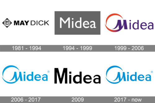
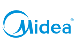
The documented sequence moves from a Chinese-name identity through a bilingual 美的 and Midea design to a mark without Chinese characters. The current design pairs the Midea wordmark with a prominent circular device; it is not text alone. Midea Group’s official materials continue to use this post-2017 identity. (Midea Group; 标志情报局)
1981 – 1994
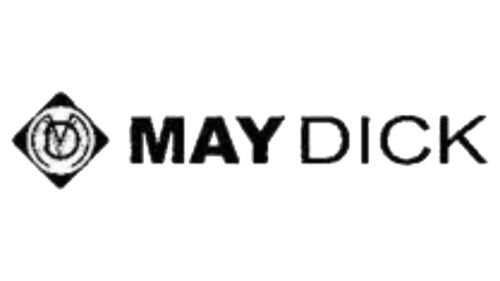
Midea Group dates registration of the 美的 trademark to 1981, after its entry into electric fans the year before. A Chinese design-history account describes the registered mark as featuring a circular fan-blade device. The image shown under this heading visibly reads “MAYDICK” and has a different emblem, so it does not verify the documented Midea mark’s appearance. (Midea Group; 中国设计之窗)
1994 – 1999

Chinese brand-history accounts date Midea’s first identity programme to 1994 and describe an in-house, fan-derived “MD” mark, with 美的 incorporated into the trademark. The image here instead shows a simple Midea wordmark. That visual difference means the image alone does not demonstrate the documented MD device. (宁海商标; Chinese brand and CI book excerpt)
1999 – 2006

The bilingual identity was publicly launched on 15 October 1999. A Chinese-language brand-history account says the English name replaced “MD” because MD was already registered in overseas markets. The displayed design pairs Midea lettering with an open circular sweep around the M. A Chinese CI book credits Hong Kong consultancy Landor with the redesign, though the visible image is a comparison of the artwork, not evidence of who designed it. (宁海商标; Chinese brand and CI book excerpt)
Published brand messaging glosses “Midea” as “My idea” and associates the open circle with balance and a Tai Chi concept. These are explanations attributed to brand-related sources, rather than meanings that can be established from the logo’s appearance alone. (标志情报局)
2006 – 2017
The 2006 revision simplified the earlier purple-and-orange treatment to blue, with heavier lettering and an adjusted dot over the i, according to Chinese brand-history coverage. The image shows the blue Midea lettering and circular device as a unified mark. A published corporate rationale associated blue with the sky and ocean and with freedom, ideals and wisdom; those are stated brand associations, not universal meanings of the color. (宁海商标; 2006 VI rationale document)
2009 (unused)
The dark image beneath this heading contains faint Midea lettering, but the image alone cannot establish its date, origin or whether the design was used. It differs visibly from the blue mark shown for 2006–2017.
2017 – Today
In 2017, Midea removed 美的 from the identity, leaving a Latin-script Midea mark. The image retains the circular device around the M as well as the wordmark, and its blue treatment resembles the preceding stage. Chinese brand-history coverage says official channels began switching to the revised identity in November 2017. Midea Group’s official global materials continue to show the post-2017 mark. (宁海商标; 标志情报局; Midea Group)
View the Midea logo archive entry.
Disclaimer
This article is part of the educational resources provided by Logo Index, an independent archive covering logos, visual identities and graphic design history. Midea and associated trademarks and brand assets remain the property of their respective rights holders where applicable.