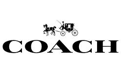
Coach is an American leather-goods and fashion house founded in New York in 1941. Its identity combines a horse-and-carriage emblem with an all-caps serif wordmark. The business began with six artisans making wallets and billfolds; the carriage emblem appeared later, in 1959, according to WWD’s Coach timeline.
 Coach Logo PNG
Meaning and history
The carriage connects the logo to the ordinary meaning of “coach,” a horse-drawn carriage. A brand presentation for Luxottica, a Coach eyewear licensee, describes the Horse & Carriage as representing “a tradition of fine workmanship in New York City.” It also identifies the carriage and C motifs as brand codes.
The early badge paired the carriage with a framed COACH wordmark, “EST. 1941” and “New York.” The date refers to the company’s founding, not the emblem’s debut. WWD dates the carriage logo to 1959, while its September 2013 report describes the older framed arrangement as the look Coach was leaving behind.
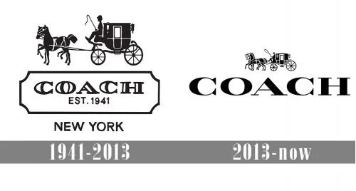
This composite contrasts the framed badge and its founding-date line with a larger, simpler Coach New York wordmark. It illustrates the main change in the identity: the name and carriage remain, while the frame and date disappear from the later lock-up.
1941 – 2013
The historic badge stacked the carriage above COACH in a rectangular frame, with “EST. 1941” inside and “New York” below. Its layout made the carriage the illustration and the framed name the central lettering. The badge’s date refers to the house’s 1941 origin; WWD’s timeline places the carriage emblem’s appearance in 1959.
Here the carriage sits above a broad, inward-cornered frame. The serif capitals and “EST. 1941” share the frame, while “NEW YORK” is set separately beneath it. WWD’s timeline dates the carriage logo to 1959, later than the founding year printed in the badge.
2013 – Today
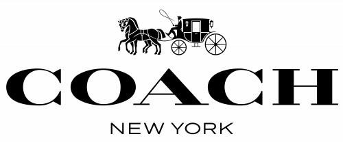
In 2013 Coach introduced a simpler Coach New York lock-up, removing the date and rectangle and enlarging and changing the lettering. WWD reported the refresh as part of a lifestyle transformation and described metallic, coppery-brass lettering on packaging. Fast Company likewise contrasted the earlier horse-and-carriage and “Coach 1941” treatment with the new “Coach New York” mark.
The image shows the wordmark in large serif capitals, with “NEW YORK” below and a smaller carriage above. Coach’s licensee brand presentation identifies Horse & Carriage and C motifs as active brand codes, supporting the continued place of both motifs alongside the wordmark.
Emblem, monogram and wordmark
The carriage is a detailed line illustration: two horses pull a carriage with a seated driver, wheels and harness visible. Its scale and placement vary across the examples here, from the dominant illustration in the historic badge to the smaller carriage above the later wordmark. The emblem’s appearance is documented from 1959; no designer attribution is needed to describe its role.
Coach added another visual layer with its Signature double-C monogram canvas, launched in 2001, according to WWD’s timeline. Unlike the carriage, which works as a single scene, the interlocking Cs form a repeatable pattern for products.
The wordmark uses uppercase serif letters. In the older badge, the lettering sits inside a frame with the founding date; the later Coach New York treatment gives the name more scale and removes that enclosure. WWD’s 2013 account describes a change in the lettering, but does not identify a named typeface.
Color and materials
Coach’s identity is associated with leather tones such as browns and tans, while black is also used for logo artwork and brass or gold tones appear in hardware. The lettering is not limited to black: WWD reported a metallic, coppery-brass finish on packaging during the 2013 refresh.

This close view emphasizes the wordmark’s uppercase serif forms and broad letter shapes. It offers a useful comparison with the smaller lettering in the historic badge, without identifying the letters as a specific typeface.
Coach and Tapestry
Coach’s corporate parent changed its name to Tapestry, Inc. in 2017, while the Coach brand name remained unchanged, NHPR reported. The corporate renaming did not replace the Coach identity described here.
Disclaimer
This article is part of the educational resources provided by Logo Index, an independent archive covering logos, visual identities and graphic design history. Coach and associated trademarks and brand assets remain the property of their respective rights holders where applicable.