 H&M Logo PNG
Meaning and history
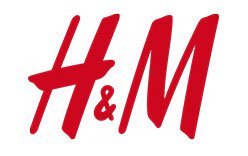
The H&M logo is a bold, slanted monogram: an H and an M joined by a smaller ampersand. Its compact form makes the initials legible across applications, from storefronts to clothing labels. The sequence below shows the change from the Hennes name to the abbreviated mark.
The name began with Hennes, the women’s clothing store Erling Persson opened in Västerås, Sweden, in 1947. In 1968, Persson acquired the Stockholm retailer Mauritz Widforss and the company became Hennes & Mauritz. H&M’s published history recounts these milestones; VRT also notes that “Hennes” means “hers” or “for her.” H&M’s company history and VRT’s profile provide the context for the initials.

1947 – 1968

The first stage shown is a single “Hennes” wordmark. Its handwritten-looking script leans across the sign, with no initials or ampersand. The name alone carries the identity.
1968

This nameplate places “Hennes” and “Mauritz” on either side of a framed H&M monogram. The surrounding words spell out the expanded company name, while the initials introduce the shorter mark. The M refers to Mauritz, not to “men.”
1968 – 1999

Here the frame and full names are gone. The red H&M monogram stands alone, with a small ampersand between the large, slanted letters. Compared with the framed version, this is a much more compact identity.
1999 – Today

This stage retains the same basic arrangement: oversized oblique H and M letterforms with a smaller ampersand. The image shows a cleaner, more open drawing than the preceding stage. H&M’s 2024 campaign and store refresh was described as a creative re-ignition, not a logo redesign. FashionUnited covered the new creative vision, while Fashion Forum reported that the temporary green Instagram background was reversed and the logo returned to white. FashionUnited’s coverage and Fashion Forum’s report describe that activity.
Monogram and color
The ampersand visibly connects the initials, while the shared slant gives the letters a sense of movement. The red-and-white treatment offers strong contrast; the alternate version below reverses those colors, placing the white monogram on red.

Disclaimer
This article is part of the educational resources provided by Logo Index, an independent archive covering logos, visual identities and graphic design history. H&M and associated trademarks and brand assets remain the property of their respective rights holders where applicable.