Meaning and History
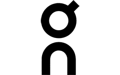
On’s logo is a compact vertical wordmark: a bold, rounded lowercase “o” above a lowercase “n.” A small projection at the upper right of the “o” gives the shape a switch-like appearance. Fast Company describes the detail as resembling an on switch; that is a visual reading, not a stated explanation from the brand (Fast Company).
Zurich studio Raffinerie credits itself with creating On’s corporate identity, including its logo and lettering. Its project page names Nenad Kovacic, Florian Streit, Reto Ehrbar and Christian Haas among the contributors (Raffinerie project credits). The mark’s simple stacked construction makes it legible at small sizes, while its unusual proportions distinguish it from a conventional horizontal wordmark.
On’s origin story provides context for the name and its running theme, rather than an explanation of the logo’s shapes. The company says Olivier Bernhard developed an early shoe prototype using pieces of garden hose attached to an outsole, and that On was founded in Zurich in 2010 with Caspar Coppetti and David Allemann. The prototypes won the ISPO BrandNew Award in March that year (On’s history; ISPO interview with co-founder Caspar Coppetti).
Today

The black mark shown here keeps the same stacked O-over-N arrangement. On’s June 2026 announcement introduced “Run On Clouds” as a permanent running identity, organised around Soft, Support, Energy and Speed, while reaffirming running as central to the brand (On’s announcement).
A separate identity development concerns the On Athletics Club, not the core On logo: in 2025, Munich studio Bureau Borsche redesigned the club’s mark, which appears alongside the vertical On wordmark (On’s announcement; page-online).
Font and Color
The lettering is described as bold and rounded, with the O and N arranged vertically. Fast Company describes the mark as two super-rounded sans-serif letterforms, while the German design publication page-online also notes the O-above-N construction. The sources do not establish a named typeface, so the lettering is best described by its visible form rather than assigned a font name.
The logo is commonly presented in monochrome, as in the black mark on a light background shown here. The two-tone contrast keeps the distinctive outline and stacked structure clear without relying on additional colour.
Disclaimer
This article is part of the educational resources provided by Logo Index, an independent archive covering logos, visual identities and graphic design history. On Cloud and associated trademarks and brand assets remain the property of their respective rights holders where applicable.