Bank of America’s logo pairs a blue, widely spaced, all-capital wordmark with a red-and-blue striped flag mark. The current identity descends from a 1998 redesign and was refreshed in 2018, according to design coverage and reporting on the brand update. Marketing-Interactive reported that the refresh accompanied the bank’s new positioning in 2017.
Meaning and history
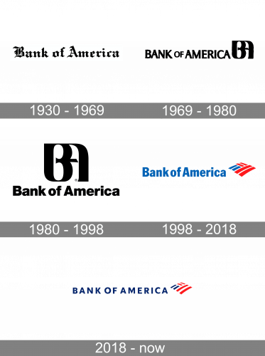
The identity’s major visual shifts are easy to see across the timeline: a wordmark gave way to a BA monogram, then to a striped flag emblem. The bank’s 1998 merger with NationsBank and BankAmerica brought the Bank of America name to the combined corporation; the Federal Reserve’s account of the merger records the name decision. The Federal Reserve record provides context for the change, while the logo stages show how the visual identity evolved.
1930 – 1969
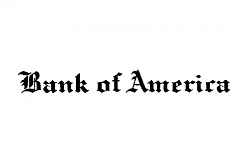
This stage shows the bank’s name alone in a heavily ornamented, blackletter-style wordmark. It has no separate emblem, unlike the later designs. A US word-mark registration record gives a claimed first use of the wording in 1928, with the application filed in 1968 and registration in 1969; those trademark dates do not establish when this particular artwork was introduced. The record concerns the wording.
1969 – 1980
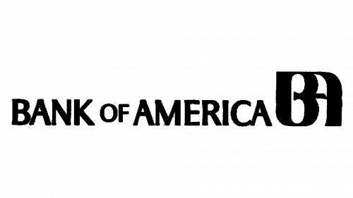
The next stage places a large BA monogram beside a cleaner, uppercase wordmark. Walter Landor & Associates created the 1969 redesign. Landor’s account described the monogram as intended to feel personal and noted that many viewers saw a bird in the interlocked letters. SFGate’s obituary of Walter Landor covers the studio’s work, and research on the design is preserved in the Landor collection at the Smithsonian’s National Museum of American History.
1980 – 1998
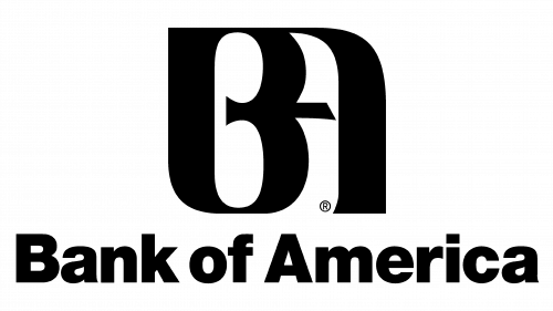
In this stage the monogram is enlarged and placed above the wordmark, changing the arrangement from a horizontal lockup to a stacked one. The lettering also appears less formal than in the previous stage. The precise date and typographic specification of this revision are not firmly established, so the visual comparison is more useful than assigning it a precise redesign year.
1998 – 2018
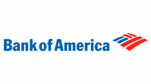
In 1998, the BA device gave way to a red-and-blue striped flag beside a blue wordmark. This was the first Flagscape-era identity, introduced around the merger that formed the present corporation. A US trademark record identifies red and blue as features of the mark and records its registration in 2001; registration is not the same as the mark’s introduction date. The registration record also gives a first-use-in-commerce date of 1999.
2018 – Today
The current stage keeps the wordmark-and-flag arrangement but shows a widely spaced, all-capital wordmark and a cleaner striped emblem. Reporting on the 2017 positioning said the update was the first refresh of the Flagscape mark in two decades; design directories date the visual revision to 2018. The current identity retains this refreshed Flagscape combination. Marketing-Interactive’s coverage describes the brand update and its timing.
Symbol
The emblem consists of angled red and blue stripes separated by white gaps, arranged to suggest a flag. The trademark record identifies red and blue as claimed colors and lists flag-related design categories. The symbol can also be separated from the wordmark, as shown here; its simple striped construction remains recognizable without lettering.
Wordmark and color
The current lockup uses a blue, uppercase sans-serif wordmark with generous spacing, set to the left of the striped emblem. The logo uses blue, red, and white. The trademark record supports the red-and-blue color claim, but it does not establish an official color specification or typeface, so exact font names and color values are not necessary to describe the mark.
Why the identity changed
The stages show a shift from relying on the bank’s name to pairing it with a distinctive emblem. Landor’s BA monogram added a compact device to the wordmark; the 1998 Flagscape redesign replaced it with a striped mark. The 2018 refresh retained that flag-and-wordmark structure while updating its presentation. Bank of America’s mark remains the red-and-blue flag alongside its blue wordmark.
View the Bank of America logo archive entry.
Disclaimer
This article is part of the educational resources provided by Logo Index, an independent archive covering logos, visual identities and graphic design history. Bank of America and associated trademarks and brand assets remain the property of their respective rights holders where applicable.