 Bank Banten Logo PNG
Meaning and history
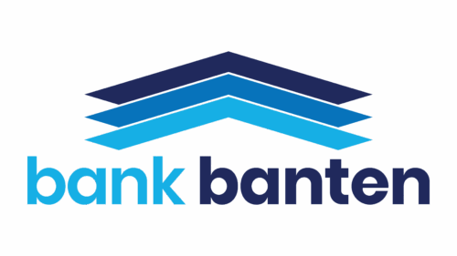
Bank Banten is the public name of PT Bank Pembangunan Daerah Banten (Perseroda) Tbk, a regional development bank owned by the Banten provincial government. Its current identity pairs three stacked blue chevrons with a two-tone, lowercase “bank banten” wordmark. The bank’s identity page presents this mark as its current corporate identity.
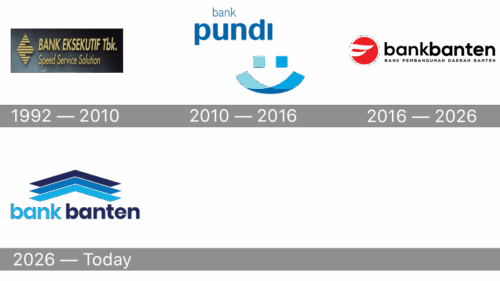
The images show a varied visual sequence: an angular diamond and formal wordmark, a face-like Pundi symbol, a red circular wing device, and the current stacked-chevron design. The bank’s corporate name also changed over time, from Executive International Bank to Bank Eksekutif Internasional, Bank Pundi Indonesia and Bank Pembangunan Daerah Banten. The stages below follow the dates in the archive’s timeline; the first two marks are described here by their visible features.
1992 — 2010

This image pairs a gold, horizontally striped diamond with a gold serif wordmark reading “BANK EKSEKUTIF Tbk.” The smaller “Speed Service Solution” line sits beneath the name. The “Tbk.” lettering is part of the visible design, but the image alone cannot establish when this particular artwork was introduced.
2010 — 2016
The Pundi design replaces the diamond and formal lettering with a blue, face-like symbol: two square shapes sit above a curved, two-part form. The lowercase wordmark gives “pundi” more visual weight than the smaller “bank” above it. This simple, character-like construction contrasts with the previous stage’s gold emblem and serif name.
2016 — 2026
This stage uses a red circular device containing a white wing-like form, beside the lowercase wordmark “bankbanten.” The full legal name appears beneath it. Bank Banten’s annual reports describe the red identity as inspired by Garuda’s wings and associate its two feathers with the shahada and GCG or prudential banking. The bank launched a new identity on 1 August 2026, ending this stage (Bank Banten’s launch announcement).
2026 — Today
The current design stacks three blue chevrons above the lowercase “bank banten” wordmark. The colors progress from light blue to blue and navy, with the two words distinguished by color. The bank says the stacked lines refer to the Tumpang Susun Tiga roof form and its funding, lending and services roles; it also links the upward shape with growth. Its identity page associates the lowercase lettering with humility and service, and blue with trust, credibility and professionalism.
Wordmark and color
The current wordmark uses lowercase lettering and separates “bank” from “banten” with two shades of blue. The bank identifies light blue, blue and navy as its corporate color gradation. Compared with the earlier red circle and wing, the current identity is built from repeated angular lines and color contrast, without a circular device or a separate legal-name line.
Disclaimer
This article is part of the educational resources provided by Logo Index, an independent archive covering logos, visual identities and graphic design history. Bank Banten and associated trademarks and brand assets remain the property of their respective rights holders where applicable.