 BMO Logo PNG
Bank of Montreal’s identity spans early formal wordmarks, a blue M-Bar introduced in 1967, and the red roundel associated with the BMO Financial Group identity from 2002. The bank’s heritage account credits the M-Bar to Hans Kleefeld of Toronto’s Stewart & Morrison Ltd. and describes the roundel’s general adoption alongside the 2002 brand consolidation. BMO’s heritage timeline provides the key dates and design credit.
Logo history
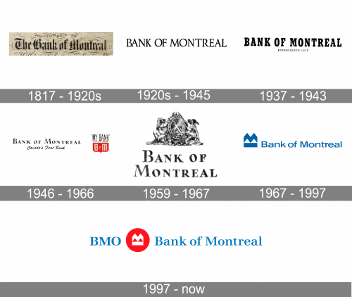
The montage shows the broad visual progression: elaborate lettering gives way to simpler capitals, then to wordmarks combined with a slogan or coat of arms. The M-Bar replaces that more detailed approach with an angular symbol and sans-serif lettering. The 1997 advertising campaign, “Can a bank change?”, was a brand milestone, not the documented debut of the roundel. BMO’s heritage timeline dates the roundel’s general adoption to 2002, when business lines were brought under the BMO Financial Group identity. Ove Brand Design’s case study also describes the unified identity work.
1817 – 1920
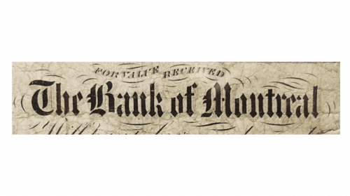
This early wordmark uses ornate, blackletter-style lettering for the bank’s name. Its dense strokes and decorative forms contrast strongly with the simpler capitals used in later stages.
1920 – 1945
The name appears in a more restrained uppercase serif. Compared with the earlier lettering, the forms are more regular and easier to read at a glance, with no separate symbol shown.
1937 – 1943
This version uses heavy, condensed serif capitals and places “Established 1817” beneath the name in smaller lettering. The founding date becomes part of the visible lockup.
1946 – 1966
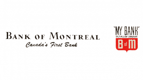
A mixed-case serif wordmark is paired with the cursive line “Canada’s First Bank.” Beside it, a small red-and-white shield carries “My Bank” above the initials B of M, adding a compact emblem to the wider wordmark.
1959 – 1967
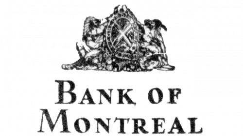
Here a detailed coat of arms sits above a large two-line Bank of Montreal wordmark. The arms had been recorded at the College of Arms in 1934 and registered in Canada in 1992, according to the Canadian Heraldic Authority’s public register. Its listed motto, CONCORDIA SALUS, is rendered there as “Harmony is salvation.”
1967 – 1997
The M-Bar era pairs an angular blue symbol with a clean sans-serif wordmark. BMO’s heritage account credits Hans Kleefeld of Stewart & Morrison Ltd. with the design and dates its launch to 1967. The bank called the new light blue “First Bank Blue”; chairman and CEO Arnold Hart described the launch as advancing “our image of vitality and service.” That was promotional framing, not an explanation of the symbol’s shape. BMO’s history of logos and slogans records these details.
1997 – Today
The image pairs the BMO and Bank of Montreal names with a white angular emblem inside a red disc. BMO’s heritage timeline places the roundel’s general adoption in 2002, when more than 30 lines of business were consolidated under the BMO Financial Group identity; Ove Brand Design also documents the identity work in its BMO case study. The heading is retained as supplied, but the 1997 campaign date should not be read as the roundel’s adoption date.
Symbol, wordmark and colour
The M-Bar name is associated with the angular symbol introduced in 1967. In the blue version, the symbol sits beside the bank’s name; in the later red-disc treatment, a white angular form occupies the centre of the roundel. The supplied images show the visible designs, while BMO’s heritage account identifies the 1967 mark as the M-Bar and records “First Bank Blue” as the colour name. The shift to a red disc changes the overall colour emphasis without requiring a claim about the symbol’s intended meaning.
The earlier stages rely mainly on serif lettering, with changes in weight, case and layout. The 1967 design introduces a sans-serif wordmark, while the roundel-era image combines the BMO and Bank of Montreal names with the emblem. The Canadian Intellectual Property Office record for “BMO & M Logo Design” lists Bank of Montreal as owner of the registered mark, registration TMA541840. The CIPO record also identifies the services covered by the registration.
Disclaimer
This article is part of the educational resources provided by Logo Index, an independent archive covering logos, visual identities and graphic design history. Bank of Montreal and associated trademarks and brand assets remain the property of their respective rights holders where applicable.