 Atkins Logo PNG
The Atkins logo pairs the ATKINS name with a prominent device above it. In the earlier version shown here, a blue ribbon carrying the white wordmark crosses a large red A. The later lockup replaces that letterform with a more angular red device while keeping the name beneath it.
Atkins began in 1989 as Complementary Formulations, founded by cardiologist Robert C. Atkins, and took the name Atkins Nutritionals in 1998, according to the company’s history summarized by Wikipedia.
Meaning and history
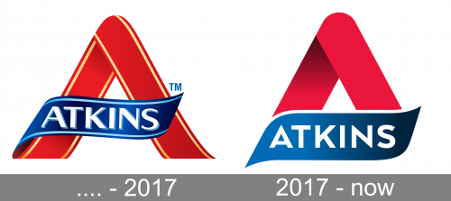
The earlier logo has a red A crossed by a blue ribbon, and the later design has an angular red form above the word ATKINS. It presents the two as before and after 2017; the image itself does not establish when the earlier version was first introduced.
Before 2017
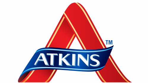
This version gives the A a broad, rounded shape with a narrow yellow outline. A curved blue ribbon cuts across it, carrying the white ATKINS lettering. The ribbon is a strong part of the lockup, not simply a background behind the word.
For international markets, Atkins refreshed its identity in 2013: the updated treatment removed a white background “flash,” added “New” to the name, and made the tape-measure device more prominent. Design Week reported that the work, including packaging by the Netherlands consultancy Proud, reached about 20 countries and used the strapline “Truly Satisfying Weight Loss.” The international identity work followed Atkins Nutritionals International’s 2011 appointment of 23red to handle identity and communications outside the United States, as The Drum reported. Design Week’s account of the refresh noted that the US identity continued to use the white flash.
2017 – Today
The later lockup shown here has an angular red A-like device above the white ATKINS lettering, which sits on a curved dark-blue ribbon. In late 2017, Atkins began rolling out redesigned US packaging by the DuPuis Group. The new packaging led with food photography and used horizontal colour bands to distinguish Meal, Snack and Treat ranges, according to Packaging Digest.
The UK’s Atkins Harvest range was a separate 2017 identity, not a replacement for the main logo. Marcomm News reported that its packaging by Brandon placed “Harvest” first and “Atkins” second, with a two-leaf chevron incorporated into the V.
Atkins remains marketed by The Simply Good Foods Company. The company’s September 2024 campaign used the Atkins name, and a Canadian trademark application filed in 2025 describes an angular design element above ATKINS and claims red for both. That colour claim differs from the later lockup pictured here, which shows a blue ribbon and white lettering. The application identifies the mark’s claimed colours; it does not change what the image visibly depicts. See the company’s campaign announcement and the Canadian trademark record.
View the Atkins logo archive entry.
Disclaimer
This article is part of the educational resources provided by Logo Index, an independent archive covering logos, visual identities and graphic design history. Atkins and associated trademarks and brand assets remain the property of their respective rights holders where applicable.