 Bertolli Logo PNG
Bertolli began in 1865 in Lucca, Tuscany, as a shop founded by Francesco and Caterina Bertolli. The date appears in the emblem’s “DAL 1865” wording, meaning “since 1865”; the founding and the phrase are recorded in the Fondazione Fiera Milano historical archive and trademark descriptions.
Meaning and history
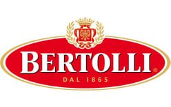
The emblem pairs a horizontal red oval with the white, black-outlined “BERTOLLI” wordmark and gold “DAL 1865” lettering. Above the oval is a crowned shield framed by laurel leaves and a ribbon. A trademark description records these components and claims red, gold, white and black as the mark’s colors; it describes the artwork, not a symbolic intention for the palette (USPTO filing).
The badge sits within a broader packaging identity that can vary by product and market. Some registered label descriptions include an olive tree and a figure carrying a basket, while other marks focus on the crest and oval (Justia’s record reference). Green also appears in packaging beyond the red-and-gold emblem, including a Dutch-market identity that retained a green-and-white pattern (Marketing Report NL).
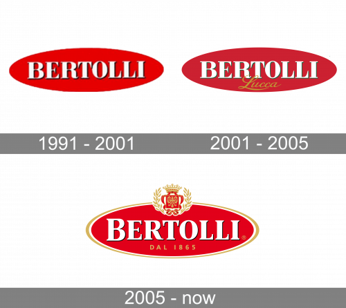
The archive’s three stage labels show a progression from a simple oval wordmark to versions with additional lettering or a crest. Those labels are useful guides to the pictured designs; trademark records independently show crest-and-oval configurations on packaging by 2007 and 2011 (Justia’s record reference).
1991 – 2001
This stage is the most stripped-back of the three: “BERTOLLI” sits in white serif capitals inside a red oval. There is no “DAL 1865” line or crest, leaving the wordmark as the only detail within the badge.
2001 – 2005
The oval remains, but the lettering gains a green edge and a gold script “Lucca” beneath it. Compared with the preceding plain badge, the extra location name and contrasting script give this version a more layered look.
2005 – Today
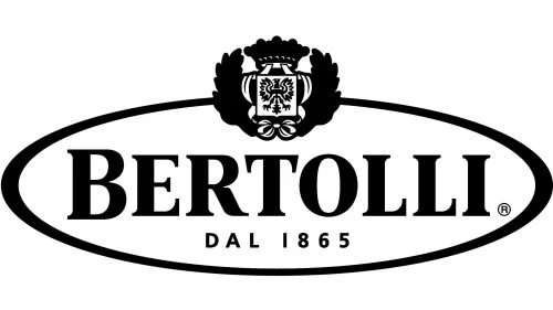
This stage image shows the full crest-and-oval arrangement in black and white: the crown, shield and laurel sit above the wordmark, with “DAL 1865” inside the oval. Its monochrome treatment differs from the red-and-gold emblem shown at the top. The archive heading groups this design with the later stage; the current identity is the colored red-oval emblem, which a 2023 Italian olive-oil packaging announcement said remained unchanged (Fooday.it).
The emblem across packaging
Bertolli’s emblem can appear on different bottle and label designs without every element of the pack becoming part of the logo. Australian trademark records include bottle-shaped marks with the Bertolli name and additional imagery such as an olive branch and sailing ship. The “BERTOLLI DAL 1865” application was filed in 2019 and entered on the register that year; a related “THE RECIPE IS SIMPLE.” mark was registered in 2018 (IP Australia).
In 2023, a packaging relaunch for the Italian olive-oil market introduced a lighter bottle using 10% less glass and a cleaner label. Fooday reported that the brand said the logo and its palette were unchanged. The update illustrates the difference between a packaging refresh and a replacement of the central emblem.
Bertolli is a brand used across food categories, rather than one business operating every product line. Mizkan announced its 2014 acquisition of the Bertolli brand and North American pasta-sauce business; other Bertolli categories have separate business owners and operators (Mizkan Group; Wikipedia).
Disclaimer
This article is part of the educational resources provided by Logo Index, an independent archive covering logos, visual identities and graphic design history. Bertolli and associated trademarks and brand assets remain the property of their respective rights holders where applicable.