 Barilla Logo PNG
Meaning and history
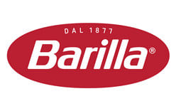
Barilla’s current logo is a horizontally flattened red oval with a white italic wordmark, a registered-trademark symbol and “Dal 1877” above the name. The identity introduced in 2022 removed the white inner component used in earlier versions and adopted a more intense red. Barilla announced the redesign on 26 January 2022 for its 145th anniversary; the company’s official properties continue to show this identity. Barilla’s announcement and its packaging information describe the update.
Barilla was founded in Parma in 1877 by Pietro Barilla. The family-owned group identifies itself as a world leader in pasta and a leading producer of pasta sauces in Europe. Barilla’s company history provides the background to the date in the logo.
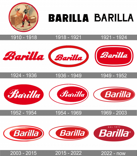
1910 – 1918
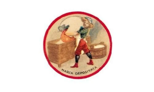
The first trademark showed a boy pouring an oversized egg yolk into a trough of flour. The Barilla Historical Archive credits sculptor Emilio Trombara with the first registered trademark and separately records painter Ettore Vernizzi’s large 1910 sign, which remained in use into the 1930s. The archive’s logo history describes both contributions.
1918 – 1921
This stage presents the name alone in heavy black capitals, a sharp contrast with the earlier illustrated trademark. The archive describes the period’s wordmarks as frequently changing rather than settling into one lasting typographic treatment. The Barilla Historical Archive recounts that experimentation.
1921 – 1924
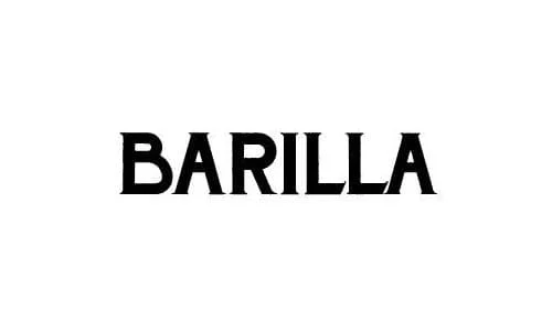
Here the name appears in black serif capitals, replacing the previous stage’s heavier, more compact lettering. These early examples show how the wordmark could change substantially while the company’s name remained its central signature. The archive’s account describes the wider period as one of repeated lettering experiments.
1924 – 1936
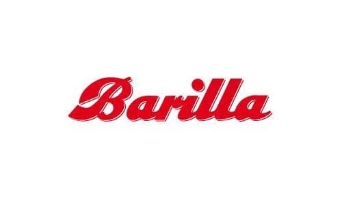
The lettering shifts again to a red, flowing script, a marked departure from the preceding block capitals. The illustrated trademark also remained part of Barilla’s visual identity into the 1930s, alongside changing wordmark treatments, according to the Barilla Historical Archive.
1936 – 1949
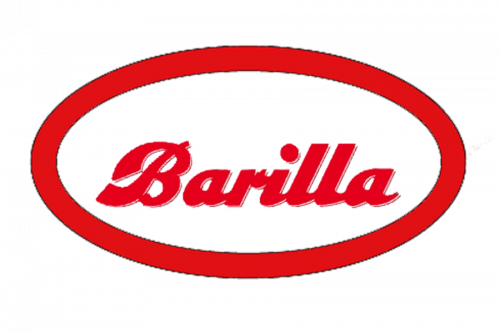
The pictured design pairs the red script name with a large oval outline. These were separate steps in the documented history: Giuseppe Venturini removed the boy in 1936, leaving a name-led mark, and added an oval border in 1949. The archive and design history record those milestones.
1949 – 1952
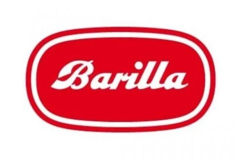
The wordmark now sits inside a filled red oval with a white inner border and an outer outline. The stronger badge-like frame develops the oval that has remained a recurring feature of later Barilla logos. The 1949 framing is credited to Venturini in the design history summarized by the Barilla Historical Archive.
1952 – 1954
The pictured mark is a simpler red oval containing the white script name. In 1952 Barilla engaged designer Erberto Carboni for a new oval logotype, after discontinuing its fresh-bread bakery business. The advertising campaign “Con pasta Barilla è sempre domenica” won the Palma d’Oro. Barilla’s Blue Box history and its historical archive describe this redesign.
1954 – 1969
Carboni’s 1954 version places the red oval and script inside a broader, asymmetric outer frame. The frame was described as representing the white and yolk of a hard-boiled egg cut in half. In 1956 Carboni also designed the first Barilla Blue Box; its blue drew on the light-blue paper once used to wrap loose pasta. The archive and Barilla’s packaging history document these details.
1969 – 2003
In 1969 Barilla commissioned the consultancy Lippincott & Margulies to study its corporate image. The resulting design flattened the ellipse and replaced the script with a more restrained custom wordmark. On the Blue Box, the logo appeared in a white, rounded “lingua” area. The archive describes the lettering as remaining practically unchanged until the 2022 redesign. The Barilla Historical Archive documents the update.
2003 – 2015
This stage adds dimensional shading and highlights to the red oval, while retaining the white inner area and italic name. Foodweb reports a restyling around 2000; the date is approximate, and the visual comparison is clearer than assigning this effect to a precise launch year. Foodweb’s coverage discusses the earlier restyling.
2015 – 2022
The mark returns to a flatter treatment than the shaded version shown before it. The red oval, white inner field and italic white wordmark remain, with the outline and color fields presenting the badge in a cleaner, more even style.
2022 – Today
Barilla’s 2022 redesign removed the white inner component, intensified the red and redrew the wordmark. “Dal 1877” was added above the name as a concise heritage statement. Barilla announced the changes on 26 January 2022; its official packaging page also describes the red and blue colors as complementary. The same redesign introduced a Blue Box without a plastic window, which Barilla says is fully recyclable and saves about 126,000 kilograms of material per year. The company announcement and packaging page outline the changes.
Wordmark, oval and color
The logo’s most durable feature is the oval frame, introduced around the wordmark in 1949 and repeatedly reworked since. Lettering moved from changing early treatments and script to the custom, non-script wordmark introduced in 1969. The red-and-white oval in Carboni’s 1950s designs was associated with an egg; the 1954 asymmetric frame specifically represented a halved hard-boiled egg. The historical archive’s account traces those design stages.
The blue associated with Barilla packaging has a separate origin: it recalls the light-blue food paper once used to wrap loose pasta. In the 2022 identity, “Dal 1877” makes the founding year part of the logo itself. Barilla’s Blue Box history explains the packaging color, while the redesign announcement describes the updated mark.
Disclaimer
This article is part of the educational resources provided by Logo Index, an independent archive covering logos, visual identities and graphic design history. Barilla and associated trademarks and brand assets remain the property of their respective rights holders where applicable.