Apollo Tyres Ltd. distinguishes its corporate identity from its product-brand identities. That distinction matters when following the logo’s history: the corporate identity changed in 2021, while the Apollo product-brand logo introduced in the 2009 identity system was retained. The company’s 2021 announcement describes that arrangement and also confirms that Vredestein’s separate identity was retained.[Company announcement]
 Apollo Tires Logo PNG
Meaning and History
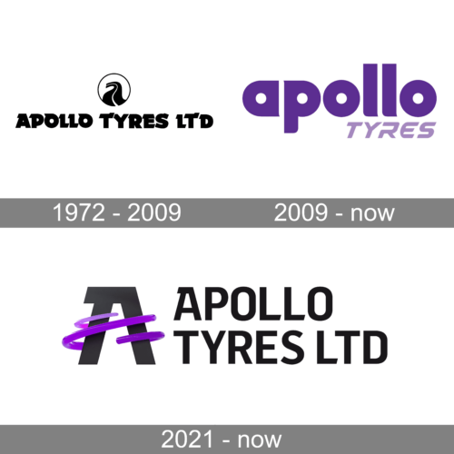
The documented sequence moves from the earlier red disc emblem to the 2009 identity system, then to the corporate identity introduced in 2021. The dates in the headings identify the stages; the company’s announcement establishes that the 2021 change was corporate, not a replacement of the Apollo product-brand logo.
1972 – 2009
Apollo Tyres’ earlier emblem is described in the company’s identity document as a red disc depicting an “unending road,” with the company name across it.[Apollo Tyres identity document] A separate account of the 2009 change recalls an older, chunky black-and-white wordmark in capital letters.[BW Businessworld]
2009 – Today
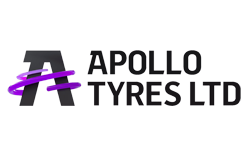
Apollo Tyres announced a new corporate identity on 13 March 2009. Tire Business reported that Saffron Brand Consultants created the identity, with Wally Olins leading the work.[Tire Business] The system paired a lowercase “apollo” wordmark with four coloured discs.
The company’s identity document connects the discs with tyres and mobility, and describes the four circles together as suggesting a vehicle’s wheels. Their outlines range from slim to thick to reflect tyre types from passenger to industrial. The documented colour meanings include black for precision, purple for premium, orange for energy, light grey for industriousness and white for purity.[Apollo Tyres identity document] Coverage of the launch also names the Flama typeface and the “Go the Distance” tagline.[afaqs]
Olins’s rationale for purple was differentiation: a book extract published by BW Businessworld recounts how he considered competitor colours, including Michelin’s blue and Bridgestone’s red, and chose purple as a less crowded option, with reference to Apollo’s Indian roots.[BW Businessworld] In 2021, the system ceased to serve as the group’s corporate identity, but Apollo Tyres retained the Apollo logo as its product-brand identity.[Company announcement]
2021 – Today
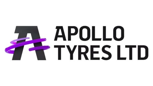
On 18 June 2021, Apollo Tyres Ltd. announced a new corporate identity, along with the vision “Driving Progress, Together” and the purpose “Enabling Excellence.” The company credited London agency Jones Knowles Ritchie with creating the identity. Its announcement said the existing Apollo Tyres logo would remain the product-brand identity, while Vredestein’s identity, unveiled in 2020, would also be retained.[Company announcement]
The 2021 stage is therefore the corporate identity, while the earlier Apollo wordmark continues in a product-brand role. Keeping those roles distinct makes the sequence clear: a long-running red disc emblem, a 2009 product and corporate system, and a new corporate identity that left the Apollo product mark in place.
Disclaimer
This article is part of the educational resources provided by Logo Index, an independent archive covering logos, visual identities and graphic design history. Apollo Tires and associated trademarks and brand assets remain the property of their respective rights holders where applicable.