 Bombardier Logo PNG
Bombardier is a Canadian business-aviation company founded in Valcourt, Quebec, in 1942 by Joseph-Armand Bombardier. Its current identity pairs the company name with the Mach symbol, introduced in 2024. Bombardier describes its present focus as business aviation, including business jets, defense and services on its brand page.
Meaning and history
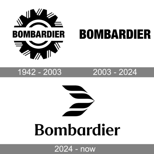
The identity’s broad visual changes are clear across the timeline: a sprocket-wheel emblem, a wordmark without a symbol, then the Mach symbol above the name. The inherited date range on the first stage begins in 1942, but BRP says the sprocket wheel became part of the company logo in 1959, not 1942.
1942 – 2003
The first image shows the Bombardier name across a large, toothed wheel. The wheel relates to the founder’s engineering: BRP identifies the barbotin, or sprocket wheel, as Joseph-Armand Bombardier’s first patented invention in 1937 and says it had been part of the company logo since 1959. That account supports the emblem’s connection to the company’s snow-vehicle roots, while the image’s 1942 heading does not establish when the logo first appeared. Le Devoir’s account of BRP’s identity also describes the sprocket’s continued presence in BRP’s own badge after the recreational-products business became independent.
This blue treatment keeps the wheel-and-name arrangement, but changes the emblem’s color from the outlined black-and-white version above to a solid blue.
The green variant retains the sprocket and wordmark while using a different color treatment. These images show variations within the emblem era rather than evidence for separate dated redesigns.
2003 – 2024
This stage shows the Bombardier name without a separate emblem. Le Devoir described the pre-2024 identity as having no symbol, with the wordmark carrying the identification. The 2003 start date is the timeline’s label; the source account establishes the earlier symbol-free identity but does not independently confirm that precise beginning year. Le Devoir’s 2024 report also notes that the company kept its name through the redesign.
2024 – Today
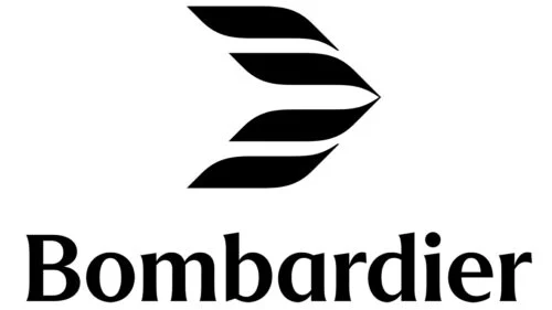
Bombardier introduced the identity shown here on 24 April 2024, and the company continues to present it on its brand pages. The named Mach symbol depicts an aircraft breaking the sound barrier; Bombardier connects its wind-and-wing elements to the company’s heritage and to the Learjet winglet. The symbol sits above the Bombardier wordmark in the image. Bombardier’s account of the redesign explains those references, while its brand page describes the bespoke typeface as modern and refined, with subtle serifs. Le Devoir observed that the lettering became finer and the capital B more prominent than in the previous wordmark.
Bombardier worked with branding agency Lippincott on the redesign. In November 2024, the project received Red Dot: Best of the Best in Brands and Communication Design, as well as a Red Dot award for the logo. The award announcement names the Mach symbol and credits Lippincott. Applied Arts’ award listing also credits the Lippincott team and gives the brand idea as “At Your Altitude.”
View the Bombardier logo archive entry.
Disclaimer
This article is part of the educational resources provided by Logo Index, an independent archive covering logos, visual identities and graphic design history. Bombardier and associated trademarks and brand assets remain the property of their respective rights holders where applicable.