
 ACTRA Logo PNG
ACTRA, the Alliance of Canadian Cinema, Television and Radio Artists, represents professional performers in recorded media in Canada. The union says it has more than 30,000 members. Its history includes several name changes before it adopted the ACTRA name in 1984. (ACTRA; The Canadian Encyclopedia)
ACTRA marks appear in production credits, giving the union’s identity a visible connection to the performers it represents. The historical designs shown here vary considerably, from a simple outlined wordmark to geometric and branch-specific treatments.
Meaning and history
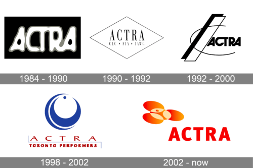
The name ACTRA followed earlier organizations for Canadian radio and television performers. The Association of Canadian Radio Artists formed in 1943 from groups in Toronto, Montreal, Winnipeg and Vancouver. The organization later became the Canadian Council of Authors and Artists in a 1952 merger, was renamed in 1963, and adopted the ACTRA name in 1984. (ACTRA; Library and Archives Canada)
ACTRA’s end-credit marks include different visual approaches, and the date ranges attached to the designs overlap. The sequence is therefore best read as a set of marks associated with credit use, not as a precise record of one national logo replacing another on a single date. (Avid Wiki)
1984 – 1990

This archive-labelled stage shows ACTRA in white, rounded, irregular lettering with a dark outline against black. The word alone fills the design; it has no enclosing badge, secondary line or separate emblem. The label places it in this period, though the image itself establishes only its appearance.
1990 – 1992

A thin diamond frames a narrow serif ACTRA wordmark. Beneath it, the image includes the abbreviations CLC and FIA, separated by dots. ACTRA is affiliated with the Canadian Labour Congress and the International Federation of Actors, making those initials recognizable as affiliations rather than extra parts of the name. (The Canadian Encyclopedia)
1992 – 2000
This design replaces the diamond with a dynamic arrangement of bold ACTRA lettering, angular bars and a long curved line. The diagonal forms dominate the composition, while the smaller wordmark sits to their right. The mark is visually more elaborate than the framed lettering of the preceding stage.
1998 – 2002

This is an ACTRA Toronto branch design, not a national redesign. A blue crescent-like symbol and dot sit above widely spaced ACTRA lettering; a rule frames the words “TORONTO PERFORMERS” below. The archive dates overlap with the preceding stage, consistent with the appearance of different credit marks in the historical sequence. (ACTRA; Avid Wiki)
2002 – now

The archive-labelled stage shows a red ACTRA wordmark beneath an orange and red emblem made of rounded forms. This is a different construction from the branch mark above. The heading is part of the historical image sequence; ACTRA’s current primary logos are documented separately in its branding resources.
Current identity
ACTRA’s official Branding and Credit Logos page provides white and black primary logos and specifies that the acronym is written in capitals as ACTRA, while branch names use standard case. The union’s French-language site also announces a new logo. These current resources distinguish the published identity from the older designs in the credit-mark sequence. (ACTRA Branding and Credit Logos; ACTRA)
Disclaimer
This article is part of the educational resources provided by Logo Index, an independent archive covering logos, visual identities and graphic design history. ACTRA and associated trademarks and brand assets remain the property of their respective rights holders where applicable.