Animal Planet is a television channel focused on animal-related programming. It launched in 1996 as a joint venture between Discovery Communications and BBC Worldwide, according to the Los Angeles Times. Its logo history moves from an image-led elephant mark to a wordmark and back to an elephant-led identity.
 Animal Planet Logo PNG
Meaning and history
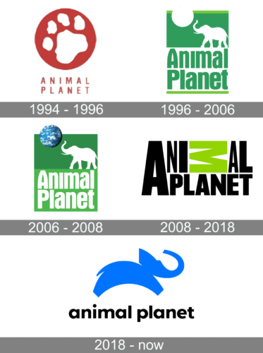
The elephant has been a recurring image in the channel’s identity. In 2018, the new mark returned to an elephant after a decade-long wordmark-only period. The release published by The Futon Critic quotes designer Sagi Haviv saying the leaping elephant builds on the original mark. Transform also connects the redesign to the earlier elephant-and-globe identity.
1994 – 1996
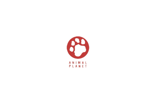
This early archive stage shows a red paw-print roundel above a compact, two-line wordmark. It is visually distinct from the green elephant identity that followed.
1996 – 2006
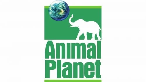
The green identity pairs a white elephant silhouette with a globe at the upper left. Below, “Animal Planet” appears in large green lettering on two lines. The elephant-and-globe combination gave the mark a clear animal and world motif. Animal Planet launched in 1996 as a Discovery Communications and BBC Worldwide venture, as the Los Angeles Times reported.
2006 – 2008
This stage retains the elephant and globe but changes the layout: white lettering sits in a green block beneath the emblem, against a larger green field. The archive places this treatment between the earlier green wordmark and the 2008 redesign.
2008 – 2018
The 2008 redesign removed the elephant and globe in favor of a bold, uppercase wordmark. Its most distinctive feature is the sideways green “M” within “ANIMAL,” set against black lettering. Design Week reported that Dunning Eley Jones won a paid four-way pitch for the identity, as part of a repositioning intended to make the channel “edgier, more adult-focused.” The unusual letter treatment also drew press attention, including from The New York Times.
2018 – Today
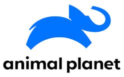
Animal Planet introduced its blue leaping-elephant identity in October 2018. The elephant is paired with a rounded lowercase wordmark, replacing the previous all-type design with an animal symbol again. The announcement credited Chermayeff & Geismar & Haviv with the redesign and said the identity debuted in the United States and United Kingdom on 28 October, alongside the premiere of Crikey! It’s the Irwins. The release also reported a rollout across more than 205 countries and territories by the end of the first quarter of 2019. The Futon Critic published the announcement; Transform described the palette shift from green to blue and black and the reference to the classic elephant-and-globe mark.
The visual sequence alternates between an emblem-led identity and a wordmark-led one. The current blue elephant restores the animal image while giving it a simpler silhouette and a lowercase wordmark.
Disclaimer
This article is part of the educational resources provided by Logo Index, an independent archive covering logos, visual identities and graphic design history. Animal Planet and associated trademarks and brand assets remain the property of their respective rights holders where applicable.