 Andina de Televisión Logo PNG
ATV is the on-air name of Peru’s Andina de Televisión, a generalist channel broadcasting on Lima’s channel 9. The initials derive from the station’s name, itself linked to the corporate operator Andina de Radiodifusión. The company was created in 1981, and the channel began official transmissions on 18 April 1983, according to the station’s history.
Meaning and history
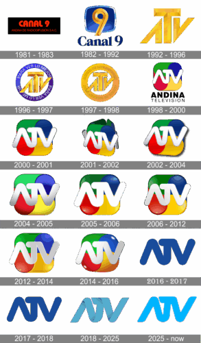
The sequence moves from Canal 9 lettering and a gold numeral to the ATV initials, a four-colour rounded square, and later blue wordmarks. The stage dates below follow the archive’s timeline; published summaries do not agree on every transition.
1981 — 1983 (pre-launch)
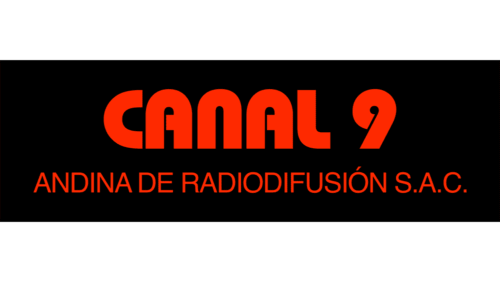
This early artwork uses red “Canal 9” lettering above the corporate name Andina de Radiodifusión S.A.C. Its black background and prominent station name make it distinct from the later numeral-based identity.
1982 — 1983 (pre-launch), 1983 — 1992

The next Canal 9 design centers a gold numeral 9 over a rounded blue screen-like shape, with “Canal 9” below. The station’s official transmissions began in April 1983, as recorded in the station history.
1992 — 1996

After the station adopted the ATV name on 14 January 1992, the numeral gave way to large gold initials. A history of the channel records the rename and describes the early ATV lettering with a taller T than the A and V (Andina de Televisión history).
1996 — 1997
The gold initials sit inside a purple circular band carrying a repeated motto. This adds a framing device around the wordmark, rather than changing the initials themselves.
1997 — 1998
The ring becomes a heavier gold-toned frame, with the station name arranged around its edge. A reference to a ring treatment around 1997 also appears in the ATV Noticias logo chronology.
1998 — 2000
A rounded square divided into four coloured sections replaces the circular frame. White ATV lettering sits above the words “Andina Televisión.” A Peruvian trademark listing describes an ATV logotype over a rounded four-section figure with “EL CANAL” beneath, though its wording differs from this pictured version (trademark listing).
2000 — 2001
The initials grow larger and acquire a metallic, dimensional finish. The four coloured sections remain behind them, making this a treatment change within the square-based design.
2001 — 2002

Here the coloured background appears as separated, projecting panels rather than a single compact square. The prominent dimensional initials remain in front.
2002 — 2004

The panels return to a joined rounded-square arrangement. White, shaded ATV lettering continues to dominate the center of the mark.
2004 — 2005
The coloured fields appear lighter, while the large white initials retain their dimensional shading. The basic square-and-wordmark structure remains unchanged.
2005 — 2006
The fields become more saturated and the initials appear broad and smooth. This is another close variation on the four-colour design.
2006 — 2012
The archive labels this stage as a continuation of the square design, with white ATV letters across glossy green, blue, red and yellow fields. A separate logo-history account places square-based marks through 2014, so the heading’s date does not establish a definitive switch to a standalone wordmark in 2006 (channel logo history).
2012 — 2014

The same square-and-initials composition uses brighter metallic shading, especially across the lettering. The rounded colour fields still provide the background.
2014 — 2016

This stage also retains the four-colour square, with white ATV letters and reflective highlights. That visible construction sits alongside published accounts that place the square design through 2014, leaving the transition around this period unclear.
2016 — 2017

The displayed mark is a dark-blue ATV wordmark on a blue field, without the four-colour square. The simplified silhouette shifts emphasis from coloured panels to the connected initials.
2017 — 2018

The blue wordmark remains, with a similarly compact, joined construction. The small visual change between these two archive stages is less pronounced than the earlier move away from the coloured square.
2018 — 2025

In 2018, ATV introduced lettering described as interwoven, ribbon-like forms; the change is also noted in the ATV Noticias chronology. This stage has a flatter blue treatment than the dimensional squares that preceded it. It was superseded by the 2025 refresh.
2025 — Today
The current identity is a bright electric-blue ATV wordmark. The channel’s 2025 image change used the slogan “Atrevámonos”; an archived January 2025 broadcast capture shows updated on-air graphics (station history; archived broadcast capture).
Lettering and colour
The initials have shifted from dimensional gold to white lettering over a four-colour square, then to blue wordmarks. The 2018 version was described as interwoven ribbon-like lettering, while the 2025 mark presents bright blue initials in a new treatment. The four-colour square is specifically described in a trademark listing; the saved sources do not establish a designer, typeface, or intended symbolism.
Disclaimer
This article is part of the educational resources provided by Logo Index, an independent archive covering logos, visual identities and graphic design history. Andina de Televisión and associated trademarks and brand assets remain the property of their respective rights holders where applicable.