 Alta Automobile Logo PNG
Alta was a Greek vehicle manufacturer active during the 1960s and 1970s, producing motorcycles, three-wheeled trucks and a small passenger car. Its visual identity appears to have been built primarily around the ALTA name in bold uppercase lettering, rather than a complex pictorial symbol.
Because Alta disappeared in 1978 and no official brand guidelines are known to survive publicly, the logo is best studied through period vehicle badges, surviving photographs and historical documentation rather than later symbolic interpretations. [1]
Alta Logo Meaning and History
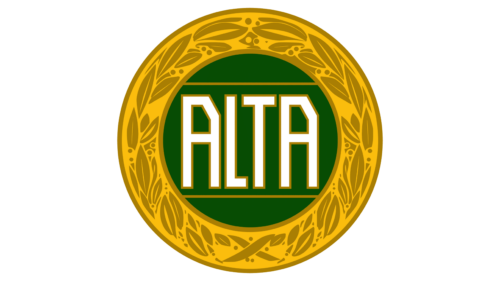
The surviving Alta identity is notable for its simplicity. Historical badge references show the marque using the name ALTA prominently in uppercase lettering, sometimes within a bordered or badge-like composition.
Claims that the lettering symbolized strength, the colors represented Greek patriotism or the badge expressed industrial ambition should therefore be treated as speculation rather than fact.
The strongest documented meaning comes from the logo’s direct function: it identifies the manufacturer clearly on motorcycles, commercial three-wheelers and passenger vehicles.
What Did the Alta Logo Look Like?
Known Alta branding is based mainly on a straightforward wordmark. The letters are blocky, uppercase and designed to remain legible when applied to vehicle badges and mechanical products.
Historical sources do not document a long sequence of formal redesigns. Surviving examples suggest that Alta relied on a consistent name-based identity during its active years, with small differences likely depending on vehicle model, badge construction or production period. [2]
Was the Alta Logo Blue and White?
Modern reproductions of the Alta logo may appear in blue, white, silver or other simplified colors, but no authoritative historical source located for this article establishes blue and white as a formal brand-standard palette.
That means the common explanation that the colors deliberately referenced the Greek flag is not sufficiently documented.
For a defunct marque like Alta, restored vehicles and recreated digital logos can introduce colors that were not necessarily standardized by the original manufacturer. Period badges and photographs are therefore more reliable than modern vector reconstructions when discussing historical appearance.
Alta Logo Typography
The Alta lettering can be described as a bold, geometric uppercase wordmark with relatively simple construction.
It is therefore more accurate to describe the visible letterforms rather than assign the logo to an approximate modern font.
The simplicity was practical for an industrial marque whose name needed to remain recognizable on motorcycles, trucks and compact vehicle badges.
Did the Alta Logo Have a Symbol?
Public historical material is limited, but Alta appears to have relied predominantly on its name rather than on a separate, widely documented standalone symbol.
This is important because some modern logo descriptions characterize the identity as a complex geometric emblem. Surviving vehicle references instead point to a relatively direct ALTA wordmark or badge.
No official explanation of an abstract symbol, shield, national motif or coded geometric meaning has been located.
When Was the Alta Logo Used?
The Alta marque entered production in 1962, when motorcycles and light three-wheeled trucks powered by Sachs 50cc engines were produced in Athens. [3]
The same identity continued through Alta’s better-known later vehicles:
- Alta 50S: an early 50cc motorcycle;
- Alta A700: a heavier three-wheeled truck introduced in 1967;
- Alta A200: a three-wheeled passenger vehicle introduced in 1968.
The company later moved production to a larger factory in Elefsis, where operations continued until 1978. [3]
The Alta A700 Badge Era
The A700 became one of Alta’s most successful vehicles. Introduced in 1967, it used a two-cylinder BMW engine producing about 35 horsepower and had an 800 kg payload. [4]
From a logo-history perspective, this period matters because Alta’s badge became attached to one of the company’s most recognizable products. The identity remained direct and utilitarian, fitting the commercial character of the vehicle.
The Alta A200 and the Brand Badge
In 1968, Alta introduced the A200, a three-wheeled passenger car powered by a 200cc Heinkel engine and based on the Fuldamobil concept, but with Alta’s own body design. [3]
Historic photographs of the A200 are among the useful surviving references for the Alta marque. One image preserved on Wikimedia Commons comes from Labros Skartsis’ book Made in Greece, an important secondary source on Greek vehicle manufacturing. [5]
These historical vehicle images are more valuable for reconstructing Alta’s branding than modern symbolic explanations created after the company disappeared.
Did the Name Alta Mean “High” or “Elevated”?
The existing article describes Alta as deriving from Latin and meaning “high” or “elevated.” That explanation is not reliably documented in the historical sources located for this article.
Some later secondary sources instead claim that the name may have been connected to the founder’s family, but the evidence is not strong enough to present a definitive etymology here. [6]
For Logo Index, it is safer not to invent or overstate a name meaning where contemporary company documentation is unavailable.
How Much Did the Alta Logo Change?
There is no well-documented official logo timeline comparable with major international manufacturers.
Available historical references suggest that Alta relied on a relatively consistent name-based badge throughout its active period. Any differences seen across surviving vehicles may reflect manufacturing variations, restoration, different badge materials or model-specific applications rather than formal corporate rebrands.
For that reason, a detailed year-by-year logo evolution would create false precision.
Alta Logo Legacy
Alta ceased operations in 1978, leaving behind a relatively small but distinctive part of Greek vehicle history. [1]
The brand’s identity survives mainly through historic motorcycles, three-wheelers, restored cars, photographs and enthusiast documentation.
From a design-history perspective, the most important lesson is not hidden symbolism. It is the way a small industrial manufacturer relied on a direct, highly legible name badge that could function across very different types of vehicles.