illycaffè was founded in Trieste in 1933 by Francesco Illy. Its logo history includes several distinct treatments of the name, from an early decorative design to the familiar lowercase white wordmark on a red square. The company dates that wordmark to 1996 and links its lettering to artist James Rosenquist’s work. (illycaffè history)
 Illy Logo PNG
Meaning and history
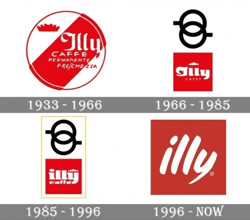
The stages below show changes in the framing and lettering around the illy name. The two-cup motif appears in the 1966 redesign, while the 1996 version reduces the mark to a lowercase wordmark within a red square. The company’s history dates the Rosenquist-inspired logo to 1996. (Museo del Marchio Italiano; illycaffè history)
1934
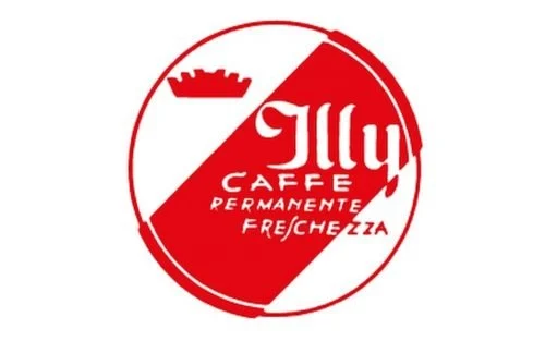
The first illy logo is dated to 1934 and credited to Xanti Schawinsky, who worked with Studio Boggeri in Milan. The Museo del Marchio Italiano also notes his work on the Olivetti logo around this period. In the historical image, the name sits within a circular, diagonally divided design, alongside a crown-like shape and smaller lettering. (Museo del Marchio Italiano)
1966
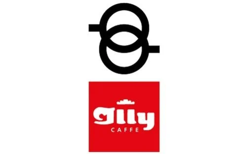
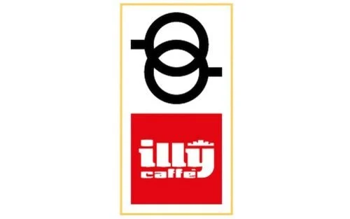
The 1966 redesign introduced a red square and a two-cup motif, which cafés serving illy had already used as a bar sign from 1960. The image shows a compact, blockier wordmark and a separate looped symbol above it. The museum credits the redesign to Carlo Mangani. (Museo del Marchio Italiano)
1985
The next redesign made the identity more essential and easier to read, with the lettering changed to lowercase, according to the Museo del Marchio Italiano. In the image, the wordmark remains in a red panel, accompanied by the looped symbol and a light rectangular border. (Museo del Marchio Italiano)
1992
1992 marks the beginning of the illy Art Collection, not a documented logo redesign. The project invited artists and designers to decorate espresso cups; illy’s company history dates the collection to that year. The initiative brought art into the brand’s product presentation while the logo timeline continued to its next documented redesign in 1996. (illycaffè history; Museo del Marchio Italiano)
1996
The 1996 logo uses lettering taken from a work by James Rosenquist. Assolombarda reports that Rosenquist made the source painting in 1995 and met Ernesto Illy in Trieste that year. The result is the lowercase white “illy” wordmark on a red square, with loose, rounded strokes replacing the earlier emblem and supporting elements. (Museo del Marchio Italiano; Assolombarda)
The company’s history identifies the Rosenquist-based design as its logo, and 2024 coverage describes a digital and e-commerce identity project by Feels Like rather than a redesign of the wordmark. The red square and painted-looking lowercase letters therefore remain the defining features of the logo. (illycaffè history; LBBOnline)
Lettering and color
The 1996 wordmark is based on Rosenquist’s painted lettering rather than a documented typeset font. Its lowercase letters have visibly varied, curved strokes. Across the historical stages, red and white recur, while the amount of surrounding graphic detail changes. (Museo del Marchio Italiano; Assolombarda)
Disclaimer
This article is part of the educational resources provided by Logo Index, an independent archive covering logos, visual identities and graphic design history. Illy and associated trademarks and brand assets remain the property of their respective rights holders where applicable.